| Image |
Comment |
| 09/18/2005 07:58:33 AM |
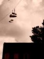
They Can't Here Us Up Hereby dwolffComment: Well, not a bad idea for a shot for this challenge but it´s framed a little bit too tight for my taste, you cut off the "basket" of the blimp on the left and that really hurts the image IMHO. Also, there seems to be a very wierd blur on the left side of the photo, was it something you did in PP or is your lens just this soft on the left side? 5 from me as I like the idea but not terribly fond of the outcome. |
 Photographer found comment helpful. Photographer found comment helpful. |
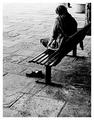
| 09/18/2005 07:55:57 AM |
Paranoiaby glodaComment: Nice lighting, did you paint this one with light or how did you get that subtle lighting on the couch she is sitting on. Nicely done. However, this isn´t a breathtaking photograph so I "only" gave it a 7 but one of the better ones in the challenge. |
| Photographer found comment helpful. |
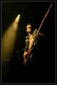
| 09/02/2005 05:21:11 PM |
The bass player by geimdrengurComment: Congratulations on getting a blue ribbon with this pretty cool shot and your first entry to boot! Oh and just for the record, about 2 weeks ago I encouraged Kiddi to start participating in challenges here at DPC as I thought he had what it took to be a ribbon winner.
Me and my stupid big mouth... I would have gotten the 13th place if I would have just kept it shut  |
| Photographer found comment helpful. |
| 09/01/2005 03:25:08 PM |
Magritte Shoesby OdedComment: Validated or not, I just don´t care at all for the post processing. If you like it, keep it up though cause what the hell do I know though but I thought you deserved an explanation as to why I only gave it a 3 and that´s mainly just because you are on topic. |
| Photographer found comment helpful. |
| 09/01/2005 03:22:42 PM |
Detachedby e301Comment: Nice candid, I love the tones and contrast in this one, gave it an 8. |
| Photographer found comment helpful. |
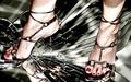
| 09/01/2005 03:21:29 PM |
Stilettos (Too Sharp)by QartComment: Nice, I love the idea and outcome, only thing I don´t really care for is the lighting making shadows or bright areas as the light is reflected up again on her feet. One of the best shots in the challenge, I gave it a 8. |
| Photographer found comment helpful. |
| 09/01/2005 03:19:07 PM |
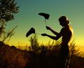
Ant's Nightmareby owenComment: Nice idea and pretty well executed, I think I would have liked it slightly more if the proportions were more 50/50, I mean the sole the left 50% of the frame and the person the right 50% of the frame. One of the better shots in the challenge, mainly because of orignality and I gave it a 7. |
| Photographer found comment helpful. |
| 09/01/2005 03:11:02 PM |
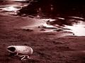
Neighbor's Talesby Car54Comment: I suggest you try and make the most of the file size of 150kb your image can be next time you enter a challenge as this one has some bad artefacts due to severe image compression. |
| Photographer found comment helpful. |
| 09/01/2005 03:09:24 PM |
divorced...by taterbugComment: Excellent colour cast and I like the composition but the title doesn´t really fit with the image IMHO, at least I don´t get it... 7 from me. |
| Photographer found comment helpful. |
| 09/01/2005 03:05:16 PM |
do a little danceby myceliumComment: Nice, but I think I would have liked it a whole lot more with some slight motion blur on the shoes itself, I find the image a bit static as it is. Love the colours and the whole setting and one of the better shots in the challenge, 7 from me. |
| Photographer found comment helpful. |
Home -
Challenges -
Community -
League -
Photos -
Cameras -
Lenses -
Learn -
Help -
Terms of Use -
Privacy -
Top ^
DPChallenge, and website content and design, Copyright © 2001-2025 Challenging Technologies, LLC.
All digital photo copyrights belong to the photographers and may not be used without permission.
Current Server Time: 08/15/2025 03:36:24 AM EDT.