| Image |
Comment |
| 06/01/2006 07:36:43 AM |
Waspby BenComment: One other thing, would be better if you had composed this more to the rule of thirds with the bug more in the lower right corner but not badly composed at all. |
 Photographer found comment helpful. Photographer found comment helpful. |
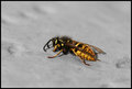
| 06/01/2006 07:36:07 AM |
Waspby BenComment: This is ok, but I can´t help but comparing this to tons of other macro bug shots that are on this site and sorry, this just doesn´t compare to most of them. Still no way a bad shot, I had voted this a 6 in a macro challenge as there is absolutely nothing wrong with it. Maybe a smaller aperture for more DOF though as part of the flys head isn´t in focus? That and a small contrast boost as it seems a bit flat. Nice shot. |
| Photographer found comment helpful. |
| 06/01/2006 07:34:22 AM |
Bluebell Pathby BenComment: I REALLY like this one, just makes me wanna go home, pack up a picknick basket, bring the wife and kids and stroll down that path. Really makes me long for summer :) Not a thing I would change about it, had this been in a challenge I would have voted an 8 or a 9, just love the mood in it. |
| Photographer found comment helpful. |
| 06/01/2006 06:26:52 AM |
a8_web.jpgby kirsty_mcnComment: This one looked great as a thumbnail but I was dissapointed when I opened it, would have been tons better if the focus had been on all the flower, or at least on the portion that is up front. This has some real potential and berhaps I am being to harsh, I am admittedly comparing this to DrAchoos free study XI entry wich was similar. Keep it up :) |
| Photographer found comment helpful. |
| 06/01/2006 06:23:32 AM |
a9_web.jpgby kirsty_mcnComment: This is my favorite of this bunch. I like it, the colors work well together, the backround and flower too. I like the stalk thing or whatever it is that is in front of the flower but not the top one that just barely is in the frame at top, think it´s too much and should be removed. Nice job technically and with the lighting. |
| Photographer found comment helpful. |
| 06/01/2006 06:19:18 AM |
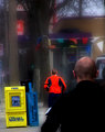
melbourne city/warf.jpgby boysetsfireComment: Pretty cool shot, looks great on the right half. However, I don´t like the left half, it´s sort of dead space to me wich isn´t always bad, but just doesn´t work here in my opinion. I feel I would have liked this better if you had turned the camera to the right and lost that dark space to the left and included the same amount to the right, am I making sense? Having the lights towards the sky in the left corner and shown me more to the right :)
Nice job technically, the reflections on the water look great. |
| Photographer found comment helpful. |
| 06/01/2006 06:17:25 AM |
Lizzie3634.jpgby -Bec-Comment: This one I like. Her attitude is great, looks like a good model in the making :) Love the dof and color toning in it. Perhaps including the elbow next time? Also I find the downwards angle this is shot from not really appealing, I always try to get down to the kid´s height when I take photos of them, looks more natural. Great shot and I like it. |
| Photographer found comment helpful. |
| 06/01/2006 06:15:20 AM |
100_4960-copy.jpgby taterbugComment: This one I don´t like as much but take in mind that I have never ever ever liked softfocus shots, I simply do not understand what people like about that technique so I am quite biased :)
There is something very unnatural about the blur around the jogger. I always try to do it in camera. However, twice I have done it in photoshop, or rather boosted up the out of focus look, here in dpchallenge. My triptych entry and my 80´s entry. I find that "lens blur" looks better than the usual gaussian blur. Don´t have photoshop here at work but if I remember correctly it´s somewhere in the filters section.
Also the red channel of the running suit looks blown out, has no detail. I like the composition though and feel of this image but because of the technical issues I honestly think I would have voted it a 4 if it had been in a challenge. |
| Photographer found comment helpful. |
| 06/01/2006 06:08:15 AM |
Death Becomes Her...by taterbugComment: Pretty nice shot, I like the color toning in it. However, the choice of DOF doesn´t really appeal to me, the purple flowers are stronger in the composition and I would have liked the whole shot better if it were all in focus or just the front flowers. A nice shot though, if it were in a challenge I would have given it a 6. Something a bit sad about it and me being a meani likes it :P |
| Photographer found comment helpful. |
| 05/31/2006 01:48:45 PM |
Uncoveredby Mal37Comment: Greetings from the critique club, here is the critique you requested :D
No question it meets the challenge, it´s a photo of you in a self portrait so no comment on that. I did vote in this challenge and gave it a 6, a 6 from me means above average, a good shot but lacks that certain something that makes me want to give it a higher score.
I must admit I don´t get the thinking behind this picture. Why you are ucovering a blanket or whatever on a black and white backround with a flag and what appears to be a wristwatch or a digital video camera is completely lost on me, I do not understand it. If I did, I might have given a higher score but I certainly didn´t deduct points for it since this is an international site and I assume this act means something to you . This might have hurt your score with others though, I am just speculating as a couple of people commented on this and I agree with them.
Technically it´s well done, I don´t like the post processing on your hand though, makes it look rather plasticky and odd, like a prosthetic. Lighting is interesting and the composition/crop works well, only to nitpick I would have preferred if you didn´t cut off your ear like that but that is no issue, just wanted to point that out.
Don´t know really what to suggest to you to improve this score other than maybe trying to put yourself in the voters shoes in whether they might understand the thought process behind the photo. Technically it´s decent and I thought it was underrated, not by much but I would have guessed this to just break a 6 if you had asked me before the challenge.
Kind regards from Iceland, Larus. |
| Photographer found comment helpful. |
Home -
Challenges -
Community -
League -
Photos -
Cameras -
Lenses -
Learn -
Help -
Terms of Use -
Privacy -
Top ^
DPChallenge, and website content and design, Copyright © 2001-2025 Challenging Technologies, LLC.
All digital photo copyrights belong to the photographers and may not be used without permission.
Current Server Time: 08/26/2025 05:46:44 PM EDT.