| Image |
Comment |
| 06/01/2006 01:18:38 PM |
Blue Denim Babyby ShaneBlakeComment: Well I can certainly see why this is one of your favorite photos! I like it, it´s very well composed, the boy is in exactly the right place, there are no distractions in the backround and his expression is good. Well exposed and clear. Seems a bit oversharpened though but I am viewing this on a crappy screen at work so don´t put too much stock into that. |
 Photographer found comment helpful. Photographer found comment helpful. |
| 06/01/2006 01:16:41 PM |
Earthyby TuckersmomComment: I totally agree with SJCarter, I like the brown color and while I normally HATE noise it works well with this image, sort of suits it. Love the mood in the picture and great DOF. |
| Photographer found comment helpful. |
| 06/01/2006 01:15:19 PM |
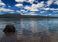
Clarityby bcobleComment: This one I like best of the three you posted, well composed, great tones and I love that sky, nice work! |
| Photographer found comment helpful. |
| 06/01/2006 01:14:52 PM |
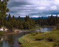
Eastern Oregonby bcobleComment: This one is much better, it´s well composed, I like the processing on the sky and the river really leads you into the frame. Like the clarity and immage quality of it. Biggest drawback I think is the tree branch that comes into the frame in the upper left corner, it´s kindof an attention stealer for me. |
| Photographer found comment helpful. |
| 06/01/2006 01:09:13 PM |
At the Fence Lineby bcobleComment: This is my least favorite of the three you posted. It´s still not bad though, but kindof average to me and I see you can do much better. There is nothing wrong with this picture though, just lacks visual impact for me. Mainly the subject I don´t find really all that interesting and I feel like I am just looking at the left part of a complete photograph, like the right half is missing. Again, I emphasize, nothing wrong with this shot, would have given it a 5 in a challenge. |
| Photographer found comment helpful. |
| 06/01/2006 08:05:38 AM |
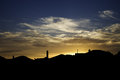
Urban sunriseby MelethiaComment: This is pretty cool. I think the foreground is a bit too much though, I would crop about 10-15% of the bottom and make it more panorama like but the rest I really like, the sky is awesome and what a view to wake up to. Like the outlined silhouettes :) |
| Photographer found comment helpful. |
| 06/01/2006 08:04:36 AM |
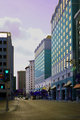
Downtown streetby MelethiaComment: I like the hue shift, gives it an antique look, like this was taken 70 years ago or something like that. Nicely composed. The blown out cloud is a huge drawback though in my opinion, if there was a way to salvage that this shot would be perfect :) |
| Photographer found comment helpful. |
| 06/01/2006 08:03:02 AM |
Scotch Bonnet: the world's hottest pepper.by Elvis_LComment: Since you specifically asked why it did so poorly I´ll adress that specifically.
1. The lighting is not so good, very harsh and I guess taken with the onboard flash. If you don´t have fancy studio equipment available or even an external flash there are ways around this. Use a big window during day, preferrably facing south. Use different settings on your camera too to minimise the power needed from the flash. Try a higher iso, don´t be afraid to go up to 400 or even 800 when there is little light available, the more natural look is better than little noise, trust me, your camera can handle it. Also use a bigger aperture, I would have used 2.8 or 4 in your shoes, both to put the "steam" more out of focus and also since you had so little light available. You still probably need your flash but much less power from it, leading to a more aesthetically pleasing lighting.
2. I would have taken this in landscape mode, the black above your head doesn´t really do anything for me and instead I would have included more "steam" and your elbows.
3. The black backround is not really flattering, I would have liked this shot heaps better with an out of focus kitchen or something like that but it´s not bad either, just a suggestion over a black backround for this shot. Would make it more natural and believable.
Hope this helps :) I like the idea and with better lighting this could have hit it off so definately keep at it. |
| Photographer found comment helpful. |
| 06/01/2006 07:49:45 AM |
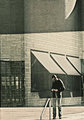
Reflectionby Arti-ElviComment: This one is pretty cool, nothing at all I would change regarding the color scheme and look of the image. Only thing I dislike is the tight composition towards the bottom, I would like just a little space below his feet but that´s it. Nice work! |
| Photographer found comment helpful. |
| 06/01/2006 07:38:01 AM |
IMG_3077.jpgby BenComment: Sorry but find this to be the worst in the three you asked for comments on. Just sorry but I dislike the choice of DOF here, I would have liked more of the center of the flower to be in focus as my eye is really drawn there and not towards the front petal like that, I just wanna squint to make out the center of the flower. I definately think you can do better when I compare this to your other two shots :) |
| Photographer found comment helpful. |
Home -
Challenges -
Community -
League -
Photos -
Cameras -
Lenses -
Learn -
Help -
Terms of Use -
Privacy -
Top ^
DPChallenge, and website content and design, Copyright © 2001-2025 Challenging Technologies, LLC.
All digital photo copyrights belong to the photographers and may not be used without permission.
Current Server Time: 08/26/2025 12:02:48 PM EDT.