| Image |
Comment |
| 06/14/2006 07:27:19 AM |
Cloneby KronusComment: This is a pretty cool shot, nice use of wideangle distortion, it really works here. I like everything about this image except for I would have placed the boy lower in the frame, his head closer to the top of the frame and had more space at the bottom but I like this :) |
 Photographer found comment helpful. Photographer found comment helpful. |
| 06/14/2006 07:26:11 AM |
silk1by KronusComment: I really liked the thumbnail, was kindof dissapointed when I opened it though, like I told you earlier I am a sucker for image quality so the noise and lack of clarity in this image doesn´t really do much for me... Really like the coloring though and if this was tack sharp, no noise and otherwise exactly the same with the blurred backround I think I would have liked this heaps :) |
| Photographer found comment helpful. |
| 06/14/2006 07:24:44 AM |
Behind the scenesby smilebig4me1xComment: You know what? I actually like the outcome. I wouldn´t enter this in challenges though as this is not "dpc friendly" but I like it somewhat and I normally hate this kind of "cheap" photoshop effect trick shots. There is just something about the coloring and clarity of this image that agrees with me. Nice work! |
| Photographer found comment helpful. |
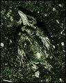
| 06/13/2006 01:33:57 PM |
The Endby aznymComment: Sorry but a bit too monotone for my taste, the dead birt completely blends in with the backround and it´s hard to make out, no one part of this photo that stands out also and that is hurting it in my opinion. Not a bad shot though at all, got a 5 from me. |
| Photographer found comment helpful. |
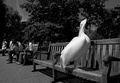
| 06/13/2006 01:32:34 PM |
Territorialby e301Comment: Haha, what a great find! I can´t imagine why noone would dare sit next to it, hehe :) Maybe a tad too dark for my taste but nothing that is hurting the shot. 7 from me! |
| Photographer found comment helpful. |
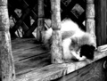
| 06/13/2006 12:21:39 PM |
I Didn\'t See You Sleeping Thereby pottersclay75Comment: Nice tones in it, especially in the wood. Gotta be careful not to blow the hightlights thoug as you do in part of the cat´s fur, not bothering me in the least, just thought I´d point it out to you in case you hadn´t noticed. Anyway, like this shot, gave it a 7. |
| Photographer found comment helpful. |
| 06/13/2006 11:34:28 AM |
|
| Photographer found comment helpful. |
| 06/13/2006 11:34:06 AM |
Waiter!!!by srdanzComment: Somehow the mood in this picture is wrong for a restaurant, something to do with the backround and lighting that makes me 99% sure you took this in your livingroom but that´s just nitpicking :) Nice shot and excellent idea, gave it a 7. |
| Photographer found comment helpful. |
| 06/13/2006 11:30:18 AM |
Satyriconby terjeComment: This shot is friggin awesome, hadn´t seen it before. Quite possible one of the best concert shots I have ever seen. Only to nitpick, I dislike the left part of the shot, the area with the smoke and I would have liked it better if you had burned it in more to make it darker. Everything else is TOP notch, I love the mood in this shot, just added it to my favorites. |
| Photographer found comment helpful. |
| 06/13/2006 11:19:56 AM |
Just around the next bend......by FalcComment: Sorry but in my opinion this is taken during the wrong time of day, the strong shadow that is across the landscape is too dark, this would have worked better if it were taken during the time of day none of it were in shadow or around sunset/sunrise where the shadows are softer. Still a nice shot, don´t get me wrong. Gave it a 6. |
| Photographer found comment helpful. |
Home -
Challenges -
Community -
League -
Photos -
Cameras -
Lenses -
Learn -
Help -
Terms of Use -
Privacy -
Top ^
DPChallenge, and website content and design, Copyright © 2001-2025 Challenging Technologies, LLC.
All digital photo copyrights belong to the photographers and may not be used without permission.
Current Server Time: 08/26/2025 05:05:06 PM EDT.