| Image |
Comment |
| 06/21/2006 07:37:35 AM |
Begonia Basketby skewsmeComment: Sorry, don´t want to offend you but I make a rule of leaving a comment when I leave really low scores and I gave this a 2. The reason is that when I view this photo, I just see a blurry blob of nothing that makes sense to me, this is way too artsy and abstract for my taste and frankly I do not like it. Thought you at least deserved an explanation why I voted like that. If you like this, that´s all that matters though so don´t listen to me. |
 Photographer found comment helpful. Photographer found comment helpful. |
| 06/21/2006 07:27:38 AM |
Confluence by CutterComment: Nice shot, taken at the exact right time of day, nice work. 7 from me. |
| Photographer found comment helpful. |
| 06/21/2006 07:19:48 AM |
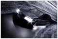
Back to the Futureby glodaComment: Pretty cool shot! The blown headlights are bothering me somewhat but not a whole lot, just would have looked better if you hadn´t left them on the whole time but turned them on just for the last second or two to keep them less exposed but other than that, this shot is ACE! Not enough for a 10 from me though but close enough, got a 9 from me. |
| Photographer found comment helpful. |
| 06/21/2006 07:08:58 AM |
Moonlight...by gipomontesantoComment: This is pretty cool, however, the bright stones at the bottom are a bit of an attention stealer, if this were an advanced editing challenge I would have darkened them to be in theme with the rocks in the backround but I still really like it as it is, don´t get me wrong. 7 from me. |
| Photographer found comment helpful. |
| 06/21/2006 07:04:33 AM |
Mississippi Queen, You Know What I Meanby pottersclay75Comment: I dunno, cropping this to a panorama doesn´t really seem to do this shot justice, it just simply lacks visual impact at this pixel size, I have a feeling this would look much better printed out in 60x30cm on somebodys wall but in this web resolution, the impact is lost... Nice shot though, don´t get me wrong. |
| Photographer found comment helpful. |
| 06/21/2006 05:05:56 AM |
|
| Photographer found comment helpful. |
| 06/14/2006 07:44:09 AM |
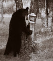
"Got Seed?"by ShutterPugComment: Haha, this shot is awesome! Love his "human" like expression, like he is severely dissapointed that there wasn´t any honey or whatever in that feeder :) Not a thing I would change about it except I may have liked a color version better, I dunno but this toning works also. |
| Photographer found comment helpful. |
| 06/14/2006 07:27:19 AM |
Cloneby KronusComment: This is a pretty cool shot, nice use of wideangle distortion, it really works here. I like everything about this image except for I would have placed the boy lower in the frame, his head closer to the top of the frame and had more space at the bottom but I like this :) |
| Photographer found comment helpful. |
| 06/14/2006 07:26:11 AM |
silk1by KronusComment: I really liked the thumbnail, was kindof dissapointed when I opened it though, like I told you earlier I am a sucker for image quality so the noise and lack of clarity in this image doesn´t really do much for me... Really like the coloring though and if this was tack sharp, no noise and otherwise exactly the same with the blurred backround I think I would have liked this heaps :) |
| Photographer found comment helpful. |
| 06/14/2006 07:24:44 AM |
Behind the scenesby smilebig4me1xComment: You know what? I actually like the outcome. I wouldn´t enter this in challenges though as this is not "dpc friendly" but I like it somewhat and I normally hate this kind of "cheap" photoshop effect trick shots. There is just something about the coloring and clarity of this image that agrees with me. Nice work! |
| Photographer found comment helpful. |
Home -
Challenges -
Community -
League -
Photos -
Cameras -
Lenses -
Learn -
Help -
Terms of Use -
Privacy -
Top ^
DPChallenge, and website content and design, Copyright © 2001-2025 Challenging Technologies, LLC.
All digital photo copyrights belong to the photographers and may not be used without permission.
Current Server Time: 08/27/2025 02:08:04 AM EDT.