| Image |
Comment |
| 07/18/2006 07:35:37 AM |
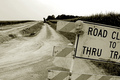
A New Road - Progress in a Small Townby JeniYComment: I am not really fond of the clipping of the road sign, I think I would have liked this image better if all of it had been in the frame and you had used the road more diagonally to draw the eye in towatds it. In short, I think you could have composed this better. |
 Photographer found comment helpful. Photographer found comment helpful. |
| 07/18/2006 07:34:32 AM |
Progress-- The Sky is the limitby prenticeComment: No offense here but I feel that the only thing linking this image to the challenge topic is the title, I just don´t see it. At least if you had a sky as the backround or something like that it would fit better. Still didn´t really vote as DNMC, just wanted to point out how I see this image. |
| Photographer found comment helpful. |
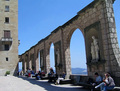
| 07/18/2006 05:48:52 AM |
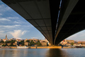
Overwhelming Sunsetby chipucComment: Not bad but compared to the recent archictecture winner this doesn´t just measure up. The composition just doesn´t work as well here in leading they eye throught the frame, here it just seems to me like the bridge is in the way and I want it out of there so I can enjoy a lovely view of what I assume is your city. Like I said though, not a bad shot at all, above average and I gave it a 6.
 |
| Photographer found comment helpful. |
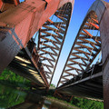
| 07/18/2006 05:46:20 AM |
Lines of Converganceby FalcComment: Nice work, love the look of the image, the color composition and the actual composition, well framed. Only nitpick is I wish the sky were just a hint darker, but that´s hard with basic editing so I didn´t deduct any points. 8 from me, I really like this shot. |
| Photographer found comment helpful. |
| 07/18/2006 05:45:06 AM |
Caribbean Sundayby LenaComment: Nice, love the composition here, works nicely. Great moment too, must be taken during a fun family summer vactation. 7 from me. |
| Photographer found comment helpful. |
| 07/18/2006 05:33:57 AM |
|
| Photographer found comment helpful. |
| 07/18/2006 05:32:49 AM |
Blessed Windows of the Worldby jah_luvComment: I would have voted this shot higher if it had better image quality, photo seems a bit soft and muddy along with bad artefacting in the sky, wish it was crystal clear and sharp. |
| Photographer found comment helpful. |
| 07/18/2006 05:31:52 AM |
Twin Bridges, est. 1959by CVetteComment: Nshapiro? Just recognize this bridge from an earlier photo by you if it is indeed you. If it is, not as fond of the composition here, a bit cramped and would have preferred this shot if you had included the tops of the bridges. A nice shot though, gave it a 6. |
| Photographer found comment helpful. |
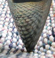
| 07/18/2006 05:30:29 AM |
Depth of Focus ... A New Perspectiveby geekssweetComment: I voted this a 3 and I make a habit out of explaining why when I vote so low. Image quality is the main factor here, the CA (purple fringing) and softness in this photo+blown highlights are the main reason why I voted so low. Also I am not a fan of abstract shots and generally dislike them, so that may also be a reason. And yes, I am not voting in abstract food, I would never do that to myself :P |
| Photographer found comment helpful. |
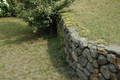
| 07/18/2006 05:28:31 AM |
Simple perspectiveby lahernComment: I gave this a 4, mainly cause the subject doesn´t interest me, frankly my first thougth when seeing this image is that it´s a photo of nothing really. Not trying to offend, just wanted to explain how I see this particular photograph, nothing more and technically it´s good, well exposed and sharp, in focus. |
| Photographer found comment helpful. |
Home -
Challenges -
Community -
League -
Photos -
Cameras -
Lenses -
Learn -
Help -
Terms of Use -
Privacy -
Top ^
DPChallenge, and website content and design, Copyright © 2001-2025 Challenging Technologies, LLC.
All digital photo copyrights belong to the photographers and may not be used without permission.
Current Server Time: 08/26/2025 03:58:26 PM EDT.