| Image |
Comment |
| 04/24/2007 08:39:45 AM |
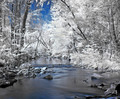
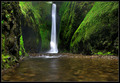
Land of Escapeby yondermanComment: Mark, this yours? Like the IR look anyway whoever took this shot. Slightly darkening the white leaves though would have sat better with me as I feel they are kindof drawing the attention away from the stream too much. |
 Photographer found comment helpful. Photographer found comment helpful. |
| 04/24/2007 08:38:05 AM |
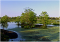
Florida Wetlandsby JuliBocComment: Sorry but the image quality is not up to par, the fuzzy/blurry look of it doesn´t appeal to me, shame as it looked promising as a thumbnail. |
| Photographer found comment helpful. |
| 04/24/2007 08:35:39 AM |
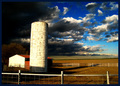
Brace Yourselves...by hoorelComment: Sorry but the dramatic post processing is just a bit over the top for my taste, keep in mind that I REALLY like strong contrast images (just look at my portfolio) that this is even too much for me. Had you toned it down a notch and darkened the house a bit and lightened the clouds in the upper left, I would have voted much higher, as it is this image got a 5 frome as I neither dislike or like it. |
| Photographer found comment helpful. |
| 04/24/2007 08:32:47 AM |
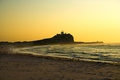
Solititudeby TajhadComment: Pretty good, centered composition works pretty well here. |
| Photographer found comment helpful. |
| 04/24/2007 08:27:11 AM |
To dream of home...is to dream of green.by DrAchooComment: Pretty good shot, something sticking out of the water would have made it even stronger though, was there no way to get closer and use those stones that are visible to the left in the stream as foreground? |
| Photographer found comment helpful. |
| 04/24/2007 08:25:13 AM |
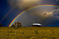
Under the Rainbowby BrianRComment: Very nice shot :) If you did add that bird in expert editing I think you went over the top and I think you did, the size/scale of it looks wrong somehow but I´ll give you the benefit of the doubt and assume it was there all along. 7 from me. |
| Photographer found comment helpful. |
| 04/24/2007 08:22:53 AM |
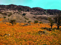
A Day Outby sarberComment: To me it looks like you went a little overboard with the saturation slider in photoshop? Anyway, looks too oversaturated to me and that cyan tone to the sky just doesn´t sit right with me, I want dark or ligth blue :) |
| Photographer found comment helpful. |
| 04/24/2007 08:17:11 AM |
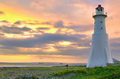
Heatby dmaddenComment: Nice but I personally would have wanted to see this slightly darker, like a 1/3 or 1/2 stop as I think it would have appealed more to me like that. Also take better care when processing next time, there is some very distinct halo around the are where the land meets the water. |
| Photographer found comment helpful. |
| 04/24/2007 08:16:01 AM |
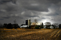
A Country Sceneby IvoryComment: A bit over the top dramatically wise for my taste but other than that pretty good. |
| Photographer found comment helpful. |
| 04/24/2007 08:14:48 AM |
Into the Westby illoosi0nComment: This is very nice, I really like the composition. However, take better care when you save it next time cause it will help you score better, this image is only 20kb and you are allowed 200kb so chose better quality next time, there is some really bad artefacting going on around the bridge. |
| Photographer found comment helpful. |
Home -
Challenges -
Community -
League -
Photos -
Cameras -
Lenses -
Learn -
Help -
Terms of Use -
Privacy -
Top ^
DPChallenge, and website content and design, Copyright © 2001-2025 Challenging Technologies, LLC.
All digital photo copyrights belong to the photographers and may not be used without permission.
Current Server Time: 08/21/2025 06:03:55 AM EDT.