| Image |
Comment |
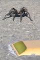
| 09/19/2005 01:55:57 PM |
The Other Sideby GeneralEComment: I'm guessing the "destination" is the other side of the road? The lighting is a bit harsh and the reflector takes away from the image more than it adds (too blurry). Granted it adds interest to the image, otherwise you just have a picture of a spider on a road. I think this could be better with different cropping and/or composition to show more of the road in front of the spider. Maybe a lower viewpoint more on the level of the spider. |
 Photographer found comment helpful. Photographer found comment helpful. |
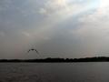
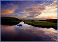
| 09/19/2005 01:52:04 PM |
My Grandma and Grandpa used to bring me here..by tolovemoonComment: Great potential, but the colors seem a bit bland. The bird, horizon, and foreground are all out of focus and the bottom half of the image seems awfully dark. I really like the ray of sunlight shining through the clouds and it does help draw your eye to the bird, but with such an out of focus image, it kind of leaves the viewer hanging. Potentially a good image. |
| Photographer found comment helpful. |
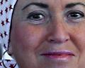
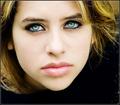
| 09/19/2005 01:43:15 PM |
The Winding Road To Cancer-Freeby lshlesComment: OK, it took me a second... I'm assuming the wrap is to cover the effects of chemotherapy? I like the statement you're trying to make, but feel the execution is somewhat lacking. The picture itself comes off more as a portrait and doesn't really say much in the way of a "destination". If I hadn't read your title I would be totally clueless. Maybe another version emphasizing the bandana would help or you could totally blow us away and lose the bandana completely to really get your point across. I understand the hesitation to do that (I've had several in my family go through chemotherapy), but the result would be VERY powerful. |
| Photographer found comment helpful. |
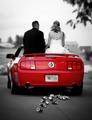
| 09/19/2005 01:37:54 PM |
With Passion in Our Heartsby SonifoComment: Nice selective desat. The image is very crisp and fits the challenge very well. The blurred license plate is distracting and I can't help but wonder if there was a better way to shoot this and not give away the license plate. |
| Photographer found comment helpful. |
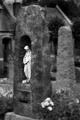
| 09/19/2005 01:34:12 PM |
Into Her armsby RefwhettComment: Good image. The contrast is good and I like your choice of black and white. I would like to see the cropping to include more space "in front" of the statue and less "behind" it. |
| Photographer found comment helpful. |
| 09/19/2005 09:04:57 AM |
|
| Photographer found comment helpful. |
| 09/18/2005 10:54:17 PM |
By any other nameby conglettComment: ** Critique Club **
First impression: I love the clarity of this image. It's very sharp and clean. The lighting on the rose also helps to bring out it's texture and color while reflecting perfectly in the dew drops.
I think the previous comments pretty well hit the nail on the head. The contrast is OK, but the cropping could be a bit better. The white object in the background competes with the rose IMHO. I've sat on this image for a few days trying to think of a better critique, but honestly I don't see much to critique about it. It's a great capture and other than the couple of things pointed out in previous comments, I see nothing wrong with it.
Good job!!! |
| Photographer found comment helpful. |
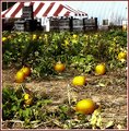
| 09/16/2005 11:26:12 AM |
pumpkinpatch2b.jpgby trobergeComment: I'm honestly not too crazy about it.
Compositionally I don't like the tent, crates, and building in the background. They make the overall image too busy IMHO. The image composition would be better if the building "stuffs" were cropped out.
The image itself appears overprocessed, smudgy, blurry, something I can't quite put my finger on. It's just simply not very clear. I like the glow on the individual pumpkins, but the lack of clarity detracts too much. Did you use NeatImage?
I would like to see the original. I think there may be something to work with here. I like the use of complimentary colors (green and yellow/orange) in the pumpkin patch and feel like there is much more potential in this image. |
| Photographer found comment helpful. |
| 09/12/2005 06:39:21 AM |
|
| Photographer found comment helpful. |
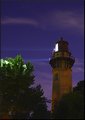
| 09/09/2005 07:32:57 AM |
Nightlightby RulerZigzagComment: Great color and composition! I really like this image. The only thing I would change would be the hot spots in the tree tops. Possibly burning these areas or maybe even cloning them out. Slight hue adjustments could also bring out more purple tones and give the image more "punch". |
| Photographer found comment helpful. |
Home -
Challenges -
Community -
League -
Photos -
Cameras -
Lenses -
Learn -
Help -
Terms of Use -
Privacy -
Top ^
DPChallenge, and website content and design, Copyright © 2001-2025 Challenging Technologies, LLC.
All digital photo copyrights belong to the photographers and may not be used without permission.
Current Server Time: 06/19/2025 07:54:54 AM EDT.