| Image |
Comment |
| 09/30/2005 10:22:03 AM |
|
 Photographer found comment helpful. Photographer found comment helpful. |
| 09/28/2005 01:58:41 PM |
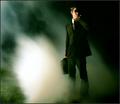
Men In Black Agent by Joey LawrenceComment: **Critique Club**
Initial Impression: I'm not qualified to critique this shot.
Detailed analysis: Joey, you have to know this is a spectacular shot and a well deserved ribbon. Your talent stretches well above and beyond my own and I'm twice your age! Your comments just further prove your creativity and ability to make the most of a situation.
Since this is supposed to be a critique, I'll give it my best shot... here goes.
The composition is spot on and I love the dramatic lighting. Your light position helps draw attention to the fog and casts very strong shadows on your profile to give a very dark and mysterious feel. There were comments on the patch of green grass, but personally I like it. It adds to the MIB realism... On a surreal, mysterious case in a very real environment. The polka dots on the tie don't exactly fit, but it's a detail that becomes lost in the otherwise flawless execution.
Overall Impression: Excellent shot, well thought out and executed. Well deserved ribbon!
I normally end my critiques here, but I wanted to add a side note in your case. When I first became more active in DPC, there was much talk about this young prodigy with a very "grunge" look. After a while your "style" became very obvious and I also noticed that many were trying to mimic the style. It's nice to see that lately you seem to have evolved to shoot images that are "outside" of your proverbial box. This image, although dark, contains none of the trademark "Joey grunge" and your destinations ribbon winner is incredibly colorful. I'm not sure if this is the beginning of some type of transition in your life, but it is very refreshing to see you evolve and develop as a very talented artist. As you continue to develop and grow as a photographer and videographer, I wish you great success.
-Lee |
| Photographer found comment helpful. |
| 09/27/2005 01:38:12 PM |
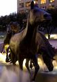
you might wanna moveby nomad469Comment: **Critique Club**
Initial Impression: Wow! That's an "in your face" shot if I've ever seen one!
Detailed analysis: The lighting is great and I love the misty fog. I'm assuming this was some type of fountain and a long exposure. If that's the case, great job! The perspective is very good and provides the statue a very strong sense of presence. I agree with the comments on the building in the background, but I honestly don't see how you could have avoided it and still achieved the same effect. The title is perfect for the image and really helps punctuate the effect of the image.
Overall Impression: Great shot. Very surreal and powerful.
Good job!
-Lee |
| Photographer found comment helpful. |
| 09/22/2005 01:49:15 PM |
A small slice of heavenby jmritzComment: OK, I had to flip it to be sure. Good reflection image. I'm sorry, but it doesn't really feel like a "destination" image to me, and that's only because it's a reflection. Perhaps the same image (not reflected) would have more appeal for me on a personal level. |
| Photographer found comment helpful. |
| 09/22/2005 01:45:30 PM |
Somewhereby myceliumComment: I like the sepia tones, but the model looks way too posed. His skin tones look a tad offish (too light). The placement of the guitar case seems unnatural. |
| Photographer found comment helpful. |
| 09/22/2005 01:43:25 PM |
Destination: Skyby Nikolai1024Comment: Very crisp image. I really like this one a lot. My only nitpicks are the very tip of the left wing is cropped off. It also seems like the light is coming from in front of the swan. Maybe a golden yellow hue would give it a warmer look. |
| Photographer found comment helpful. |
| 09/22/2005 01:40:02 PM |
...unknownby arlanbartComment: Nice crisp image and good composition, but to me it lacks interest. |
| Photographer found comment helpful. |
| 09/22/2005 01:38:57 PM |
A Peaceful New Worldby BrianRComment: I like the way you've framed the moon, but I'm undecided on how much. Maybe if the framing was a little darker, it wouldn't be competing with your main focus so much. |
| Photographer found comment helpful. |
| 09/22/2005 01:37:21 PM |
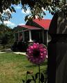
A home to call my ownby smilebig4me1xComment: If it wasn't for the flower in the foreground, this would look very much like a regular snapshot. The flower adds a much needed element of interest. I just wish the lighting was a little better on the flower. |
| Photographer found comment helpful. |
| 09/22/2005 01:35:56 PM |
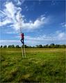
Upby Joey LawrenceComment: Great illusion and I love the colors. The subject seems a little small and a little too centered on the horizontal. I would like to see less foreground since it really does nothing to contribute to the overall image and perhaps a slightly tighter crop. I wouldn't take anything off the top though. |
| Photographer found comment helpful. |
Home -
Challenges -
Community -
League -
Photos -
Cameras -
Lenses -
Learn -
Help -
Terms of Use -
Privacy -
Top ^
DPChallenge, and website content and design, Copyright © 2001-2025 Challenging Technologies, LLC.
All digital photo copyrights belong to the photographers and may not be used without permission.
Current Server Time: 06/19/2025 02:10:22 PM EDT.