| Image |
Comment |
| 04/30/2006 05:49:46 PM |
|
 Photographer found comment helpful. Photographer found comment helpful. |
| 04/30/2006 05:49:15 PM |
|
| Photographer found comment helpful. |
| 04/30/2006 05:48:49 PM |
|
| Photographer found comment helpful. |
| 04/30/2006 05:48:16 PM |
|
| Photographer found comment helpful. |
| 04/30/2006 05:47:05 PM |
Impactby messerschmittComment: oooo i liek this one, its crisp and i get a kind of eary feeling... Nice
7 |
| Photographer found comment helpful. |
| 04/15/2006 11:11:08 PM |
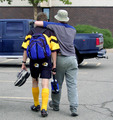
Brothersby pmichaudComment: Hola from the critique club.. :)
ok, im gonna start off by telling you this is a good image for something taken in 2002. When one enters a challenge such as best of 2002 one must consider the caliber of person he is going up against. Many of the people on dpc are professional's, this considered many of them probably had dSLR's in 2002.
Now to the image. Not to be artsy and critical but composition lacks, mainly because you didnt follow the rule of thirds, i know this is a snapshot but that would have boosted your score i little. I also think that you could have eddited this a little bit more in order to make the subject 'pop' more. i say this because in order for the photograph to be succesfull it must possess a main subject, in this photograph the lighting was flat, causing everything to look the same.
I understand that this is just a snapshot, and that you weren't really taking into acount the rule of thirds and the lighting and such, but in order to score well here, you have to do that, even if it is just a snapshot.
if you have any comments or questions please feel free to PM me. :)
hope i helped,
-Dan |
| Photographer found comment helpful. |
| 01/21/2006 07:00:46 PM |
Hot Pinkby mystical_princessComment: Hi From the Critique Club :)
Before i start i would just like to say that everything said here is not meant to be offensive or cold-hearted.
To start off with right off the bat i noticed the background and the hat were similar colors. Although one is purple and one i bright pink, the topic was burst of color. Maybe if you had a black background, or if you had her outside and you did some selective desat.
Overall the camera work in this photo was good. I'm guessing that you used an on camera flash, otherwise the shadow behind your daughter wouldn't be so harsh. Other than that the depth of feild was good, and the exposure was good. I can't help but wonder though weather running this shot through neat image would help soften the light on her face.
I think what really brought this image down was the fact that it looks like a snapshot. Although in some challenges this could be a plus, in this challenge because its a members challenge you really have to respect the calliber of photographer that you are up against, they will have profesional lighting systems and off camera flahses. I try to replicate this even though i dont have fancy stuff like that.
I hope that i helped a little bit. And if you have any comments or questions PM me.
-Dan Gruskin |
| Photographer found comment helpful. |
| 01/10/2006 04:17:41 PM |
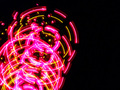
spining lightsby polkopComment: Hi from the critique club :)
Before i start nothing that is said here is meant to be offensive. Ok first off, spelling mistakes in the title are a big no no, because unless you are using the title as a play on words a mispelling is going to bring you down.
Technically this image is not very interesting. In order to do well in a chellenge on this site you must have something interesting that really grabs someones attention. The exposure seems to be correct because the lights are not blown out.
Overall i think what really brought this image down was the fact that it was not eye catching. It just seems like a run of the mill shot.
Keep up the good work, and keep learning from all those around you!!
If you have any questions or comments just PM me,
-Dan Gruskin |
| Photographer found comment helpful. |
| 01/08/2006 06:45:22 PM |
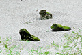
Zen Gardenby talmyComment: Hi from the critique club :)
At first when i saw this image i thought that the greens were very blown out and that the pattern did not seem like the main point of this picture. Upon further inspection my initial feelings were correct for this image.
Although the green moss and the bamboo leaves (I believe thats what they are) add to the photo nicely, when you increase the saturation of a certain color too much it becomes to look too saturated, and thus attains a fake look. Also another thing to realize is that when you reduce a color from a photograph (in this case yellow) you a re decreasing the color from the whole photo not just the part you want to unless your using selective desaturation. I say this because it is a common mistake not to realize where certain colors are and how they affect the picture. Before i do any desaturation of colors i bring the saturation of that color all of the way up just so I can see where that color is located and what areas it will affect when i do the desaturation. I think this affected the photo for me because of the pebbles seeming almost a non-real color. Also the bamboo leaves have yellow in them too and the desaturation affected them aswell.
As i said before in this photo the pattern in the pebbles does not seem like the main point in this picture. When i see this picture i see the rocks as the main focus. I think that this is also one of the reasons why this photo got voted down.
This critique is not meant to discourage you in any way, and keep up the good work. If you have any questions or comments don't hesitate to contact me via e-mail or private messaging.
-Dan Gruskin |
| Photographer found comment helpful. |
| 01/07/2006 11:46:51 PM |
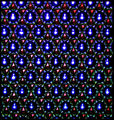
Patterns within patterns: Stars and Lightsby AlanBesComment: Hi from the critique club :)
Okay, my first impression of this shot was that it fit the challenge well, some of the spots were blown out a bit, and it was a tad crooked. Upon further inspection and after reading your comments about how you edited this picture in photoshop, i have concluded the following.
It seems like although you took a shot that fit the challenge very nicely, there is nothing in this photograph that really grabs my attention, a focal point. This is an important aspect of any photograph, without a main point why take the photo. I'm also wondering if you experimented with different white balances and exposures. I say this because unless the light source was above the pattern the blown out patches of blue seem a bit over exposed. Maybe a little less contrast in photoshop could cure this.
I hope that I helped and if you have any questions PM me,
-Dan Gruskin |
| Photographer found comment helpful. |
Home -
Challenges -
Community -
League -
Photos -
Cameras -
Lenses -
Learn -
Help -
Terms of Use -
Privacy -
Top ^
DPChallenge, and website content and design, Copyright © 2001-2025 Challenging Technologies, LLC.
All digital photo copyrights belong to the photographers and may not be used without permission.
Current Server Time: 08/01/2025 02:33:56 PM EDT.