| Image |
Comment |
| 04/13/2005 02:57:46 AM |
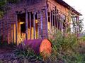
Last Lightby BudComment: Nice shot. The soft colors are very nice. Pretty good composition too, although I think maybe more sky could have been put in, but then again the sky doesn't look too great in this shot.
Also, there seems to be a lack of focus (as in actual focus by the camera, not a subject focus). Still a nice shot. |
 Photographer found comment helpful. Photographer found comment helpful. |
| 04/13/2005 02:56:35 AM |
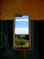
A poor subjectby j3zzComment: Well, that's interesting. I'm almost not sure what I'm looking at. Hah hah.
The colors are nice, and the subject is very interesting... It looks flat and 3D at the same time. |
| Photographer found comment helpful. |
| 04/13/2005 02:54:56 AM |
Forgotten Viewby LynnSComment: This is simply amazing. I've only viewed a few, but this is the best shot so far in the abandon buildings contest. I love the contrast here. The colors are great. The composition is simple, but technically the subject has been placed all around the image with the background in the middle.
The middle does seem to draw a lot of attention, but there's a few things on the outside surrounding wall that bring the eye out.
Nice shot. |
| Photographer found comment helpful. |
| 04/13/2005 02:53:16 AM |
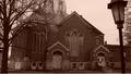
Abandoned Faithby ladyhawk22Comment: I like the composition with the tree on the left and lamp on the right, but I hate how the top of the building is cut off... Also, the sky is a bit blank and could use some life. Nice subject matter though. It looks like an interesting building to photograph. |
| Photographer found comment helpful. |
| 04/13/2005 02:52:08 AM |
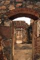
Old fort from 1897by angiedlComment: Nice textures and repition in this shot, but the camera base doesn't seem to be parallel with the ground, giving the shot an annoying tilt. Could just be the lean of the ruined buildings.
The shot could also use more contrast in color. I think a deeper blue of a sky would have helped bring in some contrast. |
| Photographer found comment helpful. |
| 04/13/2005 02:48:35 AM |
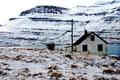
my childhood homeby biggisComment: It's a very nice setting and I like the composition, but even though it's a winter scene of an abandon building I somehow have to say the image is too lifeless. The sky is burned out, and the mountains have very little contrast to them. I think if shot at a different time of day this could have been a great photo. |
| Photographer found comment helpful. |
| 10/15/2004 02:01:58 AM |
|
| Photographer found comment helpful. |
| 10/15/2004 01:58:45 AM |
* * *by MrYuComment: Is the background a car? Whatever it is, the colors are nice and really help make the finger stand out (cool colors stay in the back, warm colors come up front). |
| Photographer found comment helpful. |
| 10/15/2004 01:57:48 AM |
Back to basicsby kosmikkreeperComment: The coloring is really nice, and I love the lighting here. The idea is great, and communicated excellently in the photo. I'd say the only thing really missing is a split-dress on the model with a more modern look on his left and an older look on his right. |
| Photographer found comment helpful. |
Home -
Challenges -
Community -
League -
Photos -
Cameras -
Lenses -
Learn -
Help -
Terms of Use -
Privacy -
Top ^
DPChallenge, and website content and design, Copyright © 2001-2025 Challenging Technologies, LLC.
All digital photo copyrights belong to the photographers and may not be used without permission.
Current Server Time: 08/01/2025 02:19:36 AM EDT.