|
|
|
Showing 961 - 970 of ~2853 |
| Image |
Comment |
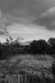
| 07/12/2015 02:09:08 PM | Waiting for the Lightby Dr.ConfuserComment: *Hello from Sid and the Critique Club*
This is a good example of how important the title is to an image.
I like your composition, making full use of the available frame by placing your main subject at the bottom you have managed to show us most of the landscape they are waiting to photograph. This does of course meet the challenge of procrastination well.
I can understand why you've chosen a large aperture to draw the viewers attention to your two relatives leaving the landscape in soft focus. However, the lack of detail somehow feels a little unsettling because to me, it feels as though this lack of detail is due to the ISO which given your camera is probably not the case.
With regard to your daughter and son-in-law I wish I could see both their faces and some interaction between them but they and the camera just don't feel as much a part of the whole scene as they should. I think a little touch that would have helped would have been to have the scene displayed on the cameras monitor too. The reds of their clothes really helps them stand out against the predominantly green landscape.
A fairly irrelevant observation is the voting pattern, the first time I've ever seen an image with such regularity, its a shame it didn't score higher and receive more comments. I find myself wanting to like it more than I actually do but also struggling to offer more constructive comments than I have, sorry.
Happy shooting Sid |  Photographer found comment helpful. Photographer found comment helpful. |
| 07/10/2015 04:32:26 PM | Thy Landscapes Shall Have Color And They Shall Be Wider Than They Are Tallby posthumousComment: *Hello from the Critique Club*
...and they shall not go anywhere near the rule of thirds or have any strong focal point!
I like your tongue-in-cheek title and approach to the challenge which is determined to break all the rules as we know them and too often slavishly follow. I'm all for breaking the rules whenever I can but in doing so we want to show that there is good reason for doing so with the end result.
Without the title, I would look at your image and fail to lock on to a focal point, the sapling on the left and the roof probably have the greatest potential but are unfortunately too insignificant. The horizon is very central too and the lighting fails to enhance any particular features within the scene.
Personally I have no problem with mono, I absolutely love it, but mono is always best done in post-processing where you can enhance those features that will benefit the image as a whole rather than let the camera's, neutral and often rather boring, mono facility decide what tones lie where. In post-processing that sky could have really been enhanced very well to bring out more of a 'storm brewing' feel to it, there is some lovely contrast potential there that the camera has simply ignored.
If the bird you cloned out was very small and insignificant then it was probably best to remove it but had it been large enough then perhaps it could have given us a focal point to lock on to?
In terms of composition, I think if you had made the reeds a foreground feature by moving closer to them and lowered the foreground so that you could emphasise that quite gorgeous sky with the upper two thirds of the frame you would have significantly improved the end result. But given your title all this is probably irrelevant because I think you have deliberately chosen to go against all the 'rules'. Anyway I'm sure you had lots of fun and thats what it should all be about � keep at it. | | Photographer found comment helpful. |
| 07/10/2015 02:47:57 PM | mumby H-GComment: *Hello from the Critique Club*
A very appealing portrait but the first thing that hit me was the background.
I like your composition the way you have positioned your mum off-centre sideways on looking over her shoulder. She has a lovely appealing look that you have managed to capture in a sort of candid unexpected way which really adds to its overall impact.
I see from your comments received that the background has caused mixed reactions. Unfortunately for me it dominates in an intrusive sort of way that is effectively competing for my attention and drawing me away from your mum. It is very soft and enables you to isolate your subject but for me it is just too soft. I'm thinking its a floral arch? If so, I think there is a strong argument to use a smaller aperture to bring more detail out of the background showing us that your mum is in a lovely floral setting. As it is, it is so soft that the background confuses and distracts but as you can see, for others it appeals.
| | Photographer found comment helpful. |
| 07/09/2015 01:33:28 PM | Midsummer's Visitorby ZitaComment: *Hello from the Critique Club*
Wow, was my initial reaction! A very creative image, that pushes boundaries. From the technical data this appears to have been deliberate camera movement during exposure as opposed to a very windy day.
I have to own up to the fact that I am greatly attracted to motion blur and especially anything that creatively approaches a standard subject in a different engaging way, so your image has instant appeal for me.
I like the colours especially the splash of yellow that breaks up the patterns here.
Having said all that there are a couple of things about the image that I feel could have been improved. The all important yellow splash is too central. The left of the image is rather weak in that the foliage is less dense and showing elements of the background whereas the right does not. I think you could greatly improve the image's impact by cropping the left of the image out thus moving the yellow further to the left and on to the thirds.
In respect of the challenge I do feel the hues are just a little on the vivid side and would have benefited from a reduction in saturation towards a more pastel effect. I think this together with your chosen technique probably accounts for a lower than deserved score but top marks from me for your approach and bravery, keep at it. | | Photographer found comment helpful. |
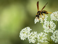
| 07/08/2015 01:29:03 PM | Yellow Hornetby clickodakComment: *Hello from the Critique Club*
First impressions, great close up that has impact.
Isn't it wonderful when mother nature puts stuff in your way just when you want it, it doesn't happen very often but you've seized the opportunity well and used it to good advantage here. Your focus is spot on, sharp on the eye which is so important with any study be it portrait, statue or as here, insect.
Technically, I think there was plenty of scope to use a smaller aperture to sharpen up the wings and thorax but perhaps this was not your desire. At f8 you would only have needed ISO 400, and f11 would still only have been ISO 800 which is easily handled by your camera. As the background is in such soft focus I think this would have given you the DOF needed to get all of the insect sharp without the background becoming too obtrusive, but as I said before, this may not have been what you wanted.
With regard to the challenge you have placed it nicely on the most obvious hotspot which works really well. I also like that you have placed the branching stem in the lower right corner which gives a solid base to the additional flower heads.
The only minor criticism is the OOF dark centre to the soft focus flower below the one on which the insect is, it looks like another insect. Once spotted it is conspicuous enough to detract from the main subject, I think it would improve the image if it was dealt with by cloning or dodging to subdue it.
Overall it is a very competent shot that meets the challenge well and deserving of the respectable score it received. | | Photographer found comment helpful. |
| 07/08/2015 01:08:30 PM | L I F E S T A T I O N • 4 1 1by Ja-9Comment: *Hello from the Critique Club*
The first thing that hits me here is the beautiful sky and the beach reflections.
That sky has such an impact it truly dominates the image, I love the blues, the whites and all the hues in between and the tremendous cloud shapes its all gorgeous. I'm very pleased to see the horizon is level! I like the additional splashes of colour given by the red of the lifestation and his flag and brolly. I am not so keen on the yellow ball and the yellow bin in particular, I find it a little distracting and would probably have cloned them out.
The large DOF gives a feel for the vast open space of the beach
What bothers me most is the composition, you've obviously made a conscious decision to include the foreground family which also draws in some quite ugly buildings in the background, neither of which, in my opinion, add to the image. To me they detract and would be better cropped out, this would then leave me with the lifestation dominating the foreground, as it should, with rest of the people being dominated by him. I think it would also have improved the end result if you had timed the shot with him looking more towards the subjects in the sea.
Overall, a fine shot which generally works well | | Photographer found comment helpful. |
| 07/08/2015 12:43:18 PM | Grace.by romilComment: *Hello from the Critique Club*
What a lovely portrait, it has instant impact.
The very shallow DOF and accurate focus on the near eye against the dark background all work very well together, nicely broken up by the splash of colour from the scarf. With regard to the scarf I personally would have liked it to be a little lower enabling me to see her mouth too, I think it could have made a stunning portrait into a sensuously appealing one too, though you could and probably would argue that hiding her mouth adds a sense of mystery.
Technically the lighting is gentle with no harsh shadows though the scarf is darkening her face in an ever so slightly moustache-like way indicating that the lighting is from below. Its a good exposure, there is good detail in both shadow and highlight areas.
In respect of the challenge her eye is nicely placed on the right vertical, you might have considered placing it a little higher on the hotspot which may have improved it overall but that would have involved some cropping to her forehead.
I hope Grace was well pleased with your image, I and the voters were! | | Photographer found comment helpful. |
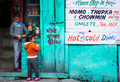
| 07/08/2015 12:24:50 PM | The Salesman.by romilComment: *Hello from the Critique Club*
The first thing that hits me with this image is the coloured wall, followed by the menu then the children.
A great slice of everyday life in a downtown suburb of the East, in this case India, if it weren't for the lovely local script this could be anywhere except that Momo etc are not readily available in my local vicinity!
I like the candid nature of the shot the children appear to be unaware of the camera and therefore naturally involved in their own moment. The colours are all very strong, I also like the way the colours from the writing are repeated in the children's clothes. I love the child's too big pink shoes!
I don't know if you've enhanced the children's faces but they stand out from their surroundings in a natural appealing sort of way. The only minor criticism of the children is that the action he is making with the scissors being so close to the back of the child's head make it look as though he is cutting her hair.
Altogether an appealing and natural moment in time well captured, reflected in the votes it received.
| | Photographer found comment helpful. |
| 07/08/2015 12:01:07 PM | Sunday Rideby PretzelComment: *Hello from the Critique Club*
I am an avid cycling fan, at present thoroughly immersed in the Tour, so am instinctively drawn to the subject. I love the patterns of the bricks and the window grill but I am not so happy with what should for me be the best part of the image, the cyclist.
My biggest problem with the cyclist may sound contrary to the often sought photographic goal of sharpness but because of the high shutter speed/sharpness he looks as though he's doing a good balancing act. I would have much preferred to have some blurring in the spokes at least to indicate movement, this is just too static for me.
In respect of the challenge, I'm not sure how many voters would have seen your idea of his helmet lining up with the edge of the window as an effective use of the RoT. With a 24-35mm lens you would have probably been able to make better use of the RoT with the window and the cyclist and positioned him moving into as opposed to out of the shot. As it is with the 50mm had you positioned the window further to the right I think you may have improved the end result somewhat. I agree rules are there to be broken and I am always keen to do so but I'm not sure it works too well here especially in respect of the challenge itself.
I hope you don't feel I have been too harsh but this is meant to be an honest reflection on how the image appears to me. | | Photographer found comment helpful. |
| 07/08/2015 08:20:37 AM | t e m p t a t i o n by Ja-9Comment: *Hello from the Critique Club*
Your image has an immediate and strong visual impact. The dark background helps the flower stand out giving it punch.
I like your choice of aperture for a sufficiently deep DOF to enable some detail in the heart of the flower and yet soften the edges of the petals in the foreground. Like your commenters, the image feels somewhat under-appreciated in terms of votes but perhaps this may be because of that very DOF. It could be argued that a sharper edge to the foreground petals would have added to its impact against the dark background. Using the same aperture and bringing the focus point nearer the front would also have softened the dark centre of the flower where there is little detail anyway. It is an alternative approach that may or may not appeal to you but I hope it may help you to understand that there may have been those who do prefer that approach and consequently marked it down as a result, though the 1s, 2s and 3s do seem severe and unjustified.
I like the soft focus areas of the stalk and leaves and their diagonal, the composition does of course make full use of the RoT and the most beneficial one of the hotspots. The only real criticism I can constructively offer is the bright highlight where the stalk and leaves meet, I feel this would benefit from being toned down and made less obvious. Also the colour saturation whilst it makes it very vivid also feels just a touch on the heavy side leaving it somewhat lacking in subtlety.
All in all, I think it is a very competent attempt that meets the challenge well. | | Photographer found comment helpful. |
|
Showing 961 - 970 of ~2853 |
Home -
Challenges -
Community -
League -
Photos -
Cameras -
Lenses -
Learn -
Help -
Terms of Use -
Privacy -
Top ^
DPChallenge, and website content and design, Copyright © 2001-2025 Challenging Technologies, LLC.
All digital photo copyrights belong to the photographers and may not be used without permission.
Current Server Time: 06/23/2025 10:43:09 PM EDT.
|