|
|
|
Showing 881 - 890 of ~2853 |
| Image |
Comment |
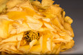
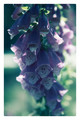
| 08/09/2015 07:34:24 AM | slow deathby GilesComment: *Hello from Sid and the Critique Club*
A flower study that partially meets the challenge.
Your commendable attempt to portray death meets the challenge in as much as the decay of the dying flower head itself conveys a feeling of the final stages of the flower's life. However, completely counter to that is the effect that the lighting is having on the front petals, it has rejuvenated and breathed a new life into them making them look much fresher than is desirable for your purposes.
I think you would have been a lot more successful to have done this in its natural environment with natural light only, perhaps using reflectors if needed. In situ this would have probably given you opportunity to repeat the theme with other decaying debris in soft focus and thus convey the feeling much more successfully. Equally, where this also fails is that the focus is on those front parts of the flower where it looks freshest, I think if your focus had been on the most withered petals with the front in soft focus that would have moved the emphasis from the freshest to the deadest parts of the flower and may well have been a lot more successful.
I'm very pleased to see that you have received several comments offering some constructive critique, (I only ever look at the comments after making my own) much of which seems to concur with the points I have raised and offers more observation that I didn't. I hope our collective efforts help, thanks for submitting, Sid |  Photographer found comment helpful. Photographer found comment helpful. |
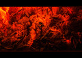
| 08/09/2015 07:08:08 AM | g l o w i n g • e m b e r sby Ja-9Comment: *Hello from Sid and the Critique Club*
An abstract that meets the challenge to some degree.
When the challenge description gives you the scope it has in defining orange as a range of colours between red and yellow not all will recognise the 'orange' qualities equally. Whilst your image has appeal it is significantly towards the red end of the definition to the extent that the smaller yellower elements in the top left stand out as being distinctly orange by comparison. If it had been me I would probably have subtly altered the hue more towards the yellow spectrum to get nearer a recognisably distinct orange through more of the image.
Having never tried to capture this sort of image I assume the long exposure enabled you to bring out more of the glow and less of the blacks because of the changing nature of the glowing embers? Bet you were nice and warm for this one!
Thanks for submitting Janine, Sid | | Photographer found comment helpful. |
| 08/09/2015 06:50:02 AM | Pomegranate Marketby dwyllieComment: *Hello from Sid and the Critique Club*
An interesting image that meets the challenge well.
When the challenge description gives you the scope it has in defining orange as a range of colours between red and yellow, some people will still see reds or yellows while others will recognise the variety of hues as you have here. To me this makes your shot more interesting in the variety of hues it conveys and the way in which you have done it in a unique and novel way. I like the comment from streetpigeon it recognises the potential the image has for different meaning beyond the basic straightforward we are pomegranates.
Your exposure is good though I wonder if perhaps you might have a little leeway for more exposure to pop the whites of the snow more without blowing the highlights on the front fruit. I like the tight crop it leaves us wondering just how much more of them there are.
I respect and admire that you had the self belief to submit your image expecting it to be 'penalised', thank you for sharing it here, Sid | | Photographer found comment helpful. |
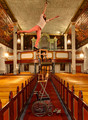
| 08/08/2015 10:07:08 AM | Stretch out.by asijComment: *Hello from Sid and the Critique Club*
Congratulations on your high placing for this highly amusing image that fulfils the challenge very well indeed.
This had me laughing my head off as I scrolled further down the image to reveal all the wobbly stack of chairs all supported by a wheelchair topped off by her wonderfully fearless but precarious posture at the top of the heap, simply wonderful. Thank you for your description, I was scratching my head to try and work out how you had done it all. On close inspection there are some anomalies but this is the sort of shot that has immediate impact and is unlikely to be studied at length such as I am now.
I think you've done such a wonderful job it wouldn't be fair to make the only minor nitpicking criticisms I have. Thank you for the entertainment, I hope your girlfriend doesn't ever have to do this for real! Sid. | | Photographer found comment helpful. |
| 08/08/2015 07:42:20 AM | s e a • s p r i t eby Ja-9Comment: *Hello from Sid and the Critique Club*
A simple image given extra quality.
As soon as this started to appear on my screen I actually uttered an ooh� it has instant appeal for me. As your commenters have stated it has a dreamy quality to it.
Your slow shutter speed and deliberate(?) movement during exposure has created a much more unique image that has an extra appeal all of its own. The vogue is so often for very long exposures turning the sea into a flat lake which, although it has its merits, has been way overdone of late, this is much more preferable. I like your composition with the child well off centre and looking in towards the rest of the frame, it works well.
There's not really anything I can add, it works for me, thanks, Sid | | Photographer found comment helpful. |
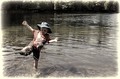
| 08/08/2015 07:31:35 AM | Before the fall...by RyanWComment: *Hello from Sid and the Critique Club*
A great shot for the family album.
A moment stopping action shot which together with your title suggests the brief calm before the subsequent splash and possible tears. I like that it is a candid moment where your son is completely oblivious to the camera.
I like the composition with your son positioned on the front third with plenty of background water and trees to convey where he is. I have to agree with posthumous I would definitely get rid of the frame edges, for me, its ruining the end result. The other big problem is the blown highlight on his arm it definitely needs pegging back some.
All in all a very pleasing shot that with the suggested alterations would be even stronger, thanks, Sid | | Photographer found comment helpful. |
| 08/08/2015 07:21:26 AM | A Lady's Gloveby ArnaMarieComment: *Hello from Sid and the Critique Club*
An appealing flower study.
A fairly straightforward flower shot that includes all of the plant detail but the lighting is such that it has created some strong contrasts causing some problems with shade and highlights. I like that you have resisted the urge to saturate as is often the case and opted for a more subtle approach, for me that works well. You have already questioned the frame yourself, from me, an emphatic no, I would have preferred it without.
Your focus is towards the top of the plant with a shallow DOF that sees the lower half fading into soft focus which is fine and works well, however, because of the shadow problem the focussed top half is least visible as opposed to the lower half.
I see you have asked for some PS feedback, for myself I always try to minimise the post processing so I am far from being an in-depth user but I will try and give you my workflow for the image. I hope you shot in RAW? The bulk of my adjustments would be in ACR (Adobe Camera Raw). I would look carefully at the histogram and start off with the auto adjustment which is sometimes sufficient on its own but if not I would tweak the sliders until I got a good even distribution of the histogram. As part of that process I would imagine I would have used some fill light to bring detail into the top half and I would have probably used recovery slider to reduce the blown highlights.
In PS my emphasis is always on getting the very best quality as opposed to fancy this that and the other filters or whatever, the danger is that you get carried away and far removed from the essential qualities within the image. I may have used hue and saturation to lightly subdue the colours a little and I may have used curves to make sure the most important parts of the image are being rendered at their best. I rarely sharpen I would prefer an unsharpened image to an over-sharpened one every day, halos are so unsightly and often ruin some otherwise brilliant images. So there we are, like I said my post processing is always minimal.
I hope this helps, thank you for your submission Arna Marie (what a lovely name), good luck, Sid | | Photographer found comment helpful. |
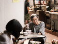
| 08/08/2015 06:53:16 AM | Retrospectionby romilComment: *Hello from Sid and the Critique Club*
An interesting candid.
Your title suggests that he is having a 'condor' moment midway through his meal and is deep in thought, to me I feel he is engaged in a conversation with the person whose hand appears in the bottom right hand corner. Because of that I feel a sense of frustration that the frame wasn't lower and further to the right to include much more of this person. Whether or not that is the case I do think it would have greatly improved your image. As one of your commenters has said we have a lot of empty space, cluttered background and a yellow notice drawing our attention away from where I really want to be. There is a strong argument for a crop excluding the girl with the man on the left of the frame but perhaps there were other things in the missing space that prevented you from framing it in this way?
Your exposure is good and the DOF is sufficient for background detail without it distracting (I'm talking about a crop just above his head), and as mentioned by your commenter nice muted colours. With the present crop the other problem I have is the bright rim of the dish which is again distracting but with the suggested crop would have been another element in the story.
Thanks for another interesting contribution Romil, Sid | | Photographer found comment helpful. |
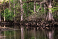
| 08/07/2015 01:03:58 PM | • n i r v a n a •by Ja-9Comment: *Hello from Sid and the Critique Club*
A nature study without a strong focal point.
This is the Orton effect again isn't it? The end result looks very similar to your image I recently critiqued for the challenge 'the Orton effect', most of my introductory remarks equally apply to this image.
I find it difficult to rest my eyes on any particular aspect of the image I am wandering around and not seeing anything that holds my attention. There is an imbalance between the right and the left, everything of any interest is to be found on the right. The general tone of the trees just doesn't look natural there seems to be a colour cast throughout.
I do like reflections and I think this may have worked better if you had concentrated on the right and more water using portrait orientation, it would probably have made it more interesting.
I'm sorry this one is just not doing it for me, Sid | | Photographer found comment helpful. |
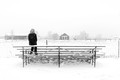
| 08/07/2015 10:21:48 AM | Reflectionby KenComment: *Hello from Sid and the Critique Club*
Congratulations on your high placing for a lovely study.
The feeling of contemplation of your lone subject in this snowbound landscape comes across very strongly which from your title is exactly your intention I presume? I like the high key effect which is broken up by the dark clothing of your model. I like the general simplicity from the foreground stand to the background structures and trees which although fairly complex is reduced to simplicity by the lighting and uniform nature of the sky.
Your exposure is spot on, you have presumably used some +EC in camera or corrected post in PS but you have captured the essence of the snow with your wonderful whites without blowing out the highlights so although you are close to the limit you have detail throughout, well done. I can see what Madman2k means about the post on the right its sort of acting as a full stop, given the nature of the image I want to continue with my imagination beyond this point, I think I agree it would probably help to crop it out.
I'm pleased for you that it was so well received here, well done, Sid | | Photographer found comment helpful. |
|
Showing 881 - 890 of ~2853 |
Home -
Challenges -
Community -
League -
Photos -
Cameras -
Lenses -
Learn -
Help -
Terms of Use -
Privacy -
Top ^
DPChallenge, and website content and design, Copyright © 2001-2025 Challenging Technologies, LLC.
All digital photo copyrights belong to the photographers and may not be used without permission.
Current Server Time: 06/23/2025 07:16:22 AM EDT.
|