|
|
|
Showing 871 - 880 of ~2853 |
| Image |
Comment |
| 08/12/2015 11:33:18 AM | Dumplings In 4 Simple Stepsby romilComment: *Hello from Sid and the Critique Club*
A well executed image that fulfils the challenge through the title.
I know I'm in the minority here but lovely as the image is, on its own it does not convey simple to me. It relies upon the viewer also taking your title into account but then in my mind the title is also an integral part of the image at least here on DPC it is so with that proviso it does meet the challenge. It's good that you have chosen to do it the way you have because if everybody entered the type of image I visualise for the challenge then there probably wouldn't be as much variety as your image has contributed.
You have received a lot of warm comments that identify the light as the key quality that gives your image that extra quality that is so lovely to see. I had a problem with the person on the extreme right but he is cleverly balanced against the hands on the left of the frame and this makes it all work well together. I like your DOF and focus point we have just the right amount of detail through the image as a whole. All in all a very effective and pleasing result in spite of my reservations.
Well done for going with your instincts, Sid |  Photographer found comment helpful. Photographer found comment helpful. |
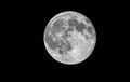
| 08/12/2015 10:58:35 AM | Simple Blue Moonby tolovemoonComment: *Hello from Sid and the Critique Club*
A straightforward moon shot that fits the challenge.
It's really a very open brief so your shot of the moon is simplicity itself, though it would require some careful consideration beforehand. I'm really surprised how much light you had it must have been a really bright moon, so bright you may even have got away without a tripod though I assume you did use one.
The detail in the moon is quite extraordinary and you have every right to be well pleased with the result, apart from all the other detail I love the craters on the right hand edge. Your mono processing is good with lovely rich blacks as a backdrop. There's nothing really to fault or to add, well done. It's a shame you didn't get any comments during the challenge but I hope this makes up for it.
Thank you for your submission, Sid. | | Photographer found comment helpful. |
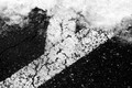
| 08/11/2015 10:17:27 AM | We started dying before the snow, and like the snow, we continued to fall.by posthumousComment: *Hello from Sid and the Critique Club*
An intriguing image needing the title too to fulfil the challenge brief.
Given the nature of the challenge the title is as much a part of the viewers interpretation and therefore the end result as the image itself. I like the high contrast mono treatment you have given the image, I like the gritty irregular surface of both the road and the snow it works well together. I like the diagonal of the composition.
I can see the relevance of the snow in your image but I am struggling to see how the road marking contributes. My interpretation, which may well be wrong, is that it signifies divergence or splitting up and that in doing so the loss of our collective strength and so we will fall? Or is it that the road marking is showing signs of decay and was starting to fail before the snows came and they will soon cover it completely? Your comment about a Google shoehorn doesn't help me, I don't understand it. However, like ubique I was intrigued by the title and had to check it out on Amazon, it looks absolutely my sort of book so thanks for the lead! Perhaps you will read the book too?
Thank you for yet another stimulating entry, Sid | | Photographer found comment helpful. |
| 08/10/2015 11:00:27 AM | Stairway to Heavenby mrjssimsComment: *Hello from Sid and the Critique Club*
An interesting image that meets the challenge well.
What a novel and original interpretation of the song, I like it. I was thinking its a shame we don't have the first two strings as bright as the others and then I realised we are looking down from the top of the neck and these are the thinner top strings.
I like your wide open aperture and resulting shallow DOF and the chosen focus point, its working very well. I also like the mono conversion. I still keep looking at those top two strings its a shame they're lost by comparison though I doubt there's much you can do about that. Perhaps a slightly smaller aperture may have defined them over the frets more?
In respect of the challenge title the frets translate very nicely into a musical stairway to heaven, I like your thinking, thank you for a great submission, Sid | | Photographer found comment helpful. |
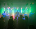
| 08/10/2015 07:07:53 AM | I Just Wanna Danceby MAKComment: *Hello from Sid and the Critique Club*
An atmospheric shot that meets the challenge.
I wasn't sure at first that this fulfilled the challenge in that it should evoke the emotion you feel when you hear your favourite song but I can see from your title and the inclusion of the dancers that in fact it meets the challenge well. That looks like a nice lens that you have used to full advantage, the shallow DOF works well and there are some nice colours.
Whilst I don't like blown highlights, its inevitable in this scene that you are going to get them but in fact they are such a part of the scene that they add to the overall effect. I like the green and red rim lighting on the subjects. I don't think the ceiling apparatus adds anything and the frame would have been better lowered to include more of the foreground people in preference which would also have emphasised the dancing element more.
A good entry thanks for submitting, Sid | | Photographer found comment helpful. |
| 08/10/2015 05:57:28 AM | Full steam aheadby asijComment: *Hello from Sid and the Critique Club*
Congratulations for your top ten placing for a fun image that meets the challenge well.
There must have been a lot of time and effort that went into the creation of this appealing and humorous image. I am not at all qualified to critique your compositing skills, although I have a basic appreciation I have never done any at all so I will approach this from the end result as an image in its own right regardless of the process involved.
My first impressions are of a fun image that has been well executed for an impressive end result. I like your composition with the main character in the lower right with plenty of fascinating detail throughout the rest of the image. I love his 'Heath Robinson' gun so intricately constructed and implausible that one would imagine on pulling the trigger a flag appearing with the word 'bang!'. The facial additions and his expression make him look deadly in an 'only joking' sort of way that adds to the humorous impression.
The background landscape is all very interesting and convincingly conceived, I like the steam train and its position but most of all I adore that airship its really the icing on the cake adding the final confirmation that this is an image to be savoured for its humour.
Well worth all the effort it must have taken and a pleasure to be able offer my thoughts, such as they are, thank you for submitting, Sid. | | Photographer found comment helpful. |
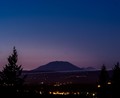
| 08/10/2015 05:20:42 AM | MtStRainier_DriftingSilhouettesby paulwestmoreland1Comment: *Hello from Sid and the Critique Club*
First of all welcome to DPC. I have just critiqued an image that you took the time and trouble to make some constructive critique on and felt that your efforts deserved a response, so here is my feedback for your entry, I hope you don't mind. Incidentally, for your future entries, if you tick the critique box when you submit your entry you will be added to the pool and I and other members of the critique club will be more than happy to offer you our thoughts.
A flawed attempt that meets the challenge well.
You have chosen an elevated position with the mountains as silhouettes which on its own forms quite a suitable location for the challenge brief. Your composition is considered, using the lower third favouring the night sky which works a lot better than a thoughtless 'plonk it in the middle' approach. The silhouettes of the main subject, the mountains, are clearly defined and you have a foreground frame of the silhouetted pines which adds too.
There are two major problems with the image, the first is the bright line that is effectively dissecting the frame into two it is so dominating and distracting it is completely overpowering the end result and, given the theme, it is detrimental. The long exposure has elongated the lone star, as it is all alone it would have been very easy to clone out which I think would have been advisable though not essential.
The other major issue as already identified by your commenter is sensor dust. You are not alone, I made exactly the same mistake just a few entries ago (see my entry � sunset). As you have used a large aperture its not immediately evident but once seen they stand out light beacons so, you must get that sensor cleaned quickly, your wife will I'm sure be able to advise you but you're welcome to contact me if you wish.
A very noble first attempt, I look forward to more from you soon, Sid. | | Photographer found comment helpful. |
| 08/09/2015 04:17:04 PM | m a l e v o l e n t • a s c e n tby Ja-9Comment: *Hello from Sid and the Critique Club*
An oft repeated but nevertheless effective shot that meets the challenge.
These type of shots always work well because they lend themselves to an easy and straightforward composition, they also easily hold our attention on the main subject, the stairwell.
I like your mono conversion you have a near full range of tones with good contrasts, it suits the subject very well indeed. The exposure is spot on with full detail throughout, the brickwork is excellently rendered. There is so much detail here to feast your eyes upon, it really is lovely.
I think I understand why you have titled it the way you have, not just for the number and steepness of the steps but those metal treads look extremely unforgiving should you slip, ouch! Thank you for another interesting entry, Sid | | Photographer found comment helpful. |
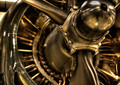
| 08/09/2015 09:55:58 AM | WW 2 Engineby DrakeComment: *Hello from Sid and the Critique Club*
A noble attempt that I assume meets the challenge.
What a lovely old engine this is, I can see what attracted you to it there's lots of lovely detail but there's the rub, I think you lost an opportunity to make more of this. I like your composition and the focus point clearly on the famous name which helps identify it and its era. What I am less happy with is your chosen aperture, the DOF is too shallow. You probably decided that you wanted to draw the viewers attention to the name to the exclusion of everything else but in my mind there was further great potential in the reflections in the centre hub such as we get a hint of in the cowl.
The tint works quite well here especially being a vintage engine a sepia type tone gives it a sense of antiquity. What I definitely do not like are the blown highlights. I know it can be difficult to get the right exposure especially with chrome under spotlights but there is too much here, it might have been better to combine a couple of exposures to avoid this. Whilst I do like your composition I think a little further away would have been better as you could have avoided cropping the lovely curve of the hub and perhaps included a little more of the lovely shape of the props.
All in all, a good effort, thanks for sharing it with us, Sid | | Photographer found comment helpful. |
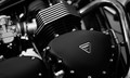
| 08/09/2015 07:58:24 AM | Triumphby bonnettComment: *Hello from Sid and the Critique Club*
A record shot that meets the challenge
The good thing about this challenge you have free reign for anything you want to do as long its duotones which your image is, therefore, it meets the challenge. The subject is one that will stir the hearts of motor cycle enthusiasts and any who admire the qualities of good engineering and an iconic name. Equally, it is a straightforward record shot and there are probably going to be a lot of voters here for whom this does not stir the same emotions.
Your exposure is good with good detail retained throughout and you have a full and lovely range of tones from the brightest highlight surrounding the makers badge through to the deepest shadows below the carb. I like your wide open aperture it emphasises the iconic name whilst still retaining sufficient detail in the rest of the components.
Where I think you have failed to make the best of the opportunity is in your composition, I just think with a little adjustment there were probably better possibilities here, for example, I think the carb has less appeal than the beautiful curve of the exhaust. By moving the frame right and up a little to include all those lovely curves you would have had a more appealing composition, you would also have had some lovely distorted reflections too. The downside is it would have moved the logo more to the middle but the fact that it is on a slant helps alleviate that.
Thanks for sharing your lovely image, Sid | | Photographer found comment helpful. |
|
Showing 871 - 880 of ~2853 |
Home -
Challenges -
Community -
League -
Photos -
Cameras -
Lenses -
Learn -
Help -
Terms of Use -
Privacy -
Top ^
DPChallenge, and website content and design, Copyright © 2001-2025 Challenging Technologies, LLC.
All digital photo copyrights belong to the photographers and may not be used without permission.
Current Server Time: 06/23/2025 07:17:40 AM EDT.
|