|
|
|
Showing 861 - 870 of ~2853 |
| Image |
Comment |
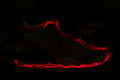
| 08/14/2015 02:43:31 PM | Shoeby CRocheComment: *Hello from Sid and the Critique Club*
An original approach that meets the challenge.
I like the originality of your entry I am confident its the only one of its type in this challenge. As one of your commenters has already remarked should the shore be more or less visible? So, let's explore both approaches, if you had made the show more visible then it would have more readily fitted in with the challenge theme and perhaps achieved a higher score, who knows. Completely invisible, well then it meets the challenge in an implied sort of way which may detract voters, however done well the red light would show up better and I think it has the greater potential.
This is where the image falls down a little in that the wavy red led outline has good definition on the sole it starts to fail on the uppers and is a complete near miss on the heel. I think if you could have defined the outline more consistently throughout you would have had a much stronger image.
I must commend you for your originality, keep those creative juices flowing, Sid |  Photographer found comment helpful. Photographer found comment helpful. |
| 08/14/2015 12:21:23 PM | A L L • S T A R Sby Ja-9Comment: *Hello from Sid and the Critique Club*
Congratulations on your high placing for this appealing shot that meets the challenge well.
As has already been observed by your commenters this would a make good advertising stock image. You have chosen well in your choice of location and background, placing of the shoes, aperture and focus point, it all works very well together.
I like the whites, however, I feel it has been pushed a little too far, there is some overexposure and loss of detail, I think probably half a stop less would have retained the detail. It is not a major issue but to me it is evident and undesirable. There is a blueish tinge on the whites that would also benefit from some adjustment. I like the orange colour and worn nature of the road lines together with the textures, it adds a nice touch.
Well done Janine, Sid | | Photographer found comment helpful. |
| 08/14/2015 12:04:55 PM | Fired Upby mrjssimsComment: *Hello from Sid and the Critique Club*
An appealing image that meets the challenge well.
What I like most about your image is the crop it makes the image very appealing and so much more interesting than the bog standard 'chuck it in the middle' approach that is so often seen. However, what lets it down badly is what I suspect to be camera shake. I'm not sure what size your lens was but as you are probably already aware your shutter speed needs to be correspondingly higher as you go further up the telephoto range. There is no sharpness anywhere which has also been exacerbated by your cropping in on it, perhaps at original resolution you may have got away with it, but it is plainly evident here I'm afraid.
It is essential to meet this challenge that you caught the flame in a very obvious sort of way and this you have achieved, well done. The sky is a very vivid blue I think it would benefit from being toned a little, it is quite overpowering as it is.
It's a shame that it wasn't sharper it would have scored higher but thanks for submitting, Sid. | | Photographer found comment helpful. |
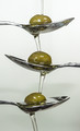
| 08/14/2015 06:44:50 AM | Olive oilby clickodakComment: *Hello from Sid and the Critique Club*
Congratulations for your high finish with this very effective studio setup that meets the challenge very well.
I love your carefully thought out setup and attention to detail and forethought that must have gone into it, the end result with the flowing oil is excellent. I like the shapes and the clarity and the way your oil flows onto each of the olives in turn. What I am enjoying the most is all of the fascinating reflections they are a delight. I also like the feint shadows that are giving the background an appealing gradient that adds weight to the image as a whole.
There's nothing I don't like and nothing I can add that would improve your excellent result, well done, Sid | | Photographer found comment helpful. |
| 08/14/2015 06:21:52 AM | Companionsby CRocheComment: *Hello from Sid and the Critique Club*
An interesting still life that meets the challenge.
You have fulfilled the challenge brief with your oil in the dish and yes, you should have listened to she who is wiser and swirled it round to make it more attractive. The thing that lets the shot down the most is the softness, where it should be sharpest, the liquid looks sharp but not as sharp as it could be. I think you should have used a smaller aperture to extend your DOF to include the bread, as it is it forms a major part of the scene but is completely out of focus. Your shutter speed is very slow due to the low lighting so I am assuming you used a tripod and this may be where the problem lies, if you did not have a remote release as soon as you press the shutter release you will introduce camera shake which is what I think the underlying problems is.
I like your composition it is very enticing having made some of your commenters hungry so to that end its worked well. I am undecided about the lighting, its nice that it makes it feel more warming but the same light has turned one of your slices into toast! It has also cast some rather strong shadows that don't really add to the overall impact.
Thank you for your submission and good luck with your future entries, Sid | | Photographer found comment helpful. |
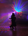
| 08/13/2015 01:02:07 PM | Dancing nightby tigerluongComment: *Hello from Sid and the Critique Club*
An interesting shot in difficult lighting.
I like the intimate moment you have captured that conveys a lovely warm and inviting atmosphere where the people are all enjoying themselves. I'm not sure if the people in the background add that much but they are sufficiently out of focus for it not to be an issue.
Although the exposure is generally dark I think you have done the right thing to anonymise the couple through silhouettes but capture the bright colours of the lighting. Your composition is generally good in terms of the lighting itself but it has made the couple a little too central for my liking. Perhaps if the radiating light in the background had been moved a little higher and further right it might have improved the overall composition. The light pattern on the floor is essential and works well. Your focus on the couple is good too.
I like your image and feel that it was undervalued here, anyway, good luck with your future entries, Sid. | | Photographer found comment helpful. |
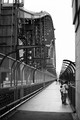
| 08/13/2015 07:48:57 AM | sydney harbour bridgeby AbraComment: *Hello from Sid and the Critique Club*
An interesting documentary style image from a different perspective
Its nice to see your informal up close capture of a significant landmark that is normally photographed from a distance. I like the way the foreground leads you over to the other shore represented by the distant buildings. I also like the inclusion of people with a mix of naturally curious tourists together with the practical need for the locals to use the bridge for their everyday needs. Its also interesting to see the people on the higher part of the bridge, presumably workers involved in the endless maintenance.
The mono processing suits the subject well, though I might have liked to see what it looks like in colour but the subject is more graphic especially against that bland featureless sky. What we wouldn't normally see from distant portrayals of the bridge are those significant fortifications which I assume are to deter suicide attempts which in itself is a sad reflection on society in itself.
All in all a pleasing result, thanks Sid | | Photographer found comment helpful. |
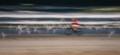
| 08/13/2015 07:02:29 AM | ~ s o a r i n g ~by Ja-9Comment: *Hello from Sid and the Critique Club*
A very appealing action shot
This is not the first time one of your images has had me exclaiming �yessss� as I scroll down to reveal it � its lovely! This really is right up my street, I love it though I'm sure not everyone here would but to be honest it did better than I would have expected but not as well as it deserved.
I obviously love the motion blur but what makes this work for me are the horizontals of the water both dark and light, the horizontal of the beach, the abstract shapes of the birds, the double vision bike and that gorgeous splash of red of the rider's clothes shaped by the wind. The only very minor amendment might be to have the rider a little more to the right it is a little too central.
I like it so much I think I'm gonna have to fave it, (that's not something that happens very often!), thanks Sid. | | Photographer found comment helpful. |
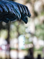
| 08/12/2015 02:58:01 PM | "It is life, I think, to watch the water." ~ Nicholas Sparksby Ja-9Comment: *Hello from Sid and the Critique Club*
A competent image that meets the challenge
Your fast shutter speed has enabled you to capture the water drops very effectively and thus meet the challenge. I like your portrait orientation to leave plenty of room for the drops to fall into. I also like the row of soft focus drops in the background against the one sharply focused drop in the foreground.
I find the background distracting especially all the colours, I think this would have worked much better in mono. I think there is also scope keeping the same aspect ratio for a crop removing some from the right and the bottom so that you have more of a feel that there are still more drops just beyond the frame.
It's a shame you didn't get any comments during the challenge and also that it didn't score higher, I think it deserved better, Sid. | | Photographer found comment helpful. |
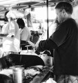
| 08/12/2015 02:47:17 PM | Corn Kingby Ja-9Comment: *Hello from Sid and the Critique Club*
A record shot that meets the challenge.
The image is a quite straightforward shot of a tradesman at his labours which, of course, meets the challenge brief. It is a very challenging exposure in the bright sunlit conditions in which you were in, so I assume in order to get sufficeint exposure to the most important part of the image, the man, you have used +EC? It has worked for the man at the expense of the rest of the background which is totally blown and, for me, detrimental to the end result.
This is obviously not a situation where you can combine exposures but if this was your only vantage point I might have tried to expose for the scene as a whole with a lower and more acceptable level of overexposure and selectively increased the exposure for the man in PS. I know the shadows hold less usable data and reveal noise more readily but there is also scope here for a lower ISO and wider aperture given the background scene.
Hope you enjoyed the cob?!? Sid | | Photographer found comment helpful. |
|
Showing 861 - 870 of ~2853 |
Home -
Challenges -
Community -
League -
Photos -
Cameras -
Lenses -
Learn -
Help -
Terms of Use -
Privacy -
Top ^
DPChallenge, and website content and design, Copyright © 2001-2025 Challenging Technologies, LLC.
All digital photo copyrights belong to the photographers and may not be used without permission.
Current Server Time: 06/23/2025 07:17:13 AM EDT.
|