|
|
|
Showing 791 - 800 of ~2853 |
| Image |
Comment |
| 09/05/2015 07:43:09 AM | Guitar curveby clickodakComment: *Hello from Sid and the Critique Club*
An appealing image that partially meets the challenge.
This is more a close up than a macro but it is certainly inanimate. You've made a lovely job of this Marcel, the black backgrounds work well to isolate the detail of the guitar. That same detail is unfortunately part of the problem in that the worn areas of the instrument are quite prominent, I think for this sort of image to work at its best it needs to be a new or an absolutely pristine guitar.
I like your composition with the three strings on the right leaving sufficient room for a balanced background on the left. Given you comments there is also the possibility for a vertical composition just up to the outer edge of the sound hole embellishments, in that way the top curve could be included and our attention would be concentrated purely on the classic curved shapes ithemselves against the black. I think the simplicity of such a composition would have had more impact.
Nicely done, thanks for your submission and apologies for the delayed critique, as they say, 'better late than never', or at least I hope it is, Sid |  Photographer found comment helpful. Photographer found comment helpful. |
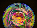
| 09/04/2015 12:19:14 PM | Playing with Lightby Catherine_BComment: *Hello from Sid and the Critique Club*
An appealing image that meets the challenge.
What lovely vibrant colours this glass lamp, most unusual and very appealing. It looks as though you have used on camera flash? I can't help but feeling how those lovely colours would have looked with backlighting, I would love to have seen how that looked, I suspect it could have been quite stunning. As it is, the lighting has caused hotspots on the surface here which have blown out amongst the surrounding colours which is a shame because for me it mars the end result.
I would also have liked to have seen the shape of the lamp if it is as beautiful as the glass it could have been good to have taken this as an abstract with the light coming through it and parts of it in soft focus, ooh, I'm getting excited just thinking about it!
I scored your image a 7 during the challenge but on this closer look I would probably have deducted a point for the flash blowouts. Anyway, thanks for your submission and apologies for the delayed critique, as they say, 'better late than never', or at least I hope it is, Sid | | Photographer found comment helpful. |
| 09/04/2015 11:28:31 AM | pawning a stolen kissby posthumousComment: *Hello from Sid and the Critique Club*
An appealing image that meets the challenge brief.
A tender moment well captured and titled. I like your composition with us able to see this interesting location and most of what they will have captured in their selfie. The climbing plant in the foreground and similar behind them forms the natural frame that enables you to fulfil the challenge nicely.
This will have been a difficult exposure which you've done a pretty good job of, you've managed to retain detail in a lot of the shadows and highlights without too much significant over and underexposure, well done.
Thank you for a pleasing and interesting entry, Sid | | Photographer found comment helpful. |
| 09/04/2015 06:36:09 AM | s e a • p e a r l sby Ja-9Comment: *Hello from Sid and the Critique Club*
An appealing image that is assumed to meet the challenge.
Haven't I already commented on this before? If not, then it is a very strikingly similar image to one already entered and critiqued by me. Yes, I've found it, 'pearls', I assume this was the outtake I saw at the time? Well, everything I said about the original applies equally to this, it has more symmetry than the pearls but as I said before I am still torn between the two.
Thanks for your great entry, Sid | | Photographer found comment helpful. |
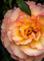
| 09/04/2015 06:26:52 AM | Creamy Roseby Catherine_BComment: *Hello from Sid and the Critique Club*
An appealing flower study that is assumed to meet the challenge.
A natural looking capture of a colourful rose with, as you say, perfect symmetry of a bountiful profusion of petals that makes for a frame filling flower. I do like your off-centre crop enabling you to show off that symmetry in the lovely rounded shape that occupies the whole of the left of the frame. I also like the inclusion of the leaf at the top of the frame I think it breaks it up nicely and naturally. And again, I like the fact that t doesn't have the seemingly obligatory water drops that seem to accompany the vast majority of flower images nowadays!
Your chosen aperture is ideal for the image it defines the heart and front of the flower well while enabling it to stand out from that perfectly formed background of symmetrical petals. Yours colours appear natural and not oversaturated as again, is often the case here. There is a possibility here of presenting this in landscape format probably with the heart at the base?
I'm sorry you didn't receive any comments during the challenge, I hope this makes up for it, Sid | | Photographer found comment helpful. |
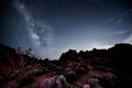
| 09/04/2015 06:12:32 AM | Valley of Fireby Dr.ConfuserComment: *Hello from Sid and the Critique Club*
Congratulations on your high score and placing with your entry assumed to meet the challenge.
What a star filled sky, I don't think I've ever seen so many stars! This is a very well executed image, the exposure is long enough to get a good image and not too long that the stars themselves are too elongated. The detail is very good throughout the image including the foreground which adds a perfect level of interest to the night scene. The composition is good with the Milky Way itself positioned nicely on the left third.
There is a nice rim of light above the right distant landscape with a few interesting clouds to boot. Perhaps the only thing I am not so keen on is the white appearance of the nearest bushes in relation to the rest of the scene. I assume this has been illuminated by yourself during the exposure? On closer inspection is it due to the cold? There does appear to be a lighter hue to the tops of all the bushes leading into the scene. Even so, I think it would benefit from a little toning down, apart from that an excellent job, well done.
Thanks for your great entry, Sid | | Photographer found comment helpful. |
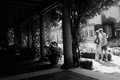
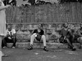
| 09/04/2015 05:59:14 AM | lateral movementby mitalapoComment: *Hello from Sid and the Critique Club*
An interesting street scene that is assumed to meet the challenge.
I always take in the title to hopefully gain more insight of the photographers intention and motivation for creating the image in the first place, so I see you want to emphasise the ladies movement within the frame. Towards that end her extreme cropping adds a huge element of intrigue, is the lady as beautiful as we think and hope she is? What is her role in relation to the others? There is movement in her leg which adds weight to the title.
Looking at the lads attention the lady has gained, the three seem quite mesmerised by her but alas, not the bloke on the left who is absorbed in his phone, another alternative title may be � 'win some, lose some' ? I quite like your extreme cropping particularly of the lady and even to a lesser extent the bloke on the right but because the cropping is so critical I don't like the whatever it is, either a bag or a block, in the foreground next to the ladies foot. In some respects I think another possibility with this shot would be a second later when the first bloke is covered by her and just the three looking at her longingly, that would probably have had more impact. I do like your low and seemingly inconspicuous viewpoint.
Sorry you didn't receive any comments during the challenge, I hope this makes up for it, Sid | | Photographer found comment helpful. |
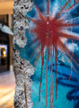
| 09/03/2015 08:36:01 AM | Berlin Wallby clickodakComment: *Hello from Sid and the Critique Club*
An interesting image that fulfils the challenge perfectly.
There can be no mistake that this most certainly is a huge lump of concrete, but not just any old concrete, it is a very important part of recent history. It is brought alive by the colourful graffiti and your title during the challenge and post challenge with your very helpful comments.
I know one of your commenters likes the inclusion of the background, I am not so keen, or rather I love the irregular left edge of the concrete and this should be preserved by the inclusion of a minimal background, I think where the brown structure becomes black would have been the ideal amount to include and I would have dodged or cloned the part of the canopy that would intrude to make it more uniform. The bright lights of bokeh in the window are very distracting and spoil the overall result especially as we are excluding some more of the lovely graffiti on the right. The positioning of your red sunburst is good.
Nicely done, thanks for your submission and apologies for the delayed critique, as they say, 'better late than never', or at least I hope it is, Sid | | Photographer found comment helpful. |
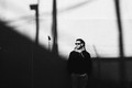
| 09/03/2015 08:23:47 AM | Shadowsby hstegComment: *Hello from Sid and the Critique Club*
An intriguing image that meets the challenge.
The theme of the challenge is met by the wall your friend is leaning against and that's where the intrigue lies, it seems to consist of two different textures with the lower half giving a fascinating grainy appearance, unless this is your own partial processing? I love the stark high contrasts you have here and the shadows themselves are also quite interesting, they add another element to the scene.
Assuming the sloping shadow continues upwards as implied I think I may have been tempted to move everything further over to the right revealing more of the slope and excluding the pole shadow on the right and lowered it to just above his hanging out shirt for just his torso. I think this would have improved the composition and therefore its impact and hopefully have scored higher.
I do love the effect of the lower half of the wall. Nicely done, thanks for your submission and apologies for the delayed critique, as they say, 'better late than never', or at least I hope it is, Sid | | Photographer found comment helpful. |
| 09/02/2015 01:58:15 PM | where the sky endsby posthumousComment: *Hello from Sid and the Critique Club*
An uninspiring image that has made a contribution to the open challenge.
In the words of Ubique I am obviously a lesser photographer because it fails to 'attract and inspire me' and I fail to see any connection with Gursky. The chicken wire adds a certain something I'll admit and it actually detracts from or sort of obscures the tilt, but since you felt compelled to comment on it its such a tilt that is to a certain degree broke. It's not immediately obvious but once evident then its so slight that it detracts, for me tilts rarely work where they are not an obvious intention that adds another element to the image, this does not.
It's inevitable that not all one's images are going to appeal to everybody and I have seen and had the pleasure of commenting on several appealing images from you but I'm sorry this one just does not do it for me, but its only my 'lesser' side revealing itself. I'm pleased for you that at least your fan club appreciate it.
Thanks for your submission and apologies for the delayed critique, as they say, 'better late than never', or at least I hope it is, Sid | | Photographer found comment helpful. |
|
Showing 791 - 800 of ~2853 |
Home -
Challenges -
Community -
League -
Photos -
Cameras -
Lenses -
Learn -
Help -
Terms of Use -
Privacy -
Top ^
DPChallenge, and website content and design, Copyright © 2001-2025 Challenging Technologies, LLC.
All digital photo copyrights belong to the photographers and may not be used without permission.
Current Server Time: 06/22/2025 04:23:58 PM EDT.
|