|
|
|
Showing 761 - 770 of ~2853 |
| Image |
Comment |
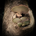
| 09/13/2015 01:14:57 PM | And it will tremble, Ever so nicely, Notice, How it sparkles, Down thereby ArnaMarieComment: *Hello from Sid and the Critique Club*
An appealing image that is assumed to meet the challenge.
Fungus photos abound always have an appeal but your's is a step above the norm with the lovely detail and texture you have managed to capture. Shooting at full aperture you have got a good DOF but I think perhaps f4 or similar would have got you just that little bit more to get the smaller fungi below the top larger one in sharp focus too. It may also have got the ring of bark surrounding the fungi sharp too but I think this would be perfectly acceptable.
I like the dark background it works well but the detail on the left is very slightly intrusive and would be best cloned out to match the rest of the background which makes the main subject stand out well. I do like the texture and detail you have captured on the fungus it is perfect, well done.
Thank you for a great submission, apologies for the long delay, Sid |  Photographer found comment helpful. Photographer found comment helpful. |
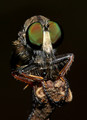
| 09/13/2015 06:01:26 AM | What Big Eyes You Haveby stuartjonathangrayComment: *Hello from Sid and the Critique Club*
An interesting image assumed to meet the challenge.
What an excellent macro, they are really quite scary but fascinating at these sort of magnifications. The flash you have used has good and bad points in your exposure, I'm not keen where it has illuminated the legs to some small parts of bright highlights but I do like the way it has picked out the individual facets of the eyes it really is showing them up well. The iridescence of the eyes is looking good too. It is filling the frame well with the supporting branch rising from the bottom its all working well together.
Thank you for an interesting submission, sorry for the delay in critique, Sid | | Photographer found comment helpful. |
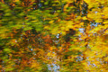
| 09/12/2015 06:53:43 AM | static dynamicby posthumousComment: *Hello from Sid and the Critique Club*
An interesting image that vaguely meets the challenge.
I like the motion blur of the leaves but I think the challenge itself required more than simply inverting an image, this does not live up to the creative aspect of the challenge. I do like the autumnal colours they are very appealing. There's not really a lot I can say other than that.
Thanks for your submission, Sid | | Photographer found comment helpful. |
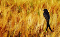
| 09/12/2015 06:09:57 AM | Black Drongoby artistChanComment: *Hello from Sid and the Critique Club*
An appealing image that is assumed to meet the challenge.
I get the pleasure to once more comment upon your image. I like it first time round and I still do, this is a great composition with the bird off-centre looking into the rest of the gorgeous golden frame, and what a beautiful bird it is too. The lighting is perfect it has enabled you to give good definition and form to the bird whilst at the same time bringing out the textures of backdrop crop. Your commenters seem to be understandably very appreciative but I'm not sure what one of them means about any technical imperfections I'm not sure how this could be improved.
Thank you for giving us such a delectable treat, I scored it an 8 and would eagerly do so again, it is so good I'm going to have to fave it. It's a real shame you don't appear to be active I hope you return soon, Sid | | Photographer found comment helpful. |
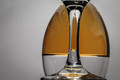
| 09/11/2015 05:57:24 PM | Upside Downby clickodakComment: *Hello from Sid and the Critique Club*
An interesting image that meets the challenge well.
I like your originality here Marcel, there's no doubting its conformity to the challenge brief, well done. Glass is a wonderful medium to work with but it does not come without its significant problems, mostly reflections and that unfortunately is where great attention to detail is needed and is a little lacking in your image. In particular the specular highlights from your lighting that form distinctive white blobs of blown highlights are the worst followed closely by those of yourself and your camera. It is not easy to get this right and some post processing is often inevitably required to perfect the end result. Another fundamental that lets your image down is that there is distinct tilt to the right.
Anyway, I commend you for a brave and original attempt, Sid | | Photographer found comment helpful. |
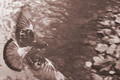
| 09/11/2015 11:47:01 AM | hear the grating roarby posthumousComment: *Hello from Sid and the Critique Club*
An excellent image assumed to meet the challenge.
I'm glad this didn't remain hidden! A great action shot, nice viewpoint and nice hint of motion and lovely muted tones throughout, definitely one of your best to date. It's a shame you have had to crop a little off the wing but its not major but the rest of the composition is working really well. There is nice sharpness on the back of the pigeon, it would have been nice to have the same sharpness on the head but again its only marginally soft and perfectly acceptable.
A great image that ought to have fared better than it did, can't say I understand the title though, if its crucial to the image' appreciation then this might explain why it didn't do better, Sid. | | Photographer found comment helpful. |
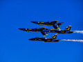
| 09/10/2015 12:39:58 PM | Upside Rightby PhocalComment: *Hello from Sid and the Critique Club*
An intriguing image that meets the challenge well.
Well there's no doubting your image certainly fulfils the challenge brief! That looks like some difficult manoeuvre, its difficult to tell their exact position in relation to each other from this angle but I assume the inverted ones are above those flying normally? Anyway, there is nothing you can do to separate them but you have captured it well. The exposure is good.
One of your commenters has remarked about the blue sky but you need space for them to fly into and you also need to see where they've come from. I suppose you could have subdued the intensity of the sky but we have just three colours here blue, yellow and white all of which are working well together so I don't think there's even a need for that. The only other thing you could have done would have been to photograph them on the diagonal which I think could have worked well but if you wanted to document them accurately as you have here then it is not an option.
Anyway, thanks for your contribution and apologies for the delayed critique, Sid | | Photographer found comment helpful. |
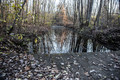
| 09/10/2015 06:31:11 AM | Looked simple on autumnby clickodakComment: *Hello from Sid and the Critique Club*
A grab shot that does not meet the challenge.
This feels as it sounds like an impromptu shot that has not had sufficient thought or preparation beforehand, although I think I understand your emotion behind it it does not suggest simplicity at all. There is too much that is competing for attention which is quite the opposite of what I should be getting if this were truly simplistic.
A much more simplistic approach would have been to focus on just one or two elements as opposed to the bridge, water, reflections, trees, leaves and sky that we have here, there is just far too much.
I'm sorry Marcel but this was definitely not one of your better ones, Sid | | Photographer found comment helpful. |
| 09/10/2015 06:13:28 AM | ~Y E L L O W~by KMcCComment: *Hello from Sid and the Critique Club*
A very appealing image that meets the challenge well.
The beautiful bold colours here are very appealing and striking against the OOF sky background which is all very simplified in keeping with the challenge brief. However, I am somewhat confused by what I am seeing here, the OOF flower in the foreground is throwing the composition as a whole off balance it would have been better to exclude it or use a smaller aperture to get it into focus. It throws me because it is in front of the right hand flower which is all clearly in focus yet none of this is. It doesn't appear to be close enough to have such an effect. The flower on the left appears to be at least on the same focal plain yet all of it is in clear focus, its all very confusing.
I think an even more effective composition would have been to just have the left and the right flower without anything else at all. I particularly like everything about these two flowers. On their own these two alone would have had much more impact, I love the viewpoint of both of them. The two in the middle spoil the overall effect.
Thank you for your submission, apologies for the delay in critique, Sid | | Photographer found comment helpful. |
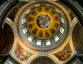
| 09/09/2015 12:52:36 PM | Eglise du Dome Church at the Hotel des Invalides by Ja-9Comment: *Hello from Sid and the Critique Club*
Congratulations on your ribbon for this appealing image that fulfils the challenge brief.
Its certainly a beautiful structure, not hard to imagine why it appears to have inspired so many in their subsequent designs, I would imagine it must be quite something to see at first hand. Its hard to conceive of the amount of effort that has gone into making something as awesome as this. This is the sort of image that cries out pure symmetry but I'm quite glad that you decided against that, I quite like the end result, though it does mean that we don't get to see enough of the two paintings on this side of the structure. If you had decided to go for total symmetry a square crop would have been a perfect option.
This would have been a difficult exposure but I think you made a good job of it, I can live with the overexposure of the windows in favour of sufficient light in the shadows without resorting to HDR. Anyway, you obviously did right for the voters here, well done Janine. | | Photographer found comment helpful. |
|
Showing 761 - 770 of ~2853 |
Home -
Challenges -
Community -
League -
Photos -
Cameras -
Lenses -
Learn -
Help -
Terms of Use -
Privacy -
Top ^
DPChallenge, and website content and design, Copyright © 2001-2025 Challenging Technologies, LLC.
All digital photo copyrights belong to the photographers and may not be used without permission.
Current Server Time: 06/22/2025 09:52:13 AM EDT.
|