|
|
|
Showing 741 - 750 of ~2853 |
| Image |
Comment |
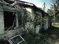
| 09/29/2015 05:35:31 PM | "Wear" The Zombies Roamby WonderDudeComment: *Hello from Sid and the critique club*
An uninspiring image that partially meets the challenge.
Your interpretation of the challenge is presumably intended to reflect the ravages of weather wear and tear on the structure but I see this more as dereliction and decay rather than wear and tear which I would more readily associate with continued use as opposed to the abandonment of this scene. The lighting is very harsh with some extreme contrasts and blown out highlights, I think a stop of -EC would have worked well here to rescue those highlights, the shadows have enough latitude to enable it. I think your composition could have excluded the pole to the benefit of the overall result.
Thank you for your submission, Sid |  Photographer found comment helpful. Photographer found comment helpful. |
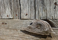
| 09/28/2015 06:00:32 PM | Wear and Tear of timeby clickodakComment: *Hello from Sid and the critique club*
An appealing image that meets the challenge
A good choice of subject that displays the ravages of the elements the wood has endured over the years, your composition is good with the nailed knot of wood placed in its most obvious and effective position on the lower left thirds hotspot, it works well. The most obvious problem with it is the time of day it was taken it has been taken under strong overhead sunlight which is not the best choice especially to bring out the textures and characteristics of the aged wood. Under better light this would have a lot more impact.
I like that you have observed beyond the structure of the building and gone for more of an abstract approach that isolates the wood and nails with an interesting section such as you have, well done Marcel. | | Photographer found comment helpful. |
| 09/23/2015 09:43:56 AM | Olinda park in springby tigerluongComment: *Hello from Sid and the Critique club*
A landscape that contributes little to the open challenge.
You probably felt the scene you had in front of you, colourful and appealing as it was, needed a little help in post processing, however, I feel you need to be made aware that the end result has not worked at all. If, as I suspect, you are relatively new to post processing the temptation is to tweak and then tweak and then tweak some more but you quickly reach a point where it becomes detrimental to the end result, as you have here. Your goal should always be to get the best possible image in camera and if necessary to enhance the quality to extract the very best quality in the end result this requires very subtle processing where less is most definitely more.
The colours are way over saturated, there is probably little resemblance to the original. The image is very heavily pixelated suggesting that the submitted jpeg has been too heavily compressed, there are large swathes of the background that lack any detail, the path in the foreground lacks any detail. If you look carefully you will see sudden transitions from blue to green and these areas form blocks of a single colour, all part of the jpeg compression technique.
All of this is a very tough way for you to learn but, to be honest, the image's quality, or rather lack of, is reflected in the voters perceptions too. Sorry to be so negative but I feel I owe it to you to help you improve. Thanks for your submission, Sid | | Photographer found comment helpful. |
| 09/23/2015 09:05:35 AM | • e f f l o r e s c e n c e •by Ja-9Comment: *Hello from Sid and the Critique club*
An appealing image that does meet the challenge.
Congratulations on your high placing Janine. A very accomplished flower shot and not a water drop in sight! The lighting is excellent enabling you to get the best out of the colours and textures for a very pleasing image. I like the off-centre composition it works very well revealing lovely detail that would probably be lost in a symmetrical composition. The shadows and highlights both add additional appeal to your image.
Well done Janine, I can't really fault it. Thanks for your submission, Sid | | Photographer found comment helpful. |
| 09/23/2015 08:57:00 AM | Simplicityby PangurbanComment: *Hello from Sid and the Critique club*
An appealing image that does meet the challenge.
I'm not sure what your lighting and shadows problem was but I think the end result is most acceptable, in fact a very nice high key effect whose shadows are very subtle and blend in well with the end result. Your exposure is very nice you have got some lovely whites without blowing the highlights. A smaller aperture would have got you a better DOF encompassing the petals in the foreground in a sharper way but I think the nature of this high key image allows you to have some softness in those petals in a way that adds to the end result in a pleasing sort of way.
Whilst I prefer an off centre composition there is sometimes a need for a more symmetrical approach such as you have here. Given the size of your subject, a miniature rose being smaller an off-centre composition filling the frame might not have been possible for you being beyond the closest limits of your lens perhaps? If not then I think this would have improved the image substantially.
Sorry you didn't get any comments during the challenge, I hope this helps. Thanks for your submission, Sid | | Photographer found comment helpful. |
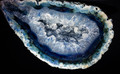
| 09/23/2015 07:27:12 AM | Foetus of a rockby clickodakComment: *Hello from Sid and the Critique club*
An appealing image that does not meet the challenge.
The rock is very appealing in its own right but in order to meet the challenge there should be nothing but rock, ie., no background at all. I can see your reasoning, the rock is certainly womb-like more than foetus like but this is the wrong challenge to use this in because you need to see the whole to understand your concept but to fulfil this challenge brief you need to crop significantly in order to fill the frame.
The lighting is uniform and illuminates the rock well and DOF is good though I wonder if you needed to use quite so small an aperture, perhaps f8 or f11 would have sufficed.
Sorry you didn't get any comments during the challenge, I hope this helps. Thanks for your submission, Sid | | Photographer found comment helpful. |
| 09/22/2015 03:52:40 PM | Follyby PangurbanComment: *Hello from Sid and the Critique club*
An appealing image that meets the challenge
As you say, a beautiful location. The lighting is very harsh and difficult to control but I think -1EC would have given you a better result it would have saturated the colours more and lessened the effect you have identified of the blown sky. You have done the right thing to reduce the amount of sky in your composition but I think you could have gone further and eliminated it completely in favour of the water. I do like the one calm patch of water that reflects perfectly the folly this really adds impact to the end result. Personally, I would have preferred to see some human interaction here, it would also given it a sense of scale.
Sorry you didn't get any comments during the challenge, I hope this makes up for it. Thanks for your submission, Sid | | Photographer found comment helpful. |
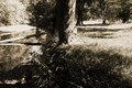
| 09/22/2015 03:25:07 PM | divided landscapeby posthumousComment: *Hello from Sid and the Critique club*
A landscape of limited appeal that meets the challenge.
The f8 aperture and your chosen focus point has enabled you to get good DOF to the foreground with some softness in the background to the left of the image in particular. The exposure could have been better controlled, you have some significant areas of overexposure in important areas of your image, particularly on the left and the bark of the foreground tree.
I can't help but look at this and feel for the lost opportunity of a much more interesting and effective composition. By placing the tree in the middle the way you have it just blocks my way into the rest of the image and then I feel frustrated that there is so much of interest in the left that hasn't been exploited. By placing the tree on the right you could have made so much more of the water and its reflections and transformed this into a much more pleasing image.
Thanks for your submission, Sid | | Photographer found comment helpful. |
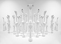
| 09/22/2015 03:09:18 PM | Take Us To Your Leader by Dr.ConfuserComment: *Hello from Sid and the Critique club*
Congratulations on your ribbon for your excellent entry that meets the challenge fully
Thanks for the interesting notes, I hope you have fully recovered from what must have been an exhausting trip! What an excellent choice of subject very well executed from all aspects, it makes a fascinating high key subject. Your viewpoint has enabled you to recreate a very effective artificial symmetry that with your most appropriate title makes for a completely new subject matter in its own right. The leader at the front has a distinctive identity that separates him from his followers all of whom together with their shadows make a most appealing and fascinating image, I like it a lot.
I'm very pleased for you that it has been so well received here and deservedly so, well done, Sid | | Photographer found comment helpful. |
| 09/18/2015 08:18:06 AM | Day Dreamingby Catherine_BComment: *Hello from Sid and the Critique Club*
An appealing image that is assumed to meet the challenge.
I get the chance to comment again! Your comments add another dimension completely you must all be very thankful for her successful recovery. So, following on from my previous comments, I don't know what lens you were using but if it had a wider aperture it would have been better to use it and soften the background down. The focus is a little on the soft side too, sometimes autofocus doesn't nail it as well as manual providing you have good eyesight, so it might be worth tweaking it sometimes during the shoot.
I think it might have been nice to try portrait orientation to reduce the background elements and get the reflection of her face and lovely eyes in the table. Talking of reflections I think the exposure is a little on the bright side there are some blown highlights amongst the reflections so a little -EC would be wise.
Thanks for your lovely entry and apologies for the delay, Sid | | Photographer found comment helpful. |
|
Showing 741 - 750 of ~2853 |
Home -
Challenges -
Community -
League -
Photos -
Cameras -
Lenses -
Learn -
Help -
Terms of Use -
Privacy -
Top ^
DPChallenge, and website content and design, Copyright © 2001-2025 Challenging Technologies, LLC.
All digital photo copyrights belong to the photographers and may not be used without permission.
Current Server Time: 09/04/2025 10:36:12 AM EDT.
|