| Image |
Comment |
| 04/08/2016 12:39:55 PM |
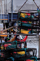
-Loading-the-Crab-Pots-by sfaliceComment: Hello from the Critique club
An interesting image that contributes to the free challenge
There is some interesting detail in the pots and ropes and the handling of them and together with the colours which are very vibrant it makes for an interesting image. What I think lets the image down is that it feels too tightly cropped, although its not essential to see the missing details it does not make for an appealing crop in its own right. The image as a whole feels very cluttered with all the elements competing for each other including the background which would be better in softer focus. Amongst all this the dayglo emblem on the mans hat on the left is so vivid that it too grabs your attention in a detrimental way.
Thanks for your entry Alice |
 Photographer found comment helpful. Photographer found comment helpful. |
| 04/07/2016 12:11:03 PM |
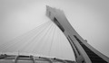
The Tallest Inclined Tower in the world. Experience advisorby clickodakComment: Hello from the Critique club
An appealing image that meets the challenge well.
Wow, is this for real Marcel! What an amazing structure! I like your composition coming in diagonally from the corner it works well. The mono presentation and the way the top of the building starts to blend into mist also works very well. The cables, I assume, are supporting a roof of some sort? Part of me wishes I could see a bit more of this part of the image to confirm that but as it is it adds an intriguing element but the main structure is so incredible that it is right to place all the emphasis upon this part of the image, I'm pretty sure this would have been my approach too. It could be argued that there is a lack of contrast but again I think the structure is powerful that this low contrast approach works to good effect.
Thank you for your incredible entry Marcel, very fitting for the challenge. |
| Photographer found comment helpful. |
| 04/03/2016 08:12:03 AM |
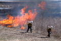
Pyrosby dtremainComment: Hello from the Critique club
An interesting attempt that does not meet the challenge
In terms of the challenge brief there are no aspects of this image that are �ridiculously disproportionate�, everything feels in correct proportion. If you look at the challenge winners it will be immediately evident what was required to fulfil the challenge brief. The subject matter itself is also unconvincing it appears to be a normal controlled situation where everything appears as you would expect it to. Thank you for your processing details, I assume the second man is the pasted man, being a little larger than the foreground man? Again, there is not enough to differentiate their sizes this could be as expected in the normal scheme of size difference between people.
I�m sorry to be rather negative about your entry David but I would recommend you have a look at the successful front page entries for a fuller appreciation of what was needed to succeed in this challenge. Thanks for your entry, better luck next time. |
| Photographer found comment helpful. |
| 04/03/2016 07:56:37 AM |
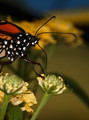
Pollinationby clickodakComment: Hello from the Critique club
An excellent insect study that only partially meets the challenge
You have taken good control of the technicals to produce a very competent macro of the butterfly�s head so very well done from that aspect. I like the square crop but given the nature of the subject, a beautifully coloured butterfly, a normal landscape orientated crop would have allowed you to include more of the butterfly. However, the challenge brief is flora, which means unfortunately, as good as it is, it detracts from what should be the main theme ie., the flowers themselves. It�s a shame this is not entered in a more appropriate challenge it would have done very well but it�s excellent practice for such a future challenge.
So, having said all that I�m now going to ignore the butterfly and concentrate on the flower side of the image and I like what I see, the foreground bud is nice and focussed with a less than perfect flower head adjacent that is also nicely focussed with interesting detail. The foreground bud is soft together with the distant flower heads in the background which I really like I think they complete the image.
Your technical control of the camera is consistently improving Marcel but do try to think carefully of the challenge brief in your choice of subject. |
| Photographer found comment helpful. |
| 03/23/2016 06:24:42 AM |
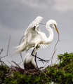
n e s t i n gby Ja-9Comment: Hello from the Critique club
An appealing image that meets the challenge well.
That's certainly some S-curve! Your defined areas of sharpness and softness are very effective they certainly make the most important elements of your subject stand out nicely. The nest building action adds interest to the shot and I find the low contrast between the bird and the sky background appealing too. It might have een even more effective without the other bird in the background or if he were in a better position and more recognisable.
Another excellent entry Janine, well done. |
| Photographer found comment helpful. |
| 03/22/2016 06:54:03 PM |
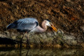
Heron searches for Preyby sfaliceComment: Hello from the Critique club
An interesting image that contributes to the challenge well
A competent shot of a heron doing what herons do, I find myself captivated by trying to determine what he has in his beak and if the red object immediately behind and below his beak is part of that same unfortunate victim. He stands out well from the soft focus background and so I have to disagree with some of the comments about softness and standing out from the background, the eye is pin sharp and thats what matters. Thanks for the processing details, all very involved by the sound of it and I would say it has generally paid off
Thanks for your entry Alice |
| Photographer found comment helpful. |
| 03/21/2016 06:31:39 AM |
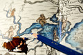
The Pooleby PangurbanComment: Hello from the Critique club
An interesting image that meets the challenge well
What a lovely interesting map you�ve used it is a great background for the pencil. I have to be honest and say that I�m not really sure why you added the shaving I feel it rather detracts from the end result, but since you have and you have asked for advice regarding the processing if you applied local dodging to the shaving alone this would not have affected the background and woud have brought out a little more detail in the shaving itself. With regards to the depth of filed I think its perfect it focusses our attention on the Poole and pencil whilst giving us an appealing soft focus view of the other interesting detail in the map.
I can imagine the jocularity yer piddles and pooles caused as a nipper! Thanks for your entry Ellie |
| Photographer found comment helpful. |
| 03/21/2016 06:21:24 AM |
Make the Finishing Touchesby gipper11Comment: Hello from the Critique club
An interesting image that meets the challenge well
You�ve found an interesting background for your pencils it works well to convey the idea of using the pencils to colour the image. Having said that I have to say that I don�t find the way the pencils have been laid on top really adds much to the overall image, they just feel a little too regimented all being aligned in a similar fashion. I actually like the way the hand is holding the implements in the drawing appealing and I would have liked to seen this sort of chaotic order replicated so that they were to one side or the other of the hand in a similar way, I think it could have worked well and for me more appealing
Thanks for your entry Larry |
| Photographer found comment helpful. |
| 03/21/2016 06:11:55 AM |
Paint-Cilby clickodakComment: Hello from the Critique club
An excellent image that meets the challenge very well
What a great concept Marcel, I hope you�ve patented the idea, it could take the world by storm! Seriously though it is a great and, as far as I am aware, original idea, the colours of the pencils are perfect nice and vivid against the more sombre background. Isn�t it interesting how your two commenters differ so much on the lighting aspect, personally I think you�ve made a good job of it, the lighting is nice and even but it does lead me on to my minor criticisms. Its down to that all important attention to the minor details, it would have been even more impressive if all of the tips of the pencils had been perfectly level and also the lighting on the blue pencil, the yellow next to it is casting a shadow on it. Like I say, they are only minor but they are important.
Well done Marcel for submitting another excellent entry. |
| Photographer found comment helpful. |
| 03/18/2016 03:49:21 PM |
High Schoolby snafflesComment: Hello from the Critique club
An appealing image that meets the challenge.
Well there's definitely a hint of Cindy Sherman here Susan, the fun is self-evident. You've captured the spirit of her work in the awkwardness of that 'moment' in the smile and the natural unpreparedness of a 'selfie' meant to be a reflection of someone other than yourself. Even down to the lighting reflected in the glasses and lips you've nailed it, normally such highlights would be less than desirable but in the context of the challenge they are the icing on the cake!
Thanks for your entry Susan. |
| Photographer found comment helpful. |
Home -
Challenges -
Community -
League -
Photos -
Cameras -
Lenses -
Learn -
Help -
Terms of Use -
Privacy -
Top ^
DPChallenge, and website content and design, Copyright © 2001-2025 Challenging Technologies, LLC.
All digital photo copyrights belong to the photographers and may not be used without permission.
Current Server Time: 08/30/2025 05:01:36 AM EDT.