| Image |
Comment |
| 01/18/2017 01:38:58 PM |
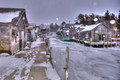
Take Less Winter Photos......by DrakeComment: Hello from the critique club
An appealing image that contributes well to the challenge
Well you've certainly appealed to your voters with this winter scene, I can understand why but its not really doing it for me, the snow on the lens detracts too much. The scene and composition and wood detail is good but the lighting is making the scene very flat and uninteresting. I'm really pleased for you that I am in the minority and that it has scored and placed so well. |
 Photographer found comment helpful. Photographer found comment helpful. |
| 01/18/2017 12:13:28 PM |
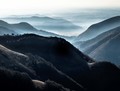
Climb more mountainsby docjonnyComment: Hello from the critique club
An appealing image that contributes well to the challenge
Wow, thats some view! The distant haze with its receding tones adds impact to the image. I didn't notice the burning in at first but once seen it becomes more evident, you should have kept quiet I might not have noticed it! There is good detail throughout and blue tones really enhance the end result. What I do like are the sunlit patches particularly the one on the right with its wispy trees its gorgeous, the lighting throughout is very appealing. Enjoy your mountains Jonathon. |
| Photographer found comment helpful. |
| 01/18/2017 12:04:26 PM |
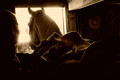
Get back on the horseby snafflesComment: Hello from the critique club
An appealing image that contributes well to the challenge
Effective composition Susan, nice to see this different viewpoint but a challenging exposure for you no doubt. The exposure is way beyond any cameras latitude so its important to expose the way you have for the important detail. In fact the blown highlights and shadows add impact to the end result concentrating our focus where it should be. The soft focus and sepia tones also add a gentle appeal to the image. Good luck with your resolution, should be fun... |
| Photographer found comment helpful. |
| 01/16/2017 04:46:35 PM |
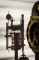
Clock Gear Silhouetteby clickodakComment: Hello from the critique club
An appealing image that contributes well to the challenge
I admire your creative approach to the challenge Marcel. The composition works well with the emphasis on the clock̢۪s lovely shadow, this is a very effective way to show the inner workings of the clock. The inclusion of the clock face works well and gives meaning to the shadow, I just wonder if your aperture was just a little too wide, perhaps a little more definition in the clock face would have given it a more instant appeal, especially here at DPC where there may be a tendency not to linger too long. A very appealing image, well done Marcel. |
| Photographer found comment helpful. |
| 01/16/2017 04:37:49 PM |
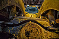
Deus ex machinaby snafflesComment: Hello from the critique club
An interesting image that contributes to the challenge
I like your chosen viewpoint and the use of the wide angle lens to emphasise the immense power of the working end of the machine. The viewpoint and the angle have enabled you to create something unique and quite powerful. There is some good detail of the metal that show its working scars and that this is a working ‘beast’. However, that same detail is not consistent throughout the image there is a definite imbalance between the sharper left and soft right but what also disturbs me are the linear striations of the shadow areas throughout, it somewhat resembles image noise but at your working ISO it quite clearly is not. |
| Photographer found comment helpful. |
| 01/16/2017 04:22:05 PM |
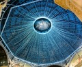
Festive domeby docjonnyComment: Hello from the critique club
An interesting image that contributes to the challenge
This was probably quite spectacular and impressive in the flesh, so to speak, though I think some of that has been lost in the image. Although your image features some of the impressiveness of the location I feel the symmetry you sought is not really evident from this composition. The partially hidden purple and red items within the lighting ‘cobweb’ once seen become too dominant to be dismissed. Your exposure is good with good detail throughout. Whilst I am no fan of obvious garish Christmas decorations this is subtle to the extent that it doesn’t really convey festivity it could easily be a permanent fixture. I am pleased that you have had some positive comments but its not quite hit the spot for me, sorry Jonathon. |
| Photographer found comment helpful. |
| 01/11/2017 06:30:25 AM |
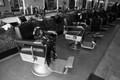
Old Time Barber Shopby clickodakComment: Hello from the critique club
An appealing image that contributes well to the challenge
A good choice of subject Marcel and well handled too. Those lovely old chairs look so comfy there must be a danger of falling asleep there! The chairs are what makes the scene work so your viewpoint is well chosen with the receding aspect of the room there is a sense of infinity to it. There is perhaps scope for more exposure but I think your exposure is preferable as the darker background enhances the distance. It looks good in mono too, preferable to colour. |
| Photographer found comment helpful. |
| 01/11/2017 06:22:36 AM |
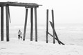
Take a walk with me down by the sea.....by Ja-9Comment: Hello from the critique club
An appealing image that contributes well to the challenge
A lovely high-key image, I have to agree with Jomari, this is more fine art than snapshot which is fully to its credit but perhaps not in terms of the challenge brief. I do like the mono processing, it makes the image both graphic and intimate at the same time. Your obvious choice of composition also enhances the end result. A fine image and result well done Janine |
| Photographer found comment helpful. |
| 01/10/2017 04:39:26 PM |
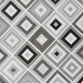
Square Textureby clickodakComment: Hello from the critique club
An interesting image that contributes to the challenge
An interesting find Marcel, I like your diagonal composition it adds a dynamic but for this square crop challenge I̢۪m not sure its quite so effective as a deliberate use of the squares could have been. I̢۪m imagining using the square patterns as the squares they are going in closer on just a couple of them and cropping in a way that would have one square dominating to say the thirds horizontal and vertical with the remaining space filled with elements of a couple of the adjacent squares. Such a composition may have enhanced the square concept thus fulfilling the challenge brief even more effectively. |
| Photographer found comment helpful. |
| 01/10/2017 04:28:47 PM |
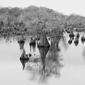
Dead Lakesby Ja-9Comment: Hello from the critique club
An interesting image that contributes to the challenge
What interesting trees or whats left of them in most cases! I̢۪m looking at your image carefully and trying to work it why its not quite hitting the spot for me and I can̢۪t quite explain it properly. I think the nearest I can come to it is that the main tree in the foreground has qualities that should make it really stand out from the background but it doesn̢۪t its merging too much into the background. Its rather as though the branches are a distinctly separate entity in their own right. What I do find more pleasing is a square crop of the lower half of the frame, an abstract of the reflections its really quite fascinating. |
| Photographer found comment helpful. |
Home -
Challenges -
Community -
League -
Photos -
Cameras -
Lenses -
Learn -
Help -
Terms of Use -
Privacy -
Top ^
DPChallenge, and website content and design, Copyright © 2001-2025 Challenging Technologies, LLC.
All digital photo copyrights belong to the photographers and may not be used without permission.
Current Server Time: 08/28/2025 07:27:21 PM EDT.