| Image |
Comment |
| 03/08/2017 09:09:45 AM |
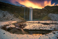
Seljalandfoss Waterfall, Icelandby Chris_AngComment: Hello from the critique club
An appealing image that makes a significant contribution to the challenge.
Good old Iceland! Another lovely landscape from this wonderful part of the world that has been well composed. I won�t labour the point but my main criticisms would be those already expressed about sharpening and saturation. I always fid it quite intriguing just how powerful and dominant a colour red is! The two people to the right and the smaller one a little higher up they really draw the eye, I think there would be a strong argument for some desat at least on the two. Apart from this Chris you have a lovely image that has been well received by your viewers, congrats on making the front page. |
 Photographer found comment helpful. Photographer found comment helpful. |
| 03/07/2017 11:54:57 AM |
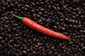
Proto-chiliby clickodakComment: Hello from the critique club
An appealing image that meets the challenge.
A great concept, well executed Marcel. The fiery red of the chili jumps out from the dark bean background which in itself adds to the culinary fell of the image is a whole. I like your diagonal composition this adds a real dynamism to the shot. The lighting is good, giving nice detail to the beans but really making the chili stand out well, the water, cliched as it is, undeniably helps too. This is gonna look really good in your kitchen, well done. |
| Photographer found comment helpful. |
| 03/07/2017 11:47:13 AM |
Hotelsby gintayComment: Hello from the critique club
An appealing image that meets the challenge.
Simple? Well yes, I think it works quite well in a simplistic way though not necessarily minimalist way Gin Tay, which may or may not, be relevant to what you were aiming to achieve. I like it, it works quite well but I�m wishing we didn�t have the edge of the board the way we do. I�m seeing a closer composition from the soft focus corner to the focus where it is on the red hotels with the car still out of focus but there is nothing but monopoly board. I don�t know if this would have been possible but it would have made me feel much more in monopoly land concentrating on those reds. |
| Photographer found comment helpful. |
| 03/07/2017 11:29:18 AM |
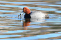
Aythya americanaby hahn23Comment: Hello from the critique club
An appealing image that meets the challenge.
I do agree Richard, that is definitely a red in my book too. However, the dominant colour here is the blue, its the first thing that hit me because it is spread throughout the image and whilst reds are normally so powerful in attracting your attention, the red here is secondary to the blues. In itself it is a lovely image, well executed with nice sharpness where its needed on the ducks eyes. I like the DOF and the nice soft foreground and background but I would prefer a less central composition, a diagonal using one of the hotspots would have greatly improved the end result. The standards of the rest of the entries need to be high to justify the placing�? I've only just seen dtremain's comment, I agree. |
| Photographer found comment helpful. |
| 03/03/2017 10:01:41 AM |
Snow Storm by clickodakComment: Well done Marcel. A perfect representation of the challenge brief. Wow, look at those ribbons lining up, star pupil... |
| Photographer found comment helpful. |
| 03/03/2017 09:56:57 AM |
The Barnby Ja-9Comment: Hello from the critique club
An appealing image that does not meet the challenge
I�m sorry Janine but I have to agree with Mike here, given the nature of the challenge, in my mind this is a long way from minimalist. You have found an appealing landscape and stamped your usual authority on it, there are no problems technically although the blues feel a little too strong they could do with pulling back a little. Obviously I don�t know what the rest of your scene was like but if you could have taken this from further away with the buildings much more insignificant then I think this would have come nearer to the challenge brief but even then that sky is very busy. The small galvanised shed on its own in the distance as a focal point would be much nearer to my idea of minimalist. |
| Photographer found comment helpful. |
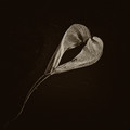
| 03/01/2017 07:54:21 AM |
World-weary heartby snafflesComment: Hello from the critique club
An appealing image the meets the challenge well
A lovely find for the subject Susan. The natural heart shape fits the challenge brief perfectly. The lighting is good bringing out the delicate details well. I like the diagonal of the heart that you have chosen for your composition. There is a little background distraction but it is not significant enough to adversely affect the end result. I hope your own romance is still thriving? |
| Photographer found comment helpful. |
| 02/27/2017 05:05:31 AM |
Gotchaby PhocalComment: Hello from the critique club
An appealing image that contributes well to the challenge
Perhaps not ruckus in the strictest sense of the word but this certainly captures a moment of conflict as detailed in the description. A great capture Ronnie, the timing is good and the poor crawfish�s demise is perfectly illustrated. The water drops add a dynamic to the moment. I do feel there seems to be a bit of over saturation it detracts somewhat, the colours throughout would benefit from some subtle desat. |
| Photographer found comment helpful. |
| 02/24/2017 02:25:48 PM |
Let the Eyes Do the Talkingby riotComment: Hello from the critique club
An appealing image that contributes well to the challenge
Another very appealing animal eyes study Eugene. If I hadn�t already seen �stray� I would probably be more impressed with this but of the two I prefer the other. As you say, the DOF is probably a tad too shallow but I am not too bothered about the nose it�s the eyes themselves that I�m referring to. The lower half of the eyes is not as bright and sharp as the tops, this is a little detrimental to the end result. I do love all the soft focus areas, in particular his lovely soft ears but I also like the abstract quality of his rear end. |
| Photographer found comment helpful. |
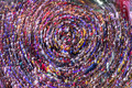
| 02/22/2017 06:49:56 AM |
Care for a Lollipopby gintayComment: Hello from the critique club
An appealing image that contributes well to the challenge
What a great creative entry Gin Tay, very appealing. However, I have to agree with Mike as indeed I think you do too, his comments are constructive. I do like your choice of subject it makes for a wonderful abstract that is full of dynamic energy. With the suggested cropping you have a unique and dynamic image that would grace any wall, well done. |
| Photographer found comment helpful. |
Home -
Challenges -
Community -
League -
Photos -
Cameras -
Lenses -
Learn -
Help -
Terms of Use -
Privacy -
Top ^
DPChallenge, and website content and design, Copyright © 2001-2025 Challenging Technologies, LLC.
All digital photo copyrights belong to the photographers and may not be used without permission.
Current Server Time: 08/28/2025 10:42:40 AM EDT.