| Image |
Comment |
| 11/12/2004 10:42:07 AM |
|
 Photographer found comment helpful. Photographer found comment helpful. |
| 11/12/2004 10:41:38 AM |
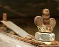
Jointedby ellulsComment: I think you had a great idea here - those rusty - rich texture nut, bolt and strap are very interesting. And I like how you have using depth of field with the right area sharp fading off into the background on the left. Compositionally this one would have been better if you had placed the right vertical threads more in the thirds position - leaving a little bit of "breathing" room on the right. |
| Photographer found comment helpful. |
| 11/12/2004 10:18:33 AM |
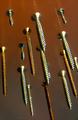
Screws attackby xoaoComment: I certainly like your theme here. The different sizes and colors on the screws keep my eye exploring the image. And your placement - while random - they are placed parallel to each other which keeps they eye moving well through the frame. The focus isn't sharp on any of them - which detracts from an otherwise excellent entry. |
| Photographer found comment helpful. |
| 11/12/2004 10:13:57 AM |
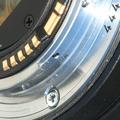
Canon Contacts 444by mickwestComment: Excellent idea. I like the way you have positioned the lines in a diagonal. Good focus on all the details. To the left of the 4's you have a hot spot that draws my eye. |
| Photographer found comment helpful. |
| 11/01/2004 08:13:55 AM |
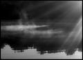
Incubation by ArtysteComment: We WERE close in the voting! You have an excellent shot here - nice and crisp focus - great depth of field -excellent exposure for the whites. And you have so many nice lines here -the rows of mints, the rows of shadows -even the rows of shadows on shadows. Congratulations on your well-deserved win! |
| Photographer found comment helpful. |
| 11/01/2004 08:08:08 AM |
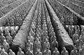
Battle Lines by CamComment: Congratulations on your blue ribbon! Excellent photo-well composed! It looks like such an amazing place. |
| Photographer found comment helpful. |
| 09/13/2004 09:38:26 AM |
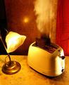
Frustrationby scalvertComment: This is great - expression - love the smoke out the ears! Great idea! |
| Photographer found comment helpful. |
| 09/13/2004 09:30:10 AM |
overdoneby coldaComment: Nice idea, but the overall image is not crisp enough. I think it would have worked better if the toast wasn't in the process of popping up. Made it blurred. I also think it would have worked better if you had balanced your colors better. It appears to yellow to me. |
| Photographer found comment helpful. |
| 09/13/2004 09:26:25 AM |
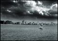
smog over the cityby whiteroomComment: I think smog shows up better in color - it is so obviously yellow and brown rather than fog which is white or gray. This looks more like clouds to me. Another technical point on this photo - your water line is not level. |
| Photographer found comment helpful. |
| 09/13/2004 09:16:01 AM |
|
| Photographer found comment helpful. |
Home -
Challenges -
Community -
League -
Photos -
Cameras -
Lenses -
Learn -
Help -
Terms of Use -
Privacy -
Top ^
DPChallenge, and website content and design, Copyright © 2001-2025 Challenging Technologies, LLC.
All digital photo copyrights belong to the photographers and may not be used without permission.
Current Server Time: 08/22/2025 07:02:07 PM EDT.