| Image |
Comment |
| 01/26/2007 09:05:08 AM |
Inoffensive Clawsby chipucComment: Very pretty, I love the spectrum of tones you got out of this. I also like the way you handled the shadows in the petals, not too much, not too little. You nailed it very nicely. GL. |
 Photographer found comment helpful. Photographer found comment helpful. |
| 01/26/2007 09:03:18 AM |
Yellowby helloiloveyouuComment: sorry, but this is DNMC! I do love the photo though, I love the idea. |
| Photographer found comment helpful. |
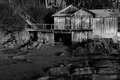
| 01/24/2007 05:35:33 PM |
Old Boat Houseby WinkComment: Diddo on the black and white comment you left me! I really like this one in black and white. I also like the dark feel you gave it instead of blowing the whites out of proportion. Though I must admit, I am more a dark person in overall taste of tone. Great, great photo. |
| Photographer found comment helpful. |
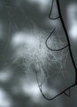
| 01/23/2007 01:16:24 PM |
Home in the Mistby smilebig4me1xComment: I thought this was a fishin pole with hooks by the thumbnail. I like the bokeh. The colors come across just a tad bit flat, and the web isn't popping out there. The first thing I notice is the bokeh, then the tree, then finally the web. The reason I mention this, is because it would appear the web is supposed to be the main subject, but it is contrary in the photo itself. |
| Photographer found comment helpful. |
| 01/22/2007 10:56:58 PM |
|
| Photographer found comment helpful. |
| 01/22/2007 10:55:08 PM |
Meramec-River.jpgby sheapodComment: Love it! You really caught this beautifully. I can almost smell the river just looking at it.
You know everytime I left Missouri, which has been alot, I always felt back at home when I smelled the river. I've come to love everything about that river. |
| Photographer found comment helpful. |
| 01/22/2007 10:51:09 PM |
Meramec-River3.jpgby sheapodComment: The hot spot in the water is distracting, the sky's blue seems too light, and a little flat, and the lime green above the hot spot seems a little over saturated.
Love ya, J. |
| Photographer found comment helpful. |
| 01/08/2007 01:32:25 PM |
Hardened by Life by SpizzerComment: Ok, wow, the big vs. The Pink Hat VS. The Crop. I gotta tell ya I don't like the hat much by the thumbnail, but when I open it I get the pleasent surprise of the contrasting colors with the eyes. To me I love the spirit in which you left the hat, and the photo is tremendous either way. Also the pink tells more of the story, so to make you think either he don't care, or he don't have the choice, both make an appealing hook. TY for entering, and congrats on the ribbon. |
| Photographer found comment helpful. |
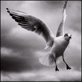
| 01/07/2007 02:40:08 PM |
Seagullby TychoComment: Wow, I love this photo. It popped out insanely in the gallery of photos. Great photo that is definately making into my favs. |
| Photographer found comment helpful. |
| 12/23/2006 11:18:37 AM |
Wish You Were Here (Pink Floyd)by LanceWComment: This is an amazing photo, a 9+ for a free study. The thing is for me, is that this totally sidesteps the challenge. Even if I could make sense of the title (and I can't), it really doesn't fit the mood of Pink Floyd. Perhaps another good title for this would of been "do you think they'll drop the bomb". As I said though, you really have an amazing photo here no doubt about it. |
| Photographer found comment helpful. |
Home -
Challenges -
Community -
League -
Photos -
Cameras -
Lenses -
Learn -
Help -
Terms of Use -
Privacy -
Top ^
DPChallenge, and website content and design, Copyright © 2001-2025 Challenging Technologies, LLC.
All digital photo copyrights belong to the photographers and may not be used without permission.
Current Server Time: 08/28/2025 12:24:26 PM EDT.