|
|
|
Showing 101 - 110 of ~728 |
| Image |
Comment |
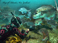
| 04/11/2009 07:58:48 AM | Come visit the beautiful New Zealand. by keriboiComment: This is a good fresh idea you brought to the postcard challenge, and I appreciate that. Colors great, sharpness good, composition is really nice. The text...ah..so, so. The format feels a bit square for a postcard, but I didn't take away any score for that. I think you did a great job, and if it were up to me you definately land a top 10, but its not, so good luck. |  Photographer found comment helpful. Photographer found comment helpful. |
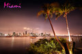
| 04/11/2009 07:51:49 AM | M i a m iby phloverComment: I'm not sure how this made it into my top 5. I just kept a look at it, and it grew on me steadily. I really think it says MIAMI, and the colors are fabulous. There is some blown out whites, and I'm not crazy over the text, you can obviously see there was some wind in the trees and shrubbery that hindered the photo a bit, but I never subtracted for it, because I personally like the setting it sets. I really dig the balance of the composition, the way the buildings end, and the trees fill in the space.
great job, good luck. 9. | | Photographer found comment helpful. |
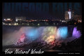
| 04/11/2009 07:45:50 AM | Your Natural Wonderby david_cComment: Great use of the text to your entry. Disciplined, and to the point. As for the photo, you did a great job. No overblown colors or lights, very smooth sharp look, and not alot of noise. I gotcha in my top 5, good luck. | | Photographer found comment helpful. |
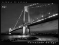
| 04/11/2009 07:43:30 AM | Gateway To Gothamby RulerZigzagComment: Well when its said and done this one made my top 5. I like how you drew out a very serine yet sophisticated look to your entry. I simple, its interesting, and its beautiful.
If I had one complaint, or critique it'd be I don't like the NYC text. The rest of the text seemed very discipined, and well put, but the NYC not so much. | | Photographer found comment helpful. |
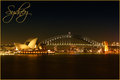
| 04/11/2009 07:39:04 AM | Sydney Iconsby GregoryBComment: Well I think I've got my scores finalized, and this one made it into my top spot. I love the warm colors you brought forth, and the text is simple, and very postcardish <---prolly not a word, but you get it. Very nice, good luck. | | Photographer found comment helpful. |
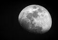
| 04/06/2009 06:30:44 AM | The Mooby Andrew1023Comment: Excellent, excellent. Very nice good, clean photo. As for postcard... | | Photographer found comment helpful. |
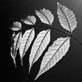
| 04/02/2009 10:21:27 PM | Veinsby mindbottlingComment: Well I love it, but I'm not sure if everybody else will. If it were up to me I'd finish ya in the top 10. Great job. | | Photographer found comment helpful. |
| 04/02/2009 10:20:16 PM | | | Photographer found comment helpful. |
| 04/02/2009 10:19:10 PM | Spilledby KarenNfldComment: My top 1. Great, great job. Love the tones, and mood it sets. A beautiful addition to anybodys home wall. | | Photographer found comment helpful. |
| 04/02/2009 07:09:50 AM | White brush strokesby parallaxComment: This is my underdog for a top 10 spot. Your vision was out of the box, and the colors, and compostion still hold my upmost attention. Fantastic vision, and fantastic set-up all the way around. | | Photographer found comment helpful. |
|
Showing 101 - 110 of ~728 |
Home -
Challenges -
Community -
League -
Photos -
Cameras -
Lenses -
Learn -
Help -
Terms of Use -
Privacy -
Top ^
DPChallenge, and website content and design, Copyright © 2001-2025 Challenging Technologies, LLC.
All digital photo copyrights belong to the photographers and may not be used without permission.
Current Server Time: 08/27/2025 11:46:38 AM EDT.
|