| Image |
Comment |
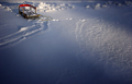
| 02/08/2007 08:07:48 AM |
Slidingby xianartComment: I really like the lighting in this image. I wonder how it would look if the shadow parts were even darker. Good job. |
 Photographer found comment helpful. Photographer found comment helpful. |
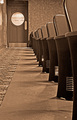
| 02/08/2007 08:05:38 AM |
Tickets Pleaseby ElaineComment: I really like the nostalgic feel that this image gives off. Reminds me of the theaters that I went to as a kid. The sepia tone really adds to the overall effect. |
| Photographer found comment helpful. |
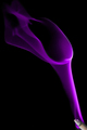
| 02/08/2007 08:03:11 AM |
Smoke Calla Lilyby levyj413Comment: Jeffrey, great job. It almost looks like silk instead of smoke. I gave this shot a 7. I'm going to have to try that sometime. |
| Photographer found comment helpful. |
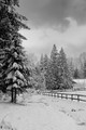
| 02/08/2007 07:58:40 AM |
A Barn Winterby jaysonmcComment: Jason, very nice snow scene. I'll bet this was a nice shot in color even with the cloudy skies. |
| Photographer found comment helpful. |
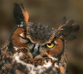
| 02/08/2007 07:56:20 AM |
Wink!by noranekoComment: You can't see it right now but I'm bowing to the master of wildlife. I gave this a 7. Excellent job. |
| Photographer found comment helpful. |
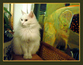
| 02/08/2007 07:55:03 AM |
No Good Looking at Meby raishComment: Very nice clean shot. I like the overall color scheme to it. You fit in well with Team Suck because your score should have been better. |
| Photographer found comment helpful. |
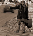
| 02/07/2007 08:56:52 PM |
Only Way Outby HipychikComment: Great shot Terry. The sepia tone really enhances this image. color would not have worked nearly as well. Nice to see somebody else from Mid-Michigan on DPC. |
| Photographer found comment helpful. |
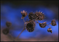
| 02/07/2007 08:48:07 PM |
Morticia's Bouquetby skewsmeComment: I like the way only one small part is in focus and the rest just fades back into nothing. The blue background really enhances the overall soft feeling to this image. Good job. |
| Photographer found comment helpful. |
| 02/07/2007 07:46:49 PM |
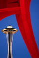
Icon vs. Sculptureby jaysonmcComment: Jason, I really like this shot and I'm surprised it didn't do a little better than it did. I was looking at this for a while trying to figure out what people didn't care for. After-all, the needle is very clear and nicely framed by the sculpture.
I'm just wondering if it's because the out-of-focus part is in the foreground and the in-focus part is in the background instead of the other way around. I think most shallow DOF shots are the opposite of what you have.
I don't know if that was it but it was just a thought.
By the way, I was up in that space needle in 1972 when I was stationed at PSNS for a while and I saw Led Zeppelin at the Seattle Center Coliseium (right near the space needle). At the time, it was called the Seattle Center. |
| Photographer found comment helpful. |
| 02/07/2007 12:03:29 PM |
Sunday morning with Marjorieby snafflesComment: This was done very well. The lighting is supurb and the whole "wood" thing really gives it a nice touch. I thought this should have scored much higher. |
| Photographer found comment helpful. |
Home -
Challenges -
Community -
League -
Photos -
Cameras -
Lenses -
Learn -
Help -
Terms of Use -
Privacy -
Top ^
DPChallenge, and website content and design, Copyright © 2001-2025 Challenging Technologies, LLC.
All digital photo copyrights belong to the photographers and may not be used without permission.
Current Server Time: 08/17/2025 05:04:37 PM EDT.