| Image |
Comment |
| 09/12/2004 07:25:22 PM |
Soccoro pearby hannafateComment: This is an example of what many folks in this challenge failed to achieve - subject and surrounding having plenty of detail, even subdued colors in many areas, without blowing everything out with atomic highlights. I like the extreme detail and the sharp contrasts. Congratulations. |
 Photographer found comment helpful. Photographer found comment helpful. |
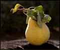
| 09/12/2004 07:20:19 PM |
and the sun comes down....by arbil14Comment: I'd be looking for more focus and detail in this image. It looks slightly cloudy. Nice idea though. Don't change the dark background. That works, except where the object it's resting on shows. Good luck with the challenge. |
| Photographer found comment helpful. |
| 09/12/2004 07:05:09 PM |
The Moonlight Power ....by kaske666Comment: Same set, different subject (an artichoke, bell pepper, tomato or apple), and I would have been attracted to the image a lot more. The image may also have been more concise with cropping which allowed more of the right and left edges of the circle to show, thus allowing the dark background to form more of the entire circle. Just my opinion. Good luck with the challenge. |
| Photographer found comment helpful. |
| 09/12/2004 06:52:43 PM |
Waiting....by PhotomamaComment: From my viewpoint, this image has lots of higher potential, depending upon how it is printed. Right now it appears to me to have too much bright highlight in the door window. You can't see any detail in the actual curtain except in a couple of places around the edge and at the bottom. If the curtain detail or pattern showed more, and the most extreme bright was toned down to the area where the young girl is peeking around the curtain it might tend to draw the eye more to the main action in the image and cause you to squint less. In other words, less is more. (If only I could do that with my commenting... ) At least that's my opinion. You may have already tried that and discarded it as a possiblity. It IS a nice image. |
| Photographer found comment helpful. |
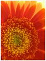
| 09/12/2004 06:42:06 PM |
Sunny Eveningby agwrightComment: I just love critiquing photographs. This image is an extraordinary example of why. You could sit here for hours and just get lost in the exquisite detail of those petals, in the blending of colors from bright yellows to bright orange/reds to dark orange/reds to yellows to dark yellows to yellow/greens to dark greens - all creating contrasts in a radiating pattern going outward from dark to light ... Of course, you know that. You took the image. Cool cropping, too. Congratulations. It's great! |
| Photographer found comment helpful. |
| 09/12/2004 06:34:11 PM |
Twilight timeby JinjitComment: This is the kind of image you expect to see people pick up for high class interior decorating. It really is a striking combination of colors, highlights and contrasts. The composition is such that everything (circular color scheme, grouping of plant stems, bright lights) draws you into the center focal point where all light eminates. Really nice image. Congratulations. |
| Photographer found comment helpful. |
| 09/12/2004 06:29:59 PM |
Poker's Mona Lisaby LucidLotusComment: You know, this is one of those photos that is so subtle that I passed it right by the first few times I was rating ... and then I viewed it while in just the right mood and, Bingo! It clicked. Its just so darn delicate and monotone that you have to look closely and then concentrate on patterns, subtle contrasts, shadows, focusing details, light gently seeping through ... I ended up adding multiple points to my first rating. Nice image. Thanks for sharing. |
| Photographer found comment helpful. |
| 09/12/2004 11:28:17 AM |
Imperfectby moviemanComment: You know, this is sick. Never-the-less, there is a gallery somewhere that would love it. Just not me. I'd rate it lower, but it has definite backlighting, detail and contrast. Where's the printing that says, "Danger: Do not place over your head!" ? |
| Photographer found comment helpful. |
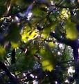
| 09/12/2004 11:25:19 AM |
Sunlight thru the leavesby GrandmaEMTComment: Hmmm... I really don't know where to go with this one. I can see a certain abstract quality, even modernistic bent to the image. But, there's something lacking in general appeal to me. It's not composition or balance, that seems to be there. There is backlighting. Maybe its because I try so hard to focus all the time with my bifocals. Sorry. Good luck with the other raters. |
| Photographer found comment helpful. |
| 09/12/2004 11:20:36 AM |
Summer Splashby davehugeComment: I think my major problem with this image is that it's so busy. The bright colors in the background are distracting. It also is hard to tell if we're getting side light reflections or any real "backlighting". I assume the cropping is because it allows you to concentrate on the sculpture and not on its base. I would have loved to see the tip of the top fin against the plain background. That would have helped some. Anyway, the glass itself has nice reflections and is focused properly along the side of the body and the front of the fin. A little more DOF might have brought out the tail, too. Maybe a black backdrop would help? Those are my thoughts - others may disagree. Good luck with the challenge. |
| Photographer found comment helpful. |
Home -
Challenges -
Community -
League -
Photos -
Cameras -
Lenses -
Learn -
Help -
Terms of Use -
Privacy -
Top ^
DPChallenge, and website content and design, Copyright © 2001-2025 Challenging Technologies, LLC.
All digital photo copyrights belong to the photographers and may not be used without permission.
Current Server Time: 08/05/2025 08:45:05 AM EDT.