| Image |
Comment |
| 08/04/2009 11:09:24 PM |
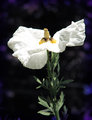
Ascending Angelby GeneralEComment: Greetings from Ernie of the Critique Club!
Subject: The flower definately meets the challenge description and is the obvious subject of the photo. It is well presented.
Composition: Nicely placed in the frame. I am not sure if a different view of the flower (from a different angle) would have improved this or not.
Technicals: Given your many contributions to this site I am sure that you are aware your highlights are overexposed in this image.
Improvements: The lighting appears to be harsh sunlight. I would suggest paying close attention to your camera's histogram to check for overexposure and compensating as needed, as well as either using fill flash or a portable light tent/scrim to cut down on the harsh sunlight. I think without the overexposure on the white petals this would have easily been in the mid 5's.
I look forward to seeing more of your entries in the near future. :)
Ernie |
 Photographer found comment helpful. Photographer found comment helpful. |
| 08/04/2009 11:01:32 PM |
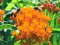
The cycle of lifeby kurtmooreohComment: Greetings from Ernie of the Critique Club!
Subject: Is the subject the flowers (the challenge topic) or the bees?
Composition: Unfortunately it seems to be quite centered and is not totally sharp. (the focus appears to be soft)
Technicals (exposure, noise etc): The image appears to have a great deal of noise (digital grain) which detract from the photo. It is almost like this is a highly cropped piece of an image. It also appears to be a bit too highly saturated. The orange of the flower seems to be almost unnatural.
Improvements: I noticed in the exif information on your photo that you used your digital zoom while taking this? It is never a good idea to use a point and shoot camera's digital zoom. Essentially all it does is crop your image to make it appear to be closer up. If you wanted to do that you could do so yourself in your image editing program afterwords and yet have much more precise control of the crop. If you then further cropped the image as you state in your comments then that would explain the noise in the image. You are actually using a very small portion of the original frame. I think the photo enhance application of Iphoto has oversaturated the colours here.
My suggestion would be to spend about an additional $70 and buy a copy of Adobe Photoshop Elements as your software for editing. It is available for a Mac and it can do about 85% of what the full version of PS can do, but at a fraction of the price. :)
Good luck. I look forward to seeing more of your images in the future. |
| Photographer found comment helpful. |
| 08/04/2009 07:49:09 PM |
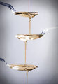
oeufs en laitby Ecce_SignumComment: Greetings from the Critique Club! Apparently it took us a little while to get to this...so I apologize for that. (hey, only a little over 3 years...)
I have seen your photography level grow by leaps and bounds since this was taken, but will still offer my opinion on this none the less. It is also rather ironic since I clicked the "take a shot at something older" in the CC que and the first one that pops up is by someone I just 10 minutes ago discussed drop shots with in a current thread!
As for the image, I think what really hurt this was the fact that the main attraction of the image (the crown from the splash) is small and also tough to distinguish from the background. I love the idea of the egg yolks to add interest and colour to the milk. I think a different background colour which contrasted with the subject...to make the subject stand out more would have helped this shot a lot. (Even though this challenge was "yellow" I think it still would have me the challenge even with a black background) |
| Photographer found comment helpful. |
| 08/04/2009 01:09:52 AM |
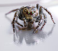
- username : SPIDER -by andrewtComment: I think this was a bit under-rated. It is a great portrait of a spider. Maybe the creepy factor worked against you. |
| Photographer found comment helpful. |
| 08/03/2009 12:30:25 AM |
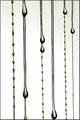
tieredby smurfguyComment: Great idea. Would be a bit better if they were offset a bit more. |
| Photographer found comment helpful. |
| 08/03/2009 12:28:43 AM |
|
| Photographer found comment helpful. |
| 08/03/2009 12:28:05 AM |
Greasyby LalliSigComment: Wow, I am sure that is not real oil on her cause no model would let you do that...but it sure looks convincing. 10 and a fave. awesome. |
| Photographer found comment helpful. |
| 08/03/2009 12:27:02 AM |
Stoneby raishComment: A nice different take on the theme. |
| Photographer found comment helpful. |
| 08/03/2009 12:26:31 AM |
|
| Photographer found comment helpful. |
| 08/03/2009 12:21:39 AM |
|
| Photographer found comment helpful. |
Home -
Challenges -
Community -
League -
Photos -
Cameras -
Lenses -
Learn -
Help -
Terms of Use -
Privacy -
Top ^
DPChallenge, and website content and design, Copyright © 2001-2025 Challenging Technologies, LLC.
All digital photo copyrights belong to the photographers and may not be used without permission.
Current Server Time: 09/04/2025 01:22:20 AM EDT.