| Image |
Comment |
| 08/17/2005 10:57:08 AM |
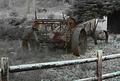
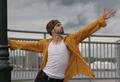
1836by res0m50rComment: Originally posted by Dreamerdoll:
I didn't score pics highly that had dates, such as yours, but the clothing or objects in the picture were clearly from this year. |
Uhhh!?!?!?
Review:
Challenge: Time Capsule
Details: Take a shot that depicts an era in time. Your title should be the year that you are trying to capture for future generations.
|
 Photographer found comment helpful. Photographer found comment helpful. |
| 08/16/2005 12:11:50 AM |
|
| Photographer found comment helpful. |
| 08/13/2005 01:07:15 AM |
The Way it Wasby bcobleComment: Good job. I agree about the blue hue in the fence. Other than that I like it. The picture is busy and by leaving some saturation it makes the subject stand out. Again Good job! |
| Photographer found comment helpful. |
| 08/11/2005 11:49:59 PM |
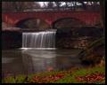
Trist Fallsby JeremyFleuryComment: Color looks good here. Some may think its over saturated but I don't think so. I think what is happening is the foreground is over powering the subject (bridge/waterfall). I would of like to seen the top of the bridge down a little more and not as much or any of the grass. I think this would balance the saturation. Hope that helps. With all that said I still think it's a good shot. Again I love the scene.
Nice use of ss, I like the water fall. Message edited by author 2005-08-11 23:51:35. |
| Photographer found comment helpful. |
| 08/11/2005 11:46:28 PM |
Trist Fallsby JeremyFleuryComment: Very nice site to take a picture. I feel the horizon needs to be straight as well. Looks to me like the picture has a haze over it, kind of like the contrast is off. Like you would see if taken through a car window or lens fogged up. Other than that looks good. I think it could use a little more processing. Good composition. |
| Photographer found comment helpful. |
| 08/08/2005 02:08:57 PM |
|
| Photographer found comment helpful. |
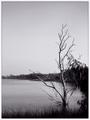
| 08/04/2005 01:06:43 AM |
Fencesby phinbobComment: I like B&W photography and your photograph is OK to me. The problem I see is my eyes are being drawn to the very back of the subject. The fence seems to be the subject to me but at the front it don't have any punch to keep me focused on it. My eyes are drawn to the three trunk behind the gate and it curving over the fence. There is not a lot of detail there. I would like to see the picture hold my attention from the gate forward but the contrast is very similar making the wooden fence blend in to the trees behind it. I think it could be a great shot with so editing to bring out that portion of the fence.
Can you upload the color version as well?
I like the composition and the detail. Good work but see if you can make us focus on the forward part of the fence on the rule of third (on the right) line. I'm not saying the rule of thirds have to always be in place I was just referencing a point on the fence. Message edited by author 2005-08-04 01:08:42. |
| Photographer found comment helpful. |
| 08/03/2005 12:48:39 AM |
|
| Photographer found comment helpful. |
| 08/02/2005 12:43:37 AM |
Reaching Out - Will Conleyby theSajComment: I like the composition. Nice and I also love the colors. A picture that makes you wonder what he is reaching out for. Good Job. |
| Photographer found comment helpful. |
| 08/01/2005 08:06:59 PM |
Reaching Outby aboutimageComment: Personally I like this one. It breaks some rules. A lot of negative space (sky) but it works well here. Gives me a since of solitude and reminds me of those days fishing by myself as a form of relaxation.
Agree with you - Robt. can give some good advice. And I'm sure swinging_johnson_v1 does the same.
Good Job. |
| Photographer found comment helpful. |
Home -
Challenges -
Community -
League -
Photos -
Cameras -
Lenses -
Learn -
Help -
Terms of Use -
Privacy -
Top ^
DPChallenge, and website content and design, Copyright © 2001-2025 Challenging Technologies, LLC.
All digital photo copyrights belong to the photographers and may not be used without permission.
Current Server Time: 08/18/2025 06:10:46 AM EDT.