DPChallenge: A Digital Photography Contest You are not logged in. (log in or register
 
Browse Settings
Currently viewing:
Registered Usergraphicfunk

Show comments:

Per page:

Order:

Comments:


Comments Made by graphicfunk
Pages:   ... [1432] [1433] [1434] [1435] [1436] [1437] [1438] ... [1528]
Showing 14341 - 14350 of ~15274
Image Comment
Stare
08/02/2004 03:19:09 PM
Stare
by Tiberius

Comment:
Killer shot. You get a solid 6.
Photographer found comment helpful.
Emerald Dragon
08/02/2004 03:18:02 PM
Emerald Dragon
by debitipton

Comment:
Very ompressive. You het a solid 6.
Photographer found comment helpful.
Malibu
08/02/2004 03:17:14 PM
Malibu
by bongo

Comment:
Wow: you have my 7
Photographer found comment helpful.
A different tomato!
08/02/2004 03:09:10 PM
A different tomato!
by Bela45

Comment:
Yeah, quite different. You have my 6 cause it is a very clear, sharp and wonderful color.
Photographer found comment helpful.
Lips
08/02/2004 02:58:49 PM
Lips
by sahko

Comment:
A very beautiful haunting image....
Photographer found comment helpful.
The Cello
08/02/2004 02:56:52 PM
The Cello
by silverleaf

Comment:
I love f holes. This is a very nice study yet I wish I could see the wood texture better. Nevertheless, a very strong image with nice warm colo.
Photographer found comment helpful.
Toboggan
08/02/2004 02:53:57 PM
Toboggan
by menardmam

Comment:
This is just too cute for words. The leaf hanging down with the white background make this a very arresting image. Of course a tighter focus on the bug would have made this a top ten image. nevertheless, I love it.
Photographer found comment helpful.
Chaplin
08/02/2004 10:22:23 AM
Chaplin
by basia03

Comment:

From the critique club:
I am embarrassed to admit that I was never a Chaplin fan abd as such the meaning here is beyond my comprehension. I will therefore address the shot from a compositional and technique point of view.

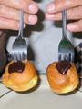
Also, allow me to add that the chocolate here is more of an addition as a dressing to the buns. This is not to deny your freedom to use chocolate in any manner you please, but only to point out that whenever you depart from the focus of chocolate you risk irritating those who did use chocolate as their main theme. It does not bother me, I rather see less as I almost got insulen shock while voting.

First, this is a very well composed visual with a hidden tilt of humor. Of course, it is food oriented but nevertheless the image is pleasing and does have a unique twist with the parallel lines running down. The forks and buns are in advantageous placing and the fingers very well posed. The picture has clarity at the cost of distracting shadows and here lies the major problem. You should always look at such a composition as a studio shot. This does not mean you need a studio, but you need studio lighting which means at minimum 2 lights and a couple of poster boards as reflectors. I have been in the photography business for many years. Since I got my Cannon 10D, I have yet to use the built in flash. I even avoid direct light most of the time. What this picture needed was a combination of lights. You could have presented the same clarity but with less strong shadows. Remember, photograpy is represented basically with light and shadow and strong shadows draw the eyes with the same force as highlights. You go to the shadow to receive a reward of finding some detail or serving as a contrast to the higher zones. When a shadow exist that adds no interest, then we have a minor problem. This is the major draw back to frontal flashes. They follow the eye level and leave obtrusive shadows. If you look at the image before you take it, you will usually find it pleasing but when you add the frontal light, it changes the meaning.

The picture has enough charm to stand on its own and one can see that you paid attention to detail, yet in order to compete, the lighting should have consisted of one main light with a fill. Also, to give it more interest a better choice of newer silverware, since the forks are very prominent.

I note in your comments that you are pleased with this choice. This is, after all, what matters most. I see enough reason to agree with you. You know, once we move a picture over to a studio look it changes character somewhat.

To conclude: It is a strong and interesting composition with the minor problem of the shadows competing with the image. Even with this, I too like the picture. dan

Message edited by author 2004-08-02 10:26:06.
Photographer found comment helpful.
Back from the Candy Store
08/02/2004 09:27:49 AM
Back from the Candy Store
by bmatt17

Comment:
From the critique club:
This is a cute picture with more a personal feel. It is well composed in so far as the general position. However, it is not the best for the challenge because the chocolate does not have a prominent role. It is acceptable to downplay the chocolate if the rest of the comp makes up for it.

Like I said this is a likable picture and one that the family and friends would be happy to look and enjoy. What follows is merely a suggestion on how to add a little more interest and make it more of a contender.

You opted for a studio-like background and this is okay, however, I would have decreased the dof to blur the backdrop a bit. Second, The shinny top creates an immediate problem because it will hog most of the light. So the general rule is: use bounced light for shinny objects instead of direct.

Next: the chocolate. If you want to keep the identical cropping than have the cute boy look at the chocolate instead of into the camera. Now, to add even more interest, I would have stayed with just brown chocolate and smeared a fair amount around his mouth. Of course, a tighter crop would have added more interest because it would bring the chocolate closer to the viewer.

I know just how these things happen. You state your idea and your models gets dressed and then you play with the viewfinder and somehow you decide to include more and more into the picture. After all, the outfit is so attractive, why not include more of it. Well, this is the temptation the photographer faces. There is always the natural impulse to include more at the cost of the main interest of the composition.

To conclude: Like I said, these are merely suggestions. The picture has enough value to stand as is. You seem to have the talent to pull a composition together. You just need to keep more focus on the subject in order to exploit its meaning.
Photographer found comment helpful.
blue herron under a blue moon
08/02/2004 12:44:31 AM
blue herron under a blue moon
by koolaid26

Comment:
Very enchanting.
Photographer found comment helpful.
Pages:   ... [1432] [1433] [1434] [1435] [1436] [1437] [1438] ... [1528]
Showing 14341 - 14350 of ~15274


Home - Challenges - Community - League - Photos - Cameras - Lenses - Learn - Help - Terms of Use - Privacy - Top ^
DPChallenge, and website content and design, Copyright © 2001-2025 Challenging Technologies, LLC.
All digital photo copyrights belong to the photographers and may not be used without permission.
Current Server Time: 08/27/2025 04:10:34 PM EDT.