| Image |
Comment |
| 02/01/2005 12:03:50 AM |
|
 Photographer found comment helpful. Photographer found comment helpful. |
| 01/29/2005 01:11:37 AM |
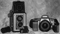
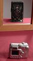
Photography Then & Nowby ChefbozComment: Several thing come to me when I see a picture like this. Firstly, this is the 20th of this subject that I have seen in this competetion, what makes this one so unique and interesting? When selecting a composition for the challenges, you'll find that certain subjects are rather commonplace and when you come into an overlap situation such as that, yours had better be damn good or you lose simply through association. The old and new camera is that type of photo. The old camera that you have on display is really a beautiful subject and has been diminished to a boring catalogue piece of metal. The background does not enhance the old camera but rather washes it out. The new camera has glare on it and the whole photo is slightly out of focus. The shot appears to be a show and tell type of photo lacking any creative effort. The subjects are too centered which also weakens the composition. Your photo does meet the challenge definition but does not inspire the viewer to look at it any further than that. Good luck. |
| Photographer found comment helpful. |
| 01/28/2005 12:09:56 AM |
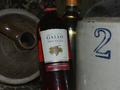
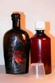
Spirits of the Past & Presentby notbiscuitComment: Though this photo does meet the challenge description, it lacks any creative impact. I see fingerprints on the wine bottle. Flash glare on the white wine bottle and upholstery behind the presentations. The jugs would have been a better focal point since they are alot more interesting. The title is well thought out and is soooo much stronger than this image can ever hope to be. This shot looks like it was slapped together at the last minute in order to get into the challenge. You have an ability to weave title with challenge but the photo falls short of your cleverness. By the way, the lamb entry is damn funny and quirky. |
| Photographer found comment helpful. |
| 01/27/2005 10:58:15 PM |
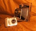
Picture of the Pastby eaemthomasComment: This picture completely lacks creativity. It is simply a literal presentation needed to fulfil the challenge requirements and that is all. Both cameras are displayed equally whereas the older model is far more interesting and should have been more of a focal point. The damask background does not fit in at all and is very distracting and is not smoothed out. This creates wrinkles which I noticed right away. Both camera lenses have flash flares and the Minolta body moreso. When I do not see any creativity in an image I tend to focus on the technical and that is not the purpose of a photo competition. I would suggest that you sell the sizzle and not the steak. In this case, the shot has no sizzle whatsoever and the steak is tough to digest. |
| Photographer found comment helpful. |
| 01/27/2005 12:40:01 PM |
Grandfather's Voigtlander vs Grandson's Nikonby nsmithComment: Unfortunately, being a photography website you can expect that this type of theme is used excessively. That being so, it makes the photgrapher's work that much harder because it is not original. The overall focus of the shot is not too bad but it is very evident where your primary light source originates thus resulting in shadows. You have decided to incorporate a frame in the photo yet it is just sitting there acting more as an eyesore than an enhancement. I would have used the older camera as the primary focus because it is so much more interesting than these new plastic cases we all have. The subjects are too centered and are presented in a catologue manner. Your willingness to include things to dress up the shot is admirable but adding some creativity could have given more favorable results. Hope that helps. |
| Photographer found comment helpful. |
| 01/27/2005 11:58:33 AM |
Corks to Threadsby AJFIComment: The title is interesting and it took me a while but I had figured it out. The old bottle is veryunique and had it been presented a bit more creatively, It could have acted moreso as a central focus. Since the title refers to the closure, there is no need for the plastic cup in the forefront which really glares and does nothing for the shot. It looks like you got some flash on all of the subjects and could have eliminated that with the use of a desk light with a sheet over it. The subjects are too centered and the background does nothing to add to the photo. On the other hand, the focus is not too bad. |
| Photographer found comment helpful. |
| 01/27/2005 02:01:29 AM |
|
| Photographer found comment helpful. |
| 01/27/2005 01:59:27 AM |
|
| Photographer found comment helpful. |
| 01/27/2005 01:56:31 AM |
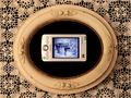
Mikey Writes Homeby DebN2003Comment: This shot is very suiting and kind of quirky. I'm thrown off by the color of the frame and feel that you could have increased the saturation on the red a bit more. Good luck. |
| Photographer found comment helpful. |
| 01/27/2005 01:54:41 AM |
Light Sources: Old and Newby orussellComment: I confess that I am not that crazy about this image but I am very impressd how you have presented your idea. There are alot of these and I think you have made yours very interesting. Good luck! |
| Photographer found comment helpful. |
Home -
Challenges -
Community -
League -
Photos -
Cameras -
Lenses -
Learn -
Help -
Terms of Use -
Privacy -
Top ^
DPChallenge, and website content and design, Copyright © 2001-2025 Challenging Technologies, LLC.
All digital photo copyrights belong to the photographers and may not be used without permission.
Current Server Time: 08/05/2025 06:54:51 AM EDT.