| Image |
Comment |
| 11/28/2004 11:13:19 AM |
Authority Figure Lincolnby prbettsComment: Interesting angle. Lincoln looks so forlorn in this rendering. Beautiful value range and use of light and shadow. I think shooting this in profile was a good decision. |
 Photographer found comment helpful. Photographer found comment helpful. |
| 11/28/2004 11:11:39 AM |
Female Controlby ValdoComment: I am somewhat confused by this image, but it doesn't completely miss the mark. The clear focus on both of the women's faces works well. I especially like the one in back. I would have cropped to just her, great expression. It does communicate well. |
| Photographer found comment helpful. |
| 11/28/2004 11:08:12 AM |
Between Quartersby moswynComment: I like the way this image is framed and the crisp focus on your subject: the basketball is stunning and the flag on the sleeve is a nice touch. The posture of your subject is perfect; as the wife of a basketball coach, I can't tell you how many times I have seen this stance. Really nice shot which fits the challenge well with a twist. Great job. |
| Photographer found comment helpful. |
| 11/26/2004 09:19:14 AM |
Big Brotherby cloudsmeComment: This is a brilliant visual. I like the messy room and the vibrant, competing colors. The expression on your subjects' faces says it all. The hopefulness and admiration of the little one is precious. The use of the ladder to physically show what is happening emotionally and socially between these two is genius. Amazing photo. |
| Photographer found comment helpful. |
| 11/26/2004 09:17:11 AM |
That's Enough!by GPComment: Creative and risky choice in the framing of this image. The harsh light and shadow work well with the intensity of your message. I like that your subject moves off the right side of the frame, but there is a little too much negative space on the left. I know this was an artistic choice and I do like the idea of more negative space there than ususal, it just feel like a little too much so that it takes away from your main visual. Kudos on your courage to risk! |
| Photographer found comment helpful. |
| 11/26/2004 09:14:15 AM |
Rules of the Gameby kearockComment: Nice framing, color, and focus on your subject. It would have been nice if you could have gotten rid of the person behind him, but this was basic editing so your options were limited in dealing with that. I like the expression on your subject's face and also the soft focus on the fans and players behind him. The image works well, except that darn person behind your subject. |
| Photographer found comment helpful. |
| 11/26/2004 09:11:31 AM |
The Source of All Power, The Root of All Evil.by RanklesComment: Interesting visual. The dark coin in the middle lower front bothers me because of the negative space it creates. I want an underlying, important coin there, perhaps one that make a political statement. |
| Photographer found comment helpful. |
| 11/26/2004 09:10:02 AM |
Because I'm the Queen, That's Why!by debitiptonComment: You certainly get your point across. I would not want to get on the wrong side of this queen unless I was her mother. Then I think I would want to "dethrone" (and I mean that in the figurative sense only) her as ruler of the domestic domain. You evoked immediate and intense emotion within me, and that is certainly one measure of the success of a piece. Great technical choice in bringing down the brightness and up the contrast so that our focus is exclusively on the subject and the amazing job you did in capturing her expression. Really fantastic image! |
| Photographer found comment helpful. |
| 11/26/2004 09:06:33 AM |
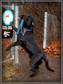
Checking the Rules before using the Trailsby miriam_mrbComment: Get sense of humor. The brilliant orange leaves against the black coat of your subject is visual striking. I like that you blew out the whites on the sign, giving it less impact so the viewer's focus stays with the dog. This photo works well for me. |
| Photographer found comment helpful. |
| 11/26/2004 09:04:49 AM |
|
| Photographer found comment helpful. |
Home -
Challenges -
Community -
League -
Photos -
Cameras -
Lenses -
Learn -
Help -
Terms of Use -
Privacy -
Top ^
DPChallenge, and website content and design, Copyright © 2001-2025 Challenging Technologies, LLC.
All digital photo copyrights belong to the photographers and may not be used without permission.
Current Server Time: 06/17/2025 06:00:07 PM EDT.