| Image |
Comment |
| 05/21/2006 08:52:38 AM |
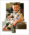
test-pic.jpgby timfythetooComment: I'd have to agree with Elvis about his chin. I'd prefer to see his whole face on one panel. Great work and a good result! Well done! |
 Photographer found comment helpful. Photographer found comment helpful. |
| 05/14/2006 11:29:05 PM |
Ernie,s Dead2by KronusComment: Near the railway tracks hey? Possible suicide or something more sinister? ;) |
| Photographer found comment helpful. |
| 05/14/2006 09:15:22 AM |
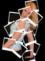
Patchwork Memoriesby RikkiComment: Originally posted by omikeo:
yep very cool, is that you ? |
Yes....I think it is him!! ;)
Great work Rikki. I know the photo you were referring to and you have done well! |
| Photographer found comment helpful. |
| 05/12/2006 11:46:15 PM |
Bearing the Crossby angela_packardComment: * Greetings from the Critique Club *
Hmmm...interesting photo here. Reading through the comments you received it appears some people didn't like the theme you used, but as for myself being a very non-religious person I won't take any view on it here.
The main thing that I see looking at this photo is that she's not really popping out from the background. Her outfit and the rock formations kind of blend together to a certain degree. I've noticed in your comments that you used a little dodge and burn on the photo. In my opinion I would of liked to have seen a little more, especially on that awesome cloudy sky in the background and a little more on the rock formations (which by the way are really cool).
The focus seems pretty crisp and it's a nice balancing DOF that you've used. Maybe you could of tried the a slightly different crop so she wasn't so central or maybe shot from a slightly different angle? It's hard to say without having been there and seen what was around, plus, as you mentioned it was for a dance shoot.
Overall it's a nice photo. I'm not a big fan of the expression on her face though. Maybe a slightly different pose with the cross could of made this a lot more powerful?
Maybe some of these points may of helped your score a little, it's always hard to say because everyone has differing opinions. You've got some fantastic photos in your portfolio there so keep at it. I'm sure more ribbons will come your way!
Neil
|
| Photographer found comment helpful. |
| 05/11/2006 10:24:00 PM |
Rusticby fplouffeComment: Yeah...it's just that pole that annoys me a little and the walls on the side. It is a hard one to crop it so they are a little off-centre though without losing some of the bottom half of them. The contrast that Laurie mentioned would definately help bring them out from the background. Well worth playing around with and trying it some different ways because this photo has good potential. Well done! |
| Photographer found comment helpful. |
| 05/11/2006 10:20:26 PM |
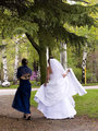
Whatch For The Dressby fplouffeComment: I'm a big fan of these 'walking between location' shots. They can be very natural. Nice colours in the background. The dress doesn't look too blue on my monitor. Nice shot! |
| Photographer found comment helpful. |
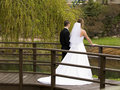
| 05/11/2006 10:18:24 PM |
The Bridgeby fplouffeComment: Wow. This is cool. A really great idea for a wedding shot. You could of even taken one similar but having them leaning over the front rail so their faces are visible. Once again I agree with Laurie just to crop it slightly to remove those stairs at the top! Good stuff! |
| Photographer found comment helpful. |
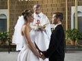
| 05/11/2006 10:16:33 PM |
Blessingby fplouffeComment: Yeah....agree. Just crop it in a tad to remove that lettering. Though I think if you rotate it it'll throw out the gold stands in the background and then look skewiff!!
Well done. Atleast the priest doesn't have a big microphone that he sticks in their faces when it's time for them to exchange vows. I've done a few of those and it makes for really ugly photos! |
| Photographer found comment helpful. |
| 05/08/2006 05:54:17 AM |
Angeline and Richardby judojoeComment: Just lost a few of the highlights there in the top of the flowers and his collar. Nicely framed though. Good work! |
| Photographer found comment helpful. |
| 05/08/2006 05:52:22 AM |
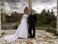
Carole.by judojoeComment: Yes! Britain indeed. Reminds me of the lady off To The Manor Born or whatever it was called! You could use the unsharp tool to tweak her facial features a bit and work on the saturation as well! In my experience I find a lot of people do like vivid colours in their wedding photos so don't be afraid to experiment. |
| Photographer found comment helpful. |
Home -
Challenges -
Community -
League -
Photos -
Cameras -
Lenses -
Learn -
Help -
Terms of Use -
Privacy -
Top ^
DPChallenge, and website content and design, Copyright © 2001-2025 Challenging Technologies, LLC.
All digital photo copyrights belong to the photographers and may not be used without permission.
Current Server Time: 08/14/2025 10:11:02 PM EDT.