| Image |
Comment |
| 08/07/2003 12:21:49 AM |
|
 Photographer found comment helpful. Photographer found comment helpful. |
| 08/07/2003 12:21:09 AM |
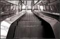
Cloning: Now I can really play with myself!by kiwinessComment: nicely done. the only part that looks out of place is the leg of the leftmost version of you.
i'm not exactly sure if the "playing with yourself" reference was tongue-in-cheek or not, but i enjoyed it.
congrats! you stole my idea! |
| Photographer found comment helpful. |
| 08/04/2003 09:20:26 AM |
|
| Photographer found comment helpful. |
| 08/04/2003 09:20:02 AM |
|
| Photographer found comment helpful. |
| 08/04/2003 09:18:19 AM |
|
| Photographer found comment helpful. |
| 08/04/2003 09:16:37 AM |
|
| Photographer found comment helpful. |
| 08/04/2003 09:10:20 AM |
|
| Photographer found comment helpful. |
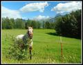
| 08/03/2003 12:25:50 AM |
Tuolumneby JPRComment: Hi from the Critique Club --
First Impression: A GREAT shot! Beautiful!
What I like: Well, actually...What I Love: color, focus, subject, scenery, exposure, levels -- all perfect. Just gorgeous. I can't think of anything to improve upon.
What I don't like: I'm afraid I'm going to have to go with the majority of the commenters and say that I don't see the "contrast" in this photo, unfortunately. I know the desire to post a shot like this and hope people make it fit the challenge, but I think this would be a winner for landscapes, postcards, travel, etc... Just not right for "Contrasts"
Congratulations. I'm blown away.
Rob |
| Photographer found comment helpful. |
| 08/03/2003 12:22:27 AM |
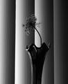
Reaching for the lightby ladpupmoeComment: Howdy from the Critique Club --
Just to start, this is a very striking image that I enjoy quite a bit. It fits the challenge well and was obviously well-received. Congratulations on a great shot.
What I like: the use of the vertical blinds as a backdrop is excellent -- a relatively common object that has a pattern that's easy to contradict. The shape of the flower really pops from the background and that's excellent for this challenge.
What I don't like: the vase. I think this picture would be more effective if the flower by itself was presented as the contrast to the background. I say this for two reasons. One: The reflections of the blinds in the vase make it blend into the background when you want it to pop -- and i totally know that it's very hard to shoot really shiny objects like that. Two: the vase is too vertical, again making it blend into the background too much. The wavy top helps, but again I think the flowerhead alone would have more impact. A bit more lighting on the flower would also help clear up a little of the darkness -- not too much, but just a tiny bit more detail.
Overall, excellent. A photo to be proud of. |
| Photographer found comment helpful. |
| 07/31/2003 10:23:23 AM |
|
| Photographer found comment helpful. |
Home -
Challenges -
Community -
League -
Photos -
Cameras -
Lenses -
Learn -
Help -
Terms of Use -
Privacy -
Top ^
DPChallenge, and website content and design, Copyright © 2001-2025 Challenging Technologies, LLC.
All digital photo copyrights belong to the photographers and may not be used without permission.
Current Server Time: 06/18/2025 02:51:32 PM EDT.