| Image |
Comment |
| 07/14/2005 11:50:47 AM |
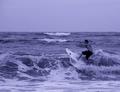
Morning Surfby idnicComment: the coloring makes the surfer blend in with the bg too much. depending on the original, this might have been better in color. |
 Photographer found comment helpful. Photographer found comment helpful. |
| 07/14/2005 11:50:00 AM |
|
| Photographer found comment helpful. |
| 07/13/2005 12:13:56 AM |
|
| Photographer found comment helpful. |
| 07/12/2005 05:37:09 PM |
|
| Photographer found comment helpful. |
| 07/12/2005 05:36:54 PM |
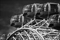
spacepods.jpgby FalcComment: B/W Club!
i really enjoy this shot. it's got great lines and structure and really blends itself to b/w.
it seems that the top half is a bit dark and the bottom half is a big bright. part of that might be the available lighting, but it does seem to be an abrupt shift from dark to light and it's a bit jarring. i think too the whiteness of the structure takes away from the pods themselves which i feel are really the subject.
composition and cropping are excellent. i love stuff cut off on one side or the other. :) |
| Photographer found comment helpful. |
| 07/12/2005 05:29:34 PM |
Convolutedby sherComment: B/W Club!
gosh. i just love this image (i just noticed that i was one of your three 10s :D ). the noise and dof really speak to me. the tones are just stellar and really run the gamut from white to black. excellent work! |
| Photographer found comment helpful. |
| 07/12/2005 05:27:51 PM |
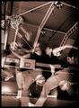
Mother and Daughterby admart01Comment: B/W Club!
i love this shot. it really tells a story and gives some emotion. i'm not a big fan of selective desaturation -- here i think this image is powerful enough without the need to draw the user to the ring (i think the ring is only pertinent if this were a shot of a couple or if there were two rings to work with).
the color and tones are great. the dark sweater sleeve is SO dark that it leaves a little bit of a hole in the shot, but it's nothing that can't be corrected just a tad. :) |
| Photographer found comment helpful. |
| 07/12/2005 05:24:52 PM |
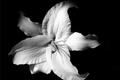
Asian Lilyby admart01Comment: B/W Club!
i think this is really a stand-out image. the full-frame composition might be a bit much because i think this should be further framed with some "white space" (or, in this case, "black space") to give the viewer a little bit less white to take in.
i also think that just a touch more lightness on the tips of the petals would work better. they seem to trail off into nothingness before their shape is complete and it interrupts what is otherwise a nice leading line. |
| Photographer found comment helpful. |
| 07/12/2005 05:22:33 PM |
Painted with fireby tristaliskComment: B/W Club!
this is a striking shot and i totally agree with you that the color is much stronger than the b/w. gorgeous gorgeous color here -- no reason to mess with it. |
| Photographer found comment helpful. |
| 07/12/2005 05:21:20 PM |
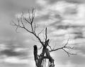
Deadwoodby TruegshtComment: B/W Club!
good range from black to white while limiting the "blown out" areas. i like the rule of thirds for the composition, but it could even be shifted left or right even more to break up the balance a bit.
a little more detail in the clouds and the bark would help as well. i think there are more tones in this that we can improve upon. |
| Photographer found comment helpful. |
Home -
Challenges -
Community -
League -
Photos -
Cameras -
Lenses -
Learn -
Help -
Terms of Use -
Privacy -
Top ^
DPChallenge, and website content and design, Copyright © 2001-2025 Challenging Technologies, LLC.
All digital photo copyrights belong to the photographers and may not be used without permission.
Current Server Time: 06/22/2025 04:23:00 PM EDT.