| Image |
Comment |
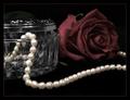
| 04/29/2005 12:41:58 AM |
Simple Eleganceby ShannonComment: And you did an elegant job, pearls are hard to shoot. Any less light and we would lose detail of the other items in the shot any more light and the pearls would be completely blown out. Excellent job...the only thing that I would like to see different is those pearls on the bottom near the front a little sharper. high marks. |
 Photographer found comment helpful. Photographer found comment helpful. |
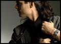
| 04/29/2005 12:35:04 AM |
OUTBACKby DrJOnesComment: I really like this shot. Even though the watch is not the center of focus you definately know its there. The lighting is superb, excellent profile. One of my top picks. I am still un-decided about the crop, I'm thinking I would like to see it not so tight on the top...but do understand that in a 640x640 challenge that if you cropped it any less that the watch would become smaller and you might lose people around DPC. |
| Photographer found comment helpful. |
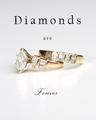
| 04/29/2005 12:28:50 AM |
Diamond Wedding Ringby -crtComment: Nice, Clean and Simple. This is a very good shot. I personally would have stayed with one font throughout the advert, completely different fonts tend to make my interest point switch between the top and bottom of the shot making the rings secondary. The same font here would act to frame the ring keeping my interest in the center of the shot. The rings themself seem a little soft and lacking detail but this is still a very good shot and I marked it higher than most. |
| Photographer found comment helpful. |
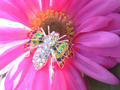
| 04/29/2005 12:20:31 AM |
A little something extraby buzzmomComment: Very nice broach or pin I believe. With this piece of jewelry I might have gone with a plain black background. The piece itself has a lot going on with all it's festive colors there is no need to add anything that could distract the viewer.
If I had to go with the bug/flower theme that you are trying to achieve here, I might have done it in the shade to avoid the hot spots that seem to pull my eye to the left. It is a colorful broach but the bright light on the petals is overbearing and draws me in that direction. Cool concept. |
| Photographer found comment helpful. |
| 04/29/2005 12:11:15 AM |
Diamonds Are A Girl's Best Friendby DeniseBernadetteComment: Cute shot and lovely expression, however there is more emphasis on the little girl's expression than the jewelry itself. There could be two different approches to throw interest back on the ring. Well thought out text or desaturating everything but the ring. Lighting on the ring could have been a tad bit better as some of the detail is blown out a bit. |
| Photographer found comment helpful. |
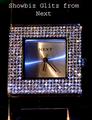
| 04/29/2005 12:04:01 AM |
Showbiz Glitz from Nextby benhurComment: Quite an interesting watch with a lot going on here. I might have tried a different angle: (turned the watch slightly to right or left) 1. So it didn't appear so calculated, the crop is tight and the watch face being square gives a boxed in feeling. 2. With a different angle there would be more depth to to the shot and we might be able to pull more detail from the stones on the face.
Also I might have used more light, I don't have a lightbox or tent so I would have rigged a set up with a white sheet and shinned lots of light from both sides through the sheet on to the watch in order to use a small f/stop to obtain focus through the whole shot. |
| Photographer found comment helpful. |
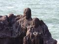
| 04/24/2005 10:30:20 AM |
stone offeringby kenboComment: Pretty neat shot. Carvings are clear and focused. I might have adjusted the shadows level up a bit to bring out just a little more detail in the faces. For myself I would have chosen a portrait crop for this situation. Using the thirds rule, I would have the taller statue in the left third, smaller on in the center and negative space (water) in the right third. |
| Photographer found comment helpful. |
| 04/21/2005 01:13:46 AM |
OOPS!,Is there a Riot going on outside?by soheilComment: Very nice shot. I don't know that duo tone was the best way to present this as the hands and triangle in the the upper left really stand out. I like how you have made all elements of the challenge hidden but stand out equally as much. Good job. |
| Photographer found comment helpful. |
| 04/21/2005 01:10:44 AM |
|
| Photographer found comment helpful. |
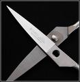
| 04/21/2005 01:07:55 AM |
you better start talkin, mr. paper!by saintaugustComment: I like the creativity behind this one. Cool composition. Personally the only that I would like to see different would be the lighting on the hot edge of the scissors, beyond that great shot. The crop bodes well here. |
| Photographer found comment helpful. |
Home -
Challenges -
Community -
League -
Photos -
Cameras -
Lenses -
Learn -
Help -
Terms of Use -
Privacy -
Top ^
DPChallenge, and website content and design, Copyright © 2001-2025 Challenging Technologies, LLC.
All digital photo copyrights belong to the photographers and may not be used without permission.
Current Server Time: 08/05/2025 06:55:56 AM EDT.