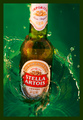
A Stella Diveby
hotpastaComment: Hey there Hotpasta, Greetings from the Critque Club.
Great shot, well executed concept and the border works in this instance as a means to contain the action. The border even acts to push the viewer inward nice subtle touch.
They play on words in the Title is a welcome asset. The colors all work well together, however the more critical dpc'ers may nit pick about how the Green background overpowers the (I believe Stella's come in a green bottle) subject of foreground object.
Possibly your intention (I can see that) was the green water and not the bottle at all. Many weekend warriors of DPC would focus on the bottle/action that is taking place.
To confirm my Observations (Opinion) I will bring a shot down and study it locally, as I did with yours.
I honestly believe the biggest contributor to your score was that it seems a bit soft. Possibly a faster shutter would have sharpened it up a bit, but the shoot as it stands I might have done one more sharpen after the resize to clear up the lettering on the labels, doing so also sharpened the water droplets and that edge (little wave) that surrounds the bottle. Again I beleive that a touch of sharpen might have brought this up a whole point in the challenge.
When I studied the shot, just after the sharpen (which added a little contrast on it's own) I also went into to Levels and darkened just a tiny bit and then added a bit more contrast by sliding the upper right handle in levels to the left just a bit. The greens seemed to jump out a bit more.
This is a really great concept/composition and I know it was a bit of work to get that feel you were looking for. The voters as usual probably wanted to see a little more pop and sharpness.
Still this is a great job at not so easy a subject.
Andy