| Image |
Comment |
| 05/05/2003 05:41:14 AM |
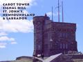
Cabot Towerby orussellComment: nice choice of font and a good timing for taking the image.. I like the fact that the human being is at the right place in the overall composition. The font works well with the overall intent of the image. Perhaps it is a too close to the tower..that part is a little disturbing.6 |
 Photographer found comment helpful. Photographer found comment helpful. |
| 05/05/2003 05:35:14 AM |
Surf, Sand and Sunby JeileenComment: I like the movement in the text and the overall image, I think the text is a little too overpowering for the image. may be a lighter color would help. |
| Photographer found comment helpful. |
| 05/05/2003 05:20:08 AM |
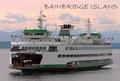
Bainbridge Islandby mzanoniComment: A little more breathing space on the left would have helped as movement is towards the left. The font size canbe smaller and/or moved a little up.
I like this shot and colors. 6 |
| Photographer found comment helpful. |
| 05/05/2003 05:17:01 AM |
Fargo, North Dakotaby alanfreedComment: I guess the text is too bold and interfering with the pillar in the image.Perhaps a little more of the foreground could have been avoided. A little more breathing space on the top also would have helped.6
|
| Photographer found comment helpful. |
| 05/05/2003 05:11:54 AM |
Windy City by pitsamanComment: Nice lighting and timing for shooting the frame. I think the choice of font and the size of font could have been better. Also SanSerif fonts work better with old architecture.
Also shutter speed choice is appropriate all the fountains to give an verall soft effect. |
| Photographer found comment helpful. |
| 05/04/2003 05:27:28 PM |
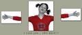
Narcissusby salparadiComment: A littel more black space on the top would have helped!
Zoom out image one a littel bit, that may bring in more harmony as the amount of white has increased in image three.
It makes me think! I like it.. |
| Photographer found comment helpful. |
| 05/04/2003 05:05:57 PM |
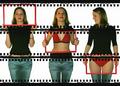
X-ray frames by kiwinessComment: These ones look harmless!!
I like the way you have created interest in the composition by the third face looking into the frame. Perhaps face one could also have been a little different to create more interest...
|
| Photographer found comment helpful. |
| 05/04/2003 04:52:55 PM |
After the Rainby KazComment: image one and two make a great composition together!! Was the third one really required?? |
| Photographer found comment helpful. |
| 05/04/2003 04:49:02 PM |
Lick It, Slam It, Suck Itby rickhd13Comment: I guess you need some more vitamins in your diet!!
Nice colors.. if the central image was a little more zoomed in and was croped a little at the bottom edge, I feel it could have made a better composition. |
| Photographer found comment helpful. |
| 05/04/2003 04:46:29 PM |
|
| Photographer found comment helpful. |
Home -
Challenges -
Community -
League -
Photos -
Cameras -
Lenses -
Learn -
Help -
Terms of Use -
Privacy -
Top ^
DPChallenge, and website content and design, Copyright © 2001-2025 Challenging Technologies, LLC.
All digital photo copyrights belong to the photographers and may not be used without permission.
Current Server Time: 08/04/2025 06:26:45 AM EDT.