|
|
| Image |
Comment |
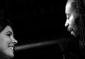
| 05/26/2004 03:05:21 PM | Singin' in Spotlightby unicumComment: The right face is very nice, good black and white contrast, nice expression! The left face misses this all and seems also a bit out of focus! But I guess you needed her for your second lightsource :) |  Photographer found comment helpful. Photographer found comment helpful. |
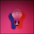
| 05/26/2004 03:02:38 PM | Stereoscopic Light Bulbby imolaavantComment: Though your lamp is slightly out of focus, I kinda like this picture! I like the two different colours of the shadows, and think that you shouldn't have showed the reflections of the lights in the lamp (but I guess you couldn't avoid that..it is an open challenge, so you couldn't use PS..pity..) | | Photographer found comment helpful. |
| 05/23/2004 12:59:56 PM | Start of Boating Season, Lake Michiganby flip89Comment: :: Critique Club Comment ::
The composition of your photo is in theory perfect; if you draw a line horizontally and a line vertically both at about 1/3 from the border, you'll see that all your subjects are on one of these two lines.
Your photo has three visible objects (2 boats and tower) all on the horizonline, so that my eyes are having trouble to chose which object is most important. The title says that the boat on the right must be the most important, but that's not really clear. The other boat (small boat) is slightly distracting. For the start of boating season there are too many boats, when you would have showed only the bigger boat, the start of boating season would have been expressed in a more symbolic way.
You choose to show a lot of pier and less of the lake, but to match your title more, it would have been nice to have the tower on the left and the boat sailing into the lake. The colours are just fine to look at, and really marine-like. The red and white of the lighthouse and the white of the boats are breaking the mass of blueness you have in your picture.
Fotowereld. | | Photographer found comment helpful. |
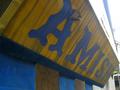
| 05/19/2004 03:45:48 PM | WTC-Amishby Herblacklist12Comment: :: Critique Club Comment ::
A lot has already been said in other comments, so I'll try to put things together shortly:
You have put the word 'Amish' in the center, so this is obviously meant to be the center of attention. You did it by photographing the sign from a different perspective, wich is appealing to the viewer, because it brings a good tension in the picture. What is a pity, is that the "A" of "Amish" is not wholy showing.
The sunlight is overexposing the sign, making te colours weak. The picture could have been making a stronger expression, when you wouldn't have been photographing into the sun. Maybe you could have waited until the sunlight was coming from another postition, when it would have shined ON the sign, the colours would have lit up and be bright!
You made this picture for the challenge "something new", a lot of viewers commented that it isn't clear what is new in your picture. I don't see it either, maybe it's something local or only know to you? Keep in mind that your public is very broad and living in all parts of the world, so a subject must speak to a lot of people.
Fotowereld. | | Photographer found comment helpful. |
| 05/19/2004 02:21:48 PM | I blame the dogby MundiComment: what is he having in his mouth and why must he do that in the toilet???? I find it a rather obscene looking picture!, please let me know what he is doing...! | | Photographer found comment helpful. |
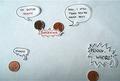
| 05/18/2004 05:54:58 PM | @_@by unikornComment: :: Critique Club Comment ::
First of all I find it difficult to make a comment on this picture, since it is obviously meant to be humourous (and it is!), but you did checked the box to get an indepth critique from the Critique Club. I won't say something on the composition and technique, because Heather did this already during the challenge, and I think she was right.
For whatever your reasons were to enter this picture to the challenge, you did a good job on bringing some humour into the game! The idea is nice, but the way you've put, it could have been different so to leave a much bigger expression. You choose to use cut out balloons and stick them on a paper, while instead you could have used the background paper itself to write on, which would have given the photo a more 'comic'look. Also the use of white paper doesn't really leave an impression, maybe a bright colour like yellow or orange would have?
I like the way you've made the textballoons, the "drippy" one saying "ewww" really does the trick making me laugh! You must have a creative mind and a talent for drawing, now take a deep dive into photographing and express your humour in a way all the DPC people will be swept off their feet!!
Looking forward for more,
Fotowereld | | Photographer found comment helpful. |
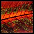
| 05/18/2004 05:34:21 PM | life:death/green:rustby AlexHugelComment: :: Critique Club Comment ::
A lot has already been said in other comments, I'll try to put some things together:
First of all, it is obvious that you interpreted "Rust" as a colour and as a state (death) which is interesting and daring, since it is not what most people will think of. The choise of title is perfect, because it explains people what you had in mind. I can see how you match rust, this orange colour and death, but in this case the orange is a very bright and warm orange, which I don't match with death quickly.
The light comes from behind the leaf and shines through some of the cells, which gives the photo a wonderful structure, especially in the green parts. Because of the indirect light there unfortunately are some dark places in the photo, instead of deep rusty colours and fresh green all over. The dark places do match the theme 'death' more though..
You mention in your own comments that you wanted to represent a sort of life and death 'yin-yang'. I reckon you mean the opposite character of the two. Again, the use of colours fits perfectly with this idea, but the colours are not really seperated, they more blend into eachother at the edges.. The fact that you have your picture 'cut' into two by the main vein suggests more the idea of a yin and yang. The line not being straight adds more tension to the picture, which is great!
You took the shot from real close and cropped the photo real tight. In combination with the firm black border, the whole gets a 'tight' feeling..it's almost like I'm on the leaf myself! For the structure of the leaf, the closeness is a good thing, but the border is a little bit too much..
The overall feeling of this picture is a good one!
Fotowereld. | | Photographer found comment helpful. |
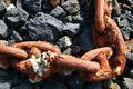
| 05/17/2004 06:36:45 PM | Chains of the ocean.by JokullComment: Critique Club Comment:
It seems to me that you have a good eye for colour; the chains on the rocks both have so-called earth colours and they work great together giving the picture a natural look which fits the title well.
The composition gives the photo an abstract touch. The way you divided the photo into squares, makes the background get as much attention as the chain. Since the chain is your subject, you could think of other ways to present it in your picture. Your camera was straight above the chain, so the 'huge'-ness you speak of in your own comments, is a bit lost. A shot from beside the chain facing up, would have showed the size of the chain maybe better.
Like other members already have noticed: the focus of the photo is more on the rocks than on the chains, so the chains are slightly unsharp. The attention is thereby also more drawn to the rocks than to the chains.
The photo met the challenge well; the rust is very much present in the texture of the chains and in the colour. When the light would have been a bit less sharp, the texture and colours would have been even more clear. I see your ISO was on 200, for outdoor shooting you can choose an ISO of 100 or less, like 50.
All in all it's a good picture which is peacefull to look at.
Fotowereld. | | Photographer found comment helpful. |
| 05/17/2004 05:25:48 PM | | | Photographer found comment helpful. |
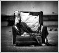
| 05/17/2004 05:14:21 PM | scrapby jus6681Comment: Ooh I like this a lot!! This is photojournalism style.. nice b/w (lots pure blacks and pure whites..great!) the grain adds that little more..wauw this one is really really great!! This one must score high, it must!! | | Photographer found comment helpful. |
Home -
Challenges -
Community -
League -
Photos -
Cameras -
Lenses -
Learn -
Help -
Terms of Use -
Privacy -
Top ^
DPChallenge, and website content and design, Copyright © 2001-2025 Challenging Technologies, LLC.
All digital photo copyrights belong to the photographers and may not be used without permission.
Current Server Time: 06/18/2025 12:49:24 AM EDT.
|