| Image |
Comment |
| 01/20/2006 02:33:50 PM |
Confidenceby jpochardComment: Excellent diagonals on the wall. They help the model give this photo motion that standard horizontals would have killed. |
 Photographer found comment helpful. Photographer found comment helpful. |
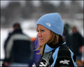
| 01/20/2006 02:26:38 PM |
The North Faceby ShutterPugComment: There's too much space above her. A tighter crop would make this a more effective photo, even if that means getting rid of the "crowd" behind her (which means it wouldn't literally fit the challenge). The subject herself is interesting and well focused. Just too much background. |
| Photographer found comment helpful. |
| 01/19/2006 04:51:27 PM |
Crushing The Ballby serogersComment: He's too centered in the frame; crop it so he's more to the right. That's a great capture of the ball hitting the bat! (And teach him to keep his eyes on the ball, all the way to the bat!) |
| Photographer found comment helpful. |
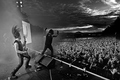
| 01/19/2006 04:45:01 PM |
Satyriconby terjeComment: This is just awesome. Perfectly fits the band. |
| Photographer found comment helpful. |
| 01/19/2006 11:36:44 AM |
what do you wantby speaseComment: I think he's too centered in the frame. A tighter crop on his head/hand might be more effective, especially since you've captured him with such a great expression. Nice, crsip focus on his eyes despite shooting through the glass. |
| Photographer found comment helpful. |
| 01/19/2006 11:32:34 AM |
|
| Photographer found comment helpful. |
| 01/19/2006 11:31:47 AM |
Hollyby nsbca7Comment: Nice use of high key and soft, pale color. |
| Photographer found comment helpful. |
| 01/19/2006 11:29:25 AM |
|
| Photographer found comment helpful. |
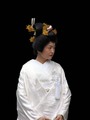
| 01/19/2006 10:56:11 AM |
Japanese Brideby cfischlComment: The framing would be better if you could go back in time and tilt the camera down a bit and get all of her hands in the shot and eliminate some of the black space at the top. |
| Photographer found comment helpful. |
| 01/19/2006 10:54:49 AM |
Wineby AngelisComment: Technically, this is almost excellent - the brand name isn't quite clear enough, especially with the glare in the middle. I like the black/white background; the bright area is perfect for the brand's tagline in an advertisement. |
| Photographer found comment helpful. |
Home -
Challenges -
Community -
League -
Photos -
Cameras -
Lenses -
Learn -
Help -
Terms of Use -
Privacy -
Top ^
DPChallenge, and website content and design, Copyright © 2001-2025 Challenging Technologies, LLC.
All digital photo copyrights belong to the photographers and may not be used without permission.
Current Server Time: 08/05/2025 04:06:51 AM EDT.