| Image |
Comment |
| 12/15/2006 03:47:47 PM |
Mademoiselle M.by MambeComment: I don't think all that negative space helps here. Either a tighter or different crop would be better. |
 Photographer found comment helpful. Photographer found comment helpful. |
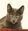
| 12/15/2006 03:45:44 PM |
Untitledby rtscribbs02Comment: This seems uniformly gray, as if you've removed contrast. The crop is weird, too - the left forepaw is cut off and I can't tell if he's sitting or not. |
| Photographer found comment helpful. |
| 12/15/2006 03:41:01 PM |
|
| Photographer found comment helpful. |
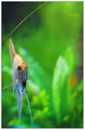
| 12/15/2006 11:14:23 AM |
Scalare Seriousby gocComment: Great DOF. Great framing. I can't decide if I like the grass blade (or whatever) cutting across the top left, but it sure does help draw the eye to the subject. |
| Photographer found comment helpful. |
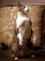
| 12/15/2006 11:07:43 AM |
Pavlov's Catby thegrandwazooComment: Looks like an old-fashioned parlor photo with the circular lighting and gold tones. The model might be turned a bit too much at an angle though. |
| Photographer found comment helpful. |
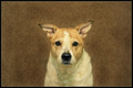
| 12/15/2006 11:05:39 AM |
V.by muur88Comment: There are a lot of things not quite right with this shot. The subject is too centered, vertically and horizontally. The crop of the body is weird. The ears flop awkwardly. The dog looks bored. The wallpaper is ugly.
The overall effect is a lot like the look of The Royal Tenenbaums.
Which is why it works so well. Two wrongs may not make a right, but it looks like a bunch of wrongs make for a great photo, or at least a distinctive style. 9 |
| Photographer found comment helpful. |
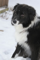
| 12/13/2006 04:40:37 PM |
dog (adidas)by tcmartinComment: You cut off his paws! I'd suggest either pulling out so we see his forepaws or crop in tighter. I like the lighting and the shallow DOF. I even like his looking so far off camera. |
| Photographer found comment helpful. |
| 11/28/2006 02:27:35 PM |
|
| Photographer found comment helpful. |
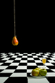
| 11/28/2006 10:56:14 AM |
Still Life with Fruitby AnnComment: Looks inspired by Magritte. I think the glass throws things off somehow, but you might be right by having something fill that space. Maybe a standing banana? Great concept, hope it does well. |
| Photographer found comment helpful. |
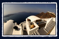
| 11/28/2006 10:53:06 AM |
Greek Perspectiveby DIVIANComment: Not only is there too much border, but I think the white in the border makes the whites in the picture look dirty, more of an off-white. Because of that, there's less contrast between the foreground white and the brown of the cliffs on the right and the hazy blue of the sea on the left. I like the picture, I just wish it were crisper. |
| Photographer found comment helpful. |
Home -
Challenges -
Community -
League -
Photos -
Cameras -
Lenses -
Learn -
Help -
Terms of Use -
Privacy -
Top ^
DPChallenge, and website content and design, Copyright © 2001-2025 Challenging Technologies, LLC.
All digital photo copyrights belong to the photographers and may not be used without permission.
Current Server Time: 08/04/2025 03:50:22 PM EDT.