| Image |
Comment |
| 07/29/2005 12:07:08 PM |
|
 Photographer found comment helpful. Photographer found comment helpful. |
| 07/29/2005 12:03:36 PM |
landscapeby arlanbartComment: Cool! The highlight is kind of distracting. I wonder how making this high-key would help. |
| Photographer found comment helpful. |
| 07/29/2005 12:02:07 PM |
|
| Photographer found comment helpful. |
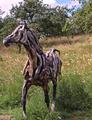
| 07/29/2005 11:59:18 AM |
What some people do with driftwood!by p2jvrComment: Nice horse. I think this photo is just a little overexposed. A bit of sharpness and contrast can be desired. Shooting this in the evening would also help. I'm guessing this photo was taken during midday. The overblown sky and the extra trees in the background aren't doing anything for the photograph. I would suggest trying to crop it out. Also, moving a bit to the left so that there is space in front of the horse, rather than behind it would have been nice. |
| Photographer found comment helpful. |
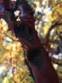
| 07/29/2005 11:55:19 AM |
Manzanitaby beafliesComment: When I see this photo, I realize that you are trying to use the diagonal lines for composition. But it doesnt seem to be doing anything for the photo. Also, something is happening with magenta colour of the bark and the really colourful background (though it is out of focus).
I think this photo could use some sharpening. It might look better in b&w. I wonder how diffeternt it would have been if you had tried to make the hole formed by the bark (upper left corner of this photo) as the center.
These are my thoughts, as all. |
| Photographer found comment helpful. |
| 07/29/2005 11:49:04 AM |
Aflameby nico_blueComment: Would this have looked better in the landscape format? I wonder...Nice shot. |
| Photographer found comment helpful. |
| 07/29/2005 09:26:53 AM |
|
| Photographer found comment helpful. |
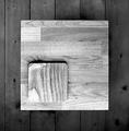
| 07/29/2005 09:25:19 AM |
Shadesby PeterCComment: Nice idea and nice picture. But somehow, the two shades of grey compete for my attention. And the lighter blocks of wood somehow seem to hurt the eye...Maybe a less brighter shade would have been better? Just thinking aloud. :) |
| Photographer found comment helpful. |
| 12/22/2004 04:43:47 PM |
|
| Photographer found comment helpful. |
| 12/22/2004 02:10:02 PM |
Harmonyby xtabintunComment: Nice. But would a little more contrast have done better? Just my thoughts |
| Photographer found comment helpful. |
Home -
Challenges -
Community -
League -
Photos -
Cameras -
Lenses -
Learn -
Help -
Terms of Use -
Privacy -
Top ^
DPChallenge, and website content and design, Copyright © 2001-2025 Challenging Technologies, LLC.
All digital photo copyrights belong to the photographers and may not be used without permission.
Current Server Time: 06/17/2025 05:21:16 AM EDT.