| Image |
Comment |
| 10/03/2005 02:44:04 PM |
My Paradiseby JudiComment: Wow, I'm curious to see if you entered the complementary colors challenge. Powerful color contrast. I'd love to see the original because I wonder if this isn't a little heavily processed? If I'm wrong, that's the most blindingly orange and blue sunset I've ever seen. |
 Photographer found comment helpful. Photographer found comment helpful. |
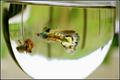
| 10/03/2005 02:35:58 PM |
View from the backdoorby suemackComment: That's a pretty guppy and you caught it with nice sharp focus and good colors. I like the shallow DOF. IMO The tilt and crop of the glass detract from the compositon, as does the large white area at bottom. |
| Photographer found comment helpful. |
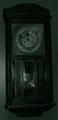
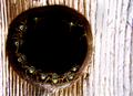
| 10/03/2005 02:30:02 PM |
Old Clockby skittlesComment: It looks like a cool clock; and fairly old, I'm guessing? Because it is shot straight-on the composition is symmetrical, and somewhat static. It also shows that the clock is not straight. I can't say much more because it is so dark that most of the details are lost. |
| Photographer found comment helpful. |
| 10/03/2005 12:47:01 PM |
Sunset on the Creekby davidbedardComment: Beautiful, crisp silhouettes and gorgeous soft sky. Love the composition. The only minor detractions I can think of are a slight halo effect, a little noise, and that small thing in the background at bottom right. They are very minor IMO; and I'd be proud to have made such a nice image. |
| Photographer found comment helpful. |
| 10/03/2005 12:43:26 PM |
|
| Photographer found comment helpful. |
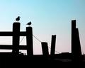
| 10/03/2005 12:42:11 PM |
Plains Sightby tuffyComment: I love this! The sky is stunning. There are a couple of little nitpicky things that keep it from being absolutely perfect for me. But they are so minor that I'm not even going to get into them. Great job! |
| Photographer found comment helpful. |
| 10/03/2005 11:06:56 AM |
Times Square - New Yorkby Nikolai1024Comment: Eeeek! I often look at images and think "I wonder if this wouldn't look better from a lower angle?" This is not one of those times. I'm thinking maybe a higher angle! That is just hilarious. One of the things I'm missing by not living in a big city. I'm giving you points for creativity and making me snicker before noon. Technically, it is a bit overwhelming to me. The background is so busy that your subject gets a little lost. Really fun though! |
| Photographer found comment helpful. |
| 09/29/2005 12:50:41 PM |
Looking At Meby KitaComment: Kita,
I'm very impressed. A 5.233 is great for a second challenge entry. There are plenty of adults here who would be very happy to get a photo like this.
I feel that your image meets the rule of thirds horizontally. If you were to leave some more room at the top, the subject would also line up on the lower third, instead of center.
The noise doesn't bother me. I think it adds to the mood. The image is very expressive. Great job! |
| Photographer found comment helpful. |
| 09/25/2005 10:03:04 PM |
|
| Photographer found comment helpful. |
| 09/21/2005 10:04:42 PM |
Defensive Lineby NaldComment: Now that is really cool! I wonder what a lower contrast version would look like? It's very emotive. Makes me think "I want to get closer and check that ou...Oh, no I don't!" |
| Photographer found comment helpful. |
Home -
Challenges -
Community -
League -
Photos -
Cameras -
Lenses -
Learn -
Help -
Terms of Use -
Privacy -
Top ^
DPChallenge, and website content and design, Copyright © 2001-2025 Challenging Technologies, LLC.
All digital photo copyrights belong to the photographers and may not be used without permission.
Current Server Time: 08/29/2025 10:10:05 AM EDT.