| Image |
Comment |
| 05/21/2004 07:07:35 AM |
|
 Photographer found comment helpful. Photographer found comment helpful. |
| 05/21/2004 07:06:29 AM |
Do You Doodle?by genghisComment: The front and back of the drawing is out of focus, as is the tip of the pen. This is a creative spin on the theme - kudos for thinking outside the box! |
| Photographer found comment helpful. |
| 05/21/2004 07:05:24 AM |
More like an addiction...by jameshearnComment: A tighter aperture would have brought moe of the suuroundings into focus. The foreground and background blurring distract from an otherwise well laid out shot. |
| Photographer found comment helpful. |
| 05/21/2004 07:04:07 AM |
|
| Photographer found comment helpful. |
| 05/21/2004 07:03:34 AM |
2 Miles Per Day --- Everydayby TommyMoe21Comment: Great use of motion blur. The front foot is very clear, and the back one captures the running motion perfectly. There's a little distraction from the window on the left. |
| Photographer found comment helpful. |
| 05/21/2004 07:00:30 AM |
|
| Photographer found comment helpful. |
| 05/21/2004 06:59:35 AM |
Gaffiti, Bad habit.by cabaComment: Nice balance between the design elements. If it were possible to take this from a lower point of view it would have obscured the background greenery and houses which are somewhat distracting. Also a touch underexposed on the bottom which removes some detail. That's not all bad if it was your intent to do so in order to emphasize the brighter graphiti elements. |
| Photographer found comment helpful. |
| 05/20/2004 01:42:42 PM |
The Flag in the 'Old Arcade'by bobdaveantComment: Great composition - I like the way the flag's bright colors stand out from the detailed, but almost monochromatic surroundings. Nice composure, and very well balanced! |
| Photographer found comment helpful. |
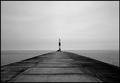
| 05/20/2004 01:41:02 PM |
pointed at my heart, it's in ohioby xburnerxComment: I really like this image. I'm a sucker for water, piers, and lighthouses. I would have liked it even more if the horizontal line at the pier's end was aligned with the horizontal horizon line. It's very subtle, but I think it would be an improvement. |
| Photographer found comment helpful. |
| 05/20/2004 01:39:09 PM |
Snowflakeby cpanaiotiComment: Great to see the bug in this - I like a subtle detail that rewards the second glance. Looks like the focus is good except for one spot near upper left. Nice composition. |
| Photographer found comment helpful. |
Home -
Challenges -
Community -
League -
Photos -
Cameras -
Lenses -
Learn -
Help -
Terms of Use -
Privacy -
Top ^
DPChallenge, and website content and design, Copyright © 2001-2025 Challenging Technologies, LLC.
All digital photo copyrights belong to the photographers and may not be used without permission.
Current Server Time: 06/20/2025 06:08:39 PM EDT.