|
|
|
Showing 1511 - 1520 of ~2015 |
| Image |
Comment |
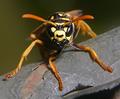
| 07/10/2005 12:18:26 PM | protector of the hiveby hopperComment: Nice! Makes me want to run and hide! :-) Excellent sharpness on the antennae and eyes and front legs. Good luck! |  Photographer found comment helpful. Photographer found comment helpful. |
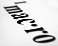
| 07/09/2005 04:15:14 PM | ac ·by BradComment: Composition: 6, I like the angle
Technical: 7, Good use of DOF, and tack sharp in the middle.
Appeal: 3, I keep asking myself... why don't I like this picture. I dunno, maybe it's just me. A picture of a printed word just doesn't turn me on...
Challenge: 5, Good close-up, probably almost macro shot.
Overall Calculated Average Score: 5, Everything is fine about this image. I just can't bring myself to say I like it enough to vote higher. You obviously have the skills and equipment to get a good macro shot, so maybe you were just having fun with this one. I look forward to seeing more captivating macros from you in the future! | | Photographer found comment helpful. |
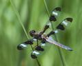
| 07/09/2005 04:11:11 PM | Double Spanby bongoComment: Composition: 4, I like that the dragonfly is at an angle, and the two lines also help to add energy to the shot. He's also slightly off center (which is better than if he had been dead center). My main "nit" on composition of bugs, animals, etc, is when the animal is facing away from you... appearing as if to "flee" from the camera. For me, the composition would be so much stronger if the dragonfly were facing towards the camera instead of away.
Technical: 7, The center of the dragonfly and its wings look tack sharp. Kudos. I'd like to have seen that sharpness on his eyes (if he were facing towards the camera). Also, good use of shallow DOF.
Appeal: 4, I like the colors and the various shades. Improving the composition would have added to the appeal of the image.
Challenge: 6, It's a nice close-up. A little closer still (really zooming in on the dragonfly) could make an extra powerful macro shot.
Overall Calculated Average Score: 5, It's a nice shot and technically works well. Only the composition keeps it from scoring higher... | | Photographer found comment helpful. |
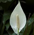
| 07/08/2005 11:44:21 PM | Naturallyby fplouffeComment: Composition: 4, A centered subject is usually the most static. You might try moving it off to the side and then tilting the image to add energy to the subject. Also, the twig on the right does nothing to add to the composition, it merely distracts.
Technical: 6, Nice and sharp in the center of the flower. The rest of the image shows a nice shallow DOF.
Appeal: 5, I like the stark contrast of the white against the dark background. A better composition would improve the appeal here.
Challenge: 5, A nice close-up. A more macro version of the image would focus right in on the center portion of the flower, exploring the textures that the average passer-by might never see.
Overall Calculated Average Score: 5, Not a bad image... technically okay, could be a little more creative. | | Photographer found comment helpful. |
| 07/08/2005 11:38:38 PM | Mini Seascapeby rox_roxComment: Composition: 6, Composition is nice... you avoided a static "centered" subject in favor of subjects which fall along the 3rds of the image.
Technical: 4, Fairly sharp.... could be sharper in the main subject and you might also explore color saturation.
Appeal: 4, To me, the biggest shell must be the main subject, because the rest is much smaller. Yet the really sharp focus in the picture is in the center (on the smaller shell) which confuses my eye... I want to look at the big shell, but end up being forced to look at the small one. The white crystals that surround the shells are okay in the center, but mostly show "dirt" on the right 3rd of the image.
Challenge: 5, Okay close-up. A more macro version would have focused on just a portion of the big shell and explored the textures to be found there when looking at an extreme close-up or macro.
Overall Calculated Average Score: 5, Not a bad pic... lacks a little in the technical and creative sides. | | Photographer found comment helpful. |
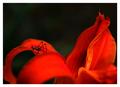
| 07/08/2005 11:33:02 PM | Drama in Redby msdoubletroubleComment: Composition: 7, Fairly nice composition... you avoided a centered subject and the reds impart some energy to the image with the curves and diagonals.
Technical: 6, The bug is nice and sharp. The rest thrown out of focus with shallow DOF (nice).
Appeal: 6, I think the strong reds both add intrigue ... and overwhelm at the same time.
Challenge: 6, Nice close-up. A stronger macro would have focused more closely on the bug.
Overall Calculated Average Score: 6, Nice image. I originally scored it a 5, but in later review decided I had been too quick to judge. | | Photographer found comment helpful. |
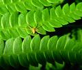
| 07/08/2005 11:23:02 PM | Itsy bitsy 7 legged Arachnidby audinutComment: Composition: 4, Composition is a little weak. Could have used a bit more of an angle in the leaves (e.g. try tilting the image 30-45 degrees and see what you get). Also, the subject is dead center which is the most static place to put him. Remember the rule of thirds to help make a more dynamic image.
Technical: 5, Fairly sharp in the leaves and in the spider. Background is out of focus (good).
Appeal: 7, I do like the repeating pattern in the leaves and the color is awesome. Just wish the image itself was a little less static (composition would help out here)
Challenge: 5, Nice close-up. A more macro version of the image would focus more on the spider. You could perhaps even crop 1/5th off the top and perhaps about 1/4th off the bottom just to add emphasis to the subject (make the repeating pattern of leaves less important and the spider more important).
Overall Calculated Average Score: 5, Okay image... not bad picture. Colors are nice. Could use a little better composition and a closer crop. | | Photographer found comment helpful. |
| 07/08/2005 11:16:43 PM | Out of Many, Oneby HornOUBetComment: Composition: 3, Dead center and flat... not really a creative composition, it's more of a "documentary" (like something you might shoot to give to your insurance company in case of theft).
Technical: 5, The focus seems right on for the bottom 2/3rds of the image, but looks just a little soft on the top 1/3rd. A more dynamic image would have taken advantage of the shallow DOF assosicated with macros and extreme close-ups by keeping the main subject in focus and allowing the rest of the image to blur in order to establish a 3-dimensional look in the image.
Appeal: 5, Hard to rate the appeal ... it's just "there". Again, like a documentary. It doesn't appear to be an image that was meant to show the creative side of the shooter.
Challenge: 5, Nice close-up. A more macro version might have focused in on just a portion of the coin and explored the texture of the metal or the engraved writing.
Overall Calculated Average Score: 5, Not a bad image... It just lacks a reason to want to spend more time looking at it. | | Photographer found comment helpful. |
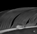
| 07/08/2005 11:09:48 PM | Water off a ________by roadrunnerComment: Composition: 6, A nice soft angle to the composition. I wonder if a stronger composition could be made by moving the droplet to the left or right?
Technical: 6, Nice and sharp on the subject, the rest illustrates shallow DOF (good).
Appeal: 4, You generate some interest by using the water droplet as a "lens" to focus the viewer's attention on the ... feather??? But then it stops there. After you've looked at that, there's really not much else to see in the image. The diagonal lines are nice, but they lead to nowhere.
Challenge: 5, Nice close-up. Closer still and you might have seen more of the texture in the feather.
Overall Calculated Average Score: 5, Not a bad image. It just lacks a strong reason to spend more time looking at it and exploring its contents. | | Photographer found comment helpful. |
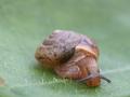
| 07/08/2005 11:04:39 PM | Hey there little buddy...by CreativeFlyPhotoComment: Composition: 4, Mostly centered composition. Could be improved by moving the snail up to the top left .. giving the snail space in which to travel. As is, he's at the end of his journey. Keep in mind the rule of 3rds and use it to your advantage.
Technical: 6, Sharp where it needs to be. Illustrates shallow DOF (good).
Appeal: 5, Just average appeal... I think a better composition would help here. Also, you might try playing around with the contrast and/or saturation.
Challenge: 5, Nice close-up. A more "macro" version would get right in that little guy's face!
Overall Calculated Average Score: 5, Technically okay. Needs to show a little more creativity. | | Photographer found comment helpful. |
|
Showing 1511 - 1520 of ~2015 |
Home -
Challenges -
Community -
League -
Photos -
Cameras -
Lenses -
Learn -
Help -
Terms of Use -
Privacy -
Top ^
DPChallenge, and website content and design, Copyright © 2001-2025 Challenging Technologies, LLC.
All digital photo copyrights belong to the photographers and may not be used without permission.
Current Server Time: 06/27/2025 12:19:17 PM EDT.
|