| Image |
Comment |
| 06/21/2006 08:18:54 PM |
|
 Photographer found comment helpful. Photographer found comment helpful. |
| 06/21/2006 08:18:29 PM |
|
| Photographer found comment helpful. |
| 06/21/2006 08:17:42 PM |
WEDDING-S-B-4.jpgby judojoeComment: I dunno... their skin may really have been this color, but I'd suggest a hue/sat layer, going to the red channel and bumping it to +3 or more to lessen the red and increase the yellow.
Edit: alternatively, convert it to B&W. Message edited by author 2006-06-21 20:19:24. |
| Photographer found comment helpful. |
| 06/20/2006 08:18:22 PM |
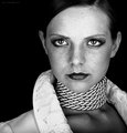
_MG_1695_150K.jpgby AnastasiaComment: I like the framing of her face with her arms/hands, although I think a tighter crop might work for this image. The thing is, the bottom part of her blouse is wrinkled and really isn't doing much for the image. Other than that, beautiful capture of a beautiful lady.
|
| Photographer found comment helpful. |
| 06/19/2006 08:39:51 PM |
Nataliaby talikfComment: Love the light. Love the angle. Love the colors. LOVE those eyes! :-) Very well done.
|
| Photographer found comment helpful. |
| 06/19/2006 08:38:44 PM |
Pounceby elsapoComment: Whoa! It looks absolutely 3-D. How'd you do that? |
| Photographer found comment helpful. |
| 06/19/2006 08:38:01 PM |
5944436.jpgby AnastasiaComment: Very nice. Love the lighting. Also, the fact that you kept her skin 'real'. I'm growing to hate neat image and the like .. a little softness is good, but it's been over done. This looks good. |
| Photographer found comment helpful. |
| 06/19/2006 07:12:20 AM |
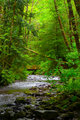
Short Sand Creekby MickComment: Wow, look at all that green! It's good that you included the red bridge. It both helps to balance the green and also give some perspective on the size of the trees. Good job.
|
| Photographer found comment helpful. |
| 06/19/2006 07:09:44 AM |
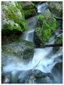
falls_2.jpgby justin_hewlettComment: Of the 3 posted, I like this one the best. I think it has the best balance between the blur of the water motion versus the un-moving rocks and moss, etc. The two branches on the right side of the image tend to lead your eye out of the image, so removing them (either before taking the picture, or cloning out after the fact) I think would help. But otherwise, I really like the contrast of the blurry water against the solid rock. Good job. Message edited by author 2006-06-19 07:10:30. |
| Photographer found comment helpful. |
| 06/18/2006 10:22:00 PM |
IMG_1666.jpgby jwillertonComment: I think this one is my favorite, mainly due to the composition of the two cars with each other, but even the main (front) car feels like it is a stronger position here than in the other shots. |
| Photographer found comment helpful. |
Home -
Challenges -
Community -
League -
Photos -
Cameras -
Lenses -
Learn -
Help -
Terms of Use -
Privacy -
Top ^
DPChallenge, and website content and design, Copyright © 2001-2025 Challenging Technologies, LLC.
All digital photo copyrights belong to the photographers and may not be used without permission.
Current Server Time: 06/25/2025 06:06:59 PM EDT.