| Image |
Comment |
| 09/15/2005 05:48:47 PM |
Like Her Momby spydrComment: Oh, I love this shot, but I wish it were a little brighter! The expression on her face is priceless, the deep shadows on the left work well. You have a perfect sense of how to crop, I could go on... But I think a little tweak upward in curves to bring up the mids would have helped. Great shot! |
 Photographer found comment helpful. Photographer found comment helpful. |
| 09/15/2005 05:37:17 PM |
The Gravelsby orussellComment: GREETINGS FROM THE CRITIQUE CLUB
by strangeghost
Hi Owen! It's quite an honor to get to critique one of your images. I've loved your work since first "meeting" you in the bokeh challenge!
COMPOSITION
I like the overall composition very much but I think it's a bit cluttered with nonessential "stuff." The primary subject (red boat) with the background hills, harbor, and sky is wonderful. The other elements tend to be a bit distracting and unnecessary. I might have continued searching for a spot that gave you your desired comp but left a bit more open feel in the foreground. Lacking that, I might have tried to tighten up on the boat a little and frame that in a very close object with the water, sky, etc., forming a distant backdrop, keeping the very deep dof.
TECHNIQUE
The bright, beautifully saturated colors meet the challenge in stunning form. The rich greens of the grass, the rusty red of the boat, and the deep blues of the water and sky are wonderful. I particularly like the evident blue gradient of the sky. Superb sharpness and bright colors make the shot a real eye-catcher. Since you had access to advanced editing rules, I wonder if you considered selecting the sky and clouds and stretching things a bit more, or bumping the contrast with curves? It pops as it is, but I can't resist pushing the limits when I have a sky like this to work with. It's evident to me that your post-processing skills are superb and you have a great eye.
OVERALL IMPACT
A very pleasing image that begs a closer look. The wonderful play of colors and objects is a visual feast. Very well done! Message edited by author 2005-09-15 17:38:14. |
| Photographer found comment helpful. |
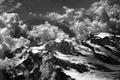
| 09/15/2005 12:53:20 PM |
through heaven's lenseby tomzinhoComment: GREETINGS FROM THE CRITIQUE CLUB
by strangeghost
COMPOSITION
Airplane window shots can be a pain. You have access to some pretty incredible scenery from a great vantage point, but not much control over the details. This is a great capture under those circumstances, catching both foreground peaks with lots of detail and background mountains lost a bit in the haze of distance. Love the combination of clouds, snow and dark rock. You had great light and took full advantage of the opportunity.
TECHNIQUE
Your end result looks very good, and you achieved a very respectable score in the challenge, so your technique was obviously successful. I wonder if you really only used desat and contrast enhancement to achieve the BW effect though. If you're using photoshop, you might also experiement with channel mixer to achieve other types of BW effect. There are many, many ways to achieve the BW look, don't limit yourself to simple desat/contrast adjustments! I agree with the commenter who observed that you had achieved an Ansel Adams-type look. It catches the eye!
OVERALL IMPACT
Not many people can resist a second or third look at a compelling landscape shot, especially one with an unusual viewpoint and a sweeping grandure. You have certainly done that here. The image is eye-catching and and well composed. Not many people could pass by quickly with this pic. Nice job! Message edited by author 2005-09-15 14:37:21. |
| Photographer found comment helpful. |
| 09/11/2005 05:05:25 PM |
|
| Photographer found comment helpful. |
| 09/11/2005 09:02:33 AM |
|
| Photographer found comment helpful. |
| 09/10/2005 08:15:39 PM |
sharp image!by RiponladyComment: Would do wonderfully in a texture challenge. All the patterned lines make a feast for the eye. Lots of interest. Did you try jacking the greens and yellows even more?? Cool shot. |
| Photographer found comment helpful. |
| 09/10/2005 05:53:23 PM |
IMG_6246.jpgby ajschelComment: Very deep shadows here make for deep relief on the subject, but I wonder if that's starting to work against you due to the darkness and lack of detail on the wall to the left. I think you chose the correct perspective and crop though. Nicely done. |
| Photographer found comment helpful. |
| 09/10/2005 04:47:40 PM |
Good Day Sunshine 2by NeilComment: Intense color contrast for sure, but I think it would be better with some more front lighting too. The detail on the right seems too dim. Maybe a slightly wider crop too. |
| Photographer found comment helpful. |
| 09/10/2005 03:27:44 PM |
chicago.jpgby puzzledComment: I like the image but something seems vaguely "wrong." Maybe it's how the building ends so abruptly at the right. I know that's an architectural design, but it looks off somehow. The crop at the top is unfortunate too. |
| Photographer found comment helpful. |
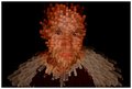
| 09/10/2005 09:26:59 AM |
Sir Francis Drake.jpgby mystical_princessComment: I like your crop on the hat and head, but I think the background is a little too overpowering. Your model is wonderful and I love the grainy BW texture. |
| Photographer found comment helpful. |
Home -
Challenges -
Community -
League -
Photos -
Cameras -
Lenses -
Learn -
Help -
Terms of Use -
Privacy -
Top ^
DPChallenge, and website content and design, Copyright © 2001-2025 Challenging Technologies, LLC.
All digital photo copyrights belong to the photographers and may not be used without permission.
Current Server Time: 08/14/2025 03:35:56 AM EDT.