|
|
|
Showing 481 - 490 of ~1262 |
| Image |
Comment |
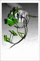
| 09/20/2005 08:17:02 PM | For those who served with honor - USAFby notorious77Comment: Greetings from the Critique Club
by strangeghost
COMPOSITION
I think this was a great compositional idea that suffered from a few major flaws. First, the placement of the grave marker and the flowers is awkward, the way both are sequestered to their side of the picture. I can't decide if it's a picture of the marker, the grass or the flowers. There is no interaction between the elements to suggest drama, emotion or stories. Much better would have been an arrangement were the flowers are backed by the marker. Your angles and lines are very simple too, leaving little inherent interest in the composition. I visualize a close up shot on a few flowers/stems, from an interesting angle, with the grave marker visible in the background, with a few engraved words visible to set a mood.
TECHNIQUE
The flowers are blown out a bit (whites losing detail due to overexposure) and may also be a little soft. The grave marker is not quite vertical, which also adds a bit of a disconcerting feel to the viewer (feels like something is leaning...). Then there's the image dimensions. You are allowed 640 pixels on the longest dimension, and I can rarely think of a case where you should use every pixel you're given. Your image is just too small. Many voters will penalize this automatically because you're making them work harder to see what you've shot. If your resizing was to keep the file size (kilobytes) down to the 150K limit, read the tutorials on how to accomplish this without compromising your image dimensions. The other technical point I'll make is the lighting. The flowers are a bit overexposed, and the grave marker looks underexposed, as though it's in shadow. Choose your time of day so that you have sunlight over your shoulder, and ideally, hitting your subject obliquely. The deep-cut lettering in a grave marker can look dramatically 3-D with good lighting.
OVERALL IMPACT
From your photographer's comment, it was clear that this was a shot that was motivated by a strong emotional tie for you. Pay attention to the issues of composition and go shoot this again. Spend some time browsing the challenge archives on this site. I recommend the "cemetery" and "heros" challenges particularly. Look at how others have shot similar scenes to yours and study their composition. Observe how every detail plays a role in creating the final impact and eye-appeal of a photo.
Keep shooting. Keep experimenting, and keep learning!
|  Photographer found comment helpful. Photographer found comment helpful. |
| 09/19/2005 08:14:46 PM | Branches of Lifeby sz1_Comment: Greetings from the Critique Club
by strangeghost
COMPOSITION
The composition of this photo just doesn't feel right to me. The hand is awkwardly placed behind the vine. The hand is apparently reaching for the "branch" but that isn't communicated readily. Additionally, the surface (floor, table, whatever) doesn't add anything to the composition and likely subtracts from it. Instead, I would have tried suspending the branch in front of a neutral background - black or white would have worked - and had the hand coming in from either left or right. And then there's your border. I generally don't like borders that call attention to themselves. The best border is the one you don't notice because it's subtle, understated, and blends perfectly with the image. Yours is a bit conspicuous.
TECHNIQUE
The two primary things I'd mention here are your choice to light the scene using flash, and the use of autofocus. The flash caused stark shadows to appear and detracts from the elegant simplicity of the vine. Using auto focus at f/4 for this scene forces your rebel to chose a focus point somewhat arbitrarily (it seems to have selected the stem leading to the large leaf on the left). Instead, stop down your aperture a bit to add some depth of field, and manually focus to keep as much of the plant in focus. Now it could be that your intention was to blur the background and hand. Fair enough, but I would still recommend manually focusing in a situation like this so you can choose what part of your foreground is highlighted by sharp focus.
You didn't say how you achieved the selective de-saturation, but whatever method you used, it worked well. Maybe just de-saturating all the channels except green??
OVERALL IMPACT
As shot, I think it's a fairly low impact picture, as was reflected by your 5.2 score. It just didn't resonate with the voters and make them stop and stare. I think you have achieved an artistic shot, but keep working on drama and pure visual appeal. Make the voters stop and stare with their jaws on the floor.
| | Photographer found comment helpful. |
| 09/19/2005 05:17:27 PM | Branching tracksby timluComment: Greetings from the Critique Club
by strangeghost
COMPOSITION
You mention in your photographer's comment that it feels like something is missing from the composition, and that maybe you should have tried a shorter lens. I take that to mean you wish you had a wider field. As it is, you have achieved significant depth. The stones in the foreground are all sharp and you've got good detail right up to the foliage. I like the way you've used the tracks to create meandering lines that lead the eye up and out the left side. The background is a little busy with the telephone poles and power lines. This might have worked better with a different location where you had less clutter, and maybe even a longer stretch of track to work with. I wonder what was right behind you as you shot, both from the standpoint of the above clutter comment as well as the lighting differences looking back the other way. As I write this, I'm scrolling up and down to look at your picture as I write, and I find that when I scroll in such a way as to clip the top centimeter or so off your photo, I think it improves (clipping the power poles and lines). I think the net effect is to let the rail tracks be the primary subject and lead the eye up and off with no distractions interrupting.
TECHNIQUE
Excellent job achieving the depth you wanted with your long shutter and lens stopped way down. You might have even pushed it one stop further; you have plenty of light and even some blown highlights (rail by the road and the tops of the railroad tracks). The grasses and trees seem a bit too yellow also, maybe knock down the saturation a bit or even shift the hue a bit to green them up.
OVERALL IMPACT
I think your photo might have had more impact with the above mentioned crop and hue shift. After writing the above two paragraphs, I read your voter comments and see that several others have also mentioned the crop issue. It's a good photo but clearly didn't "wow" the voters. You have a good eye for composition though. I'll look forward to seeing more of your stuff. | | Photographer found comment helpful. |
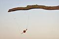
| 09/18/2005 04:56:25 PM | Fishing Interuptedby The EskimoComment: Greetings from the Critique Club
by strangeghost
COMPOSITION
It took me a second or two to realize your intent (I'm not a fisherman) but then it was clear enough. My main feeling is there is just too much space that's not doing anything for you. If it were a deep blue sky, or an interesting wood pattern on a boardwalk, or something beside whitish, overexposed sky, it might have helped you. As it is, I think it hurts the composition. I'd also recommend tighter on the bob and the line, making those two objects clearer and sharper. As shot, the string is barely visible and a little jaggy looking in some areas.
TECHNIQUE
I've already mentioned the exposure problems in the sky. Additionally, the focus is not sharp, and there appears to be quite a bit of dirt or debris around the limb, and possibly some dirt artifacts on the sensor. Since this was a basic editing challenge, you're options are very limited for dealing with those specks. Again, taking care of business in the setup or composition could have helped.
OVERALL IMPACT
Not much impact IMO. It's the kind of image that probably generates lots of very quick votes of 4 or 5 and then the voter moves on. The image lacks a really clear focus which could have been alleviated by getting in much closer on your subject and thinking much more about composition. On the other hand, you got some comments that indicate that you've obviously connected with some voters. That's a big plus, and would've worked much more to your advantage had the image had more visual appear or 'pop.' | | Photographer found comment helpful. |
| 09/18/2005 01:39:08 PM | Branch Line Trainby bob_bobskiComment: Greetings from the Critique Club
by strangeghost
Hi Bob, welcome to DPC!
COMPOSITION
I like the composition. You're close in on your subject, the frame is filled, and you have great lines running diagonally through the frame with a dramatic perspective expansion toward the right. I might have cropped off the cables visible at the bottom. I'm sure your choice of subject left some voters saying "huh" as far as the challenge was concerned.
TECHNIQUE
I see several problems here, which if rectified, would have made this a much more eye-catching image. The whites of the train the stones at lower left are overexposed and have lost much detail. The colors in general seem a bit washed out and low contrast. Since you were already at f36 (!) you might have gone to a slightly faster shutter or even thrown a ND or CP filter on the lens to knock down the light a little more. The colors seem muted and pastel. I would have worked to bump the saturation of these colors and might also have shifted the hue a little to really make them pop. Also applying a curves "S" will help with the contrast and the tones. Finally, maybe a dramatic USM adjustment with 40/100/3 type settings. This doesn't really sharpen in the traditional sense but helps boost the tones.
OVERALL IMPACT
This is an image that had significant potential but suffered from some technical shortcomings that prevented it from standing out in a large, crowded challenge. You have a great eye for composition though. Keep shooting and keep experimenting with the longer exposure stuff, and don't be afraid to really work your images over in post-processing to bring out the potential.
I enjoyed studying your image for this critique. Message edited by author 2005-09-18 13:41:25. | | Photographer found comment helpful. |
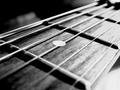
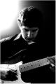
| 09/17/2005 10:41:39 PM | Intense Frettingby RanklesComment: Greetings from the Critique Club
by strangeghost
COMPOSITION
Unusual viewpoint and very close presentation are the strong points of this composition. Weaknesses are the very blown area on the lower right, underneath the neck of the guitar. Less troublesome are the soft blurry objects visible in the upper left. The angle of attack is interesting, as the guitar strings and fret bars make interesting intersecting lines throughout the photo. The way the strings converge in the upper righthand corner is attractive and gives the photo a well balanced feel.
TECHNIQUE
My two chief complaints are the shallow depth of field and the reflective glare left by the position of the light source. The shallow dof leaves only the center portion of a few strings sharply focused near the center of the photo; everything closer or farther away is blurred. This would not be a bad thing in many photos where, for instance, there is an object of interest at the focal plane which the shallow dof can lead the eye to. I think this subject needs a greater dof, accomplished by jacking the f-stop as small as possible, or more ideally, backing the camera off a little and using the greatest available zoom to macro in on your composition. Keeping the fret-boards, wood-grain, and strings in the sharpest focus possible would have given this photo a lot of zing, IMO. Lighting a subject like this is tricky. Usually, diffuse sources are best; softboxes, or bright lights behind a sheet, or reflected off a white board/wall/ceiling, etc.
OVERALL IMPACT
The result you've achieved with this photo does have a very high contrast appearance, but the various elements have a haphazard feel and probably don't present enough initial visual appeal to make the average voter stop and stare. Your score of nearly 5.2 is around average, but probably left you feeling a bit frustrated. The voters who bothered to comment generally liked your photo (though some mentioned some of the points I've raised), but you probably got a lot of quick "vote 5 and move on" responses.
Keep working on the composition and technical elements. You've clearly got a good eye. I enjoyed studying your photo for this critique! | | Photographer found comment helpful. |
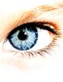
| 09/17/2005 04:36:00 PM | In this sky I feel lost.by srugoloComment: Greetings from the Critique Club
by strangeghost
COMPOSITION
The first thing that strikes me about your composition is the portrait presentation of a subject that is largely horizontal. It's not a bad presentation, but different and gives an unusual feel to the image. The more I look at it, the more there's a feel of peeking through a keyhole or something. Intriguing. Macros of eyes have been attempted many, many times in challenges over the last year or two and most are ordinary and forgettable. Yours grabs attention quickly, mainly because of the technical presentation.
TECHNIQUE
The primary technique-related topic is obviously your choice of overexposing to obtain the blown-highlights/high-key presentation. I confess that I like the effect quite a lot. The white of the eye is completely detail-less, as is the negative space above and below, which serves to frame the eye, eyebrow and lash combination. The colors are vivid and well saturated, and the black of the iris is striking. I think your shot is a wonderful response to the "high contrast" challenge. Focus is tack-sharp where it needs to be.
OVERALL IMPACT
I think the impact is quite high, and your score reflects that you struck a chord with the voters too. This shot is a nice blend of reality and an artist's interpretation. It's got some wow and pop. I enjoyed studying it for this critique. | | Photographer found comment helpful. |
| 09/16/2005 11:56:46 AM | Chester alley catby philupComment: GREETINGS FROM THE CRITIQUE CLUB
by strangeghost
COMPOSITION
In my opinion, you've followed every important rule about capturing a portrait shot: you're tight on your subject, you've filled the frame, you've got great detail in the eyes, and the shot is extremely attractive and eye-catching. Oh yes, and it's a cat! Pet shots are tough, I know I struggle with them myself. Whatever you used to distract his attention worked great. Many cat shots capture that lazy, "why are you bothering me" look. This animal is so attentive - ears up, eyes wide, head cocked at an upward angle - that it adds an element of intrigue. And I love the flat black background. Meets the high contrast challenge perfectly, IMO.
TECHNIQUE
I can't find anything to suggest as a technical improvement. In addition to what I've already commented on re: composition, your lighting appears to be spot on. The highlights on the right nose (cat's left) are blown, but I like the pushed effect since it adds to the photo's contrasty feel. Some of your commenters mentioned the clipped ear, but I feel that this was a necessary compromise to achieve the tight shot of the face, and I fully agree with the way you've cropped. It's perfect IMO.
OVERALL IMPACT
As your score indicates, and I fully agree, this is a shot that has impact. It catches the attention and draws the viewer in because there is personality evident. It's a wonderful pet shot and you should be proud to display it. | | Photographer found comment helpful. |
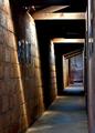
| 09/15/2005 10:09:29 PM | Emptinessby barbaraanneComment: GREETINGS FROM THE CRITIQUE CLUB
by strangeghost
COMPOSITION
A well lit, wonderfully evocative scene. Your choice of vantage point draws beautiful lines all throughout your photo that naturally lead the eye and draw my interest. The shadows are deep and dark, but still reveal a teasing hint of detail. After wandering over the architectural highlights, my eye is naturally drawn to the photos on the walls. The two at the far end are clearly recognizable as portraits, but who are they? The closer photos on the walls are indecipherable due to the perspective. Your title doesn't leave any clues (but sets the emotional stage). I'm glad I had your photo notes to help me interpret the scene. I'd love to have seen other perspectives that would have shown a few of the miners' faces in some detail, but this would have meant drastically changing your composition.
TECHNIQUE
Nearly perfect. There are a few blown highlights on the upper beams but this hardly matters in a wondrous scene as this. You've captured such perfect earth tones with such a variety of different feels for each wall, the floor, the woodwork, etc. It's all very well done. Textures are visible throughout owing to your excellent focus, deep dof, and near perfect exposure.
OVERALL IMPACT
This is a wonderful photograph and one that you should be very proud to have created. It drips with feeling: loneliness, emptiness (great title), abandonment, etc. Like all great pictures, it suggests stories; poses questions for the viewer. It drew me in and I'm honored to have had the chance to study it closely.
| | Photographer found comment helpful. |
| 09/15/2005 08:50:47 PM | On Stageby Zap228Comment: GREETINGS FROM THE CRITIQUE CLUB
by strangeghost
COMPOSITION
Very definitely a high contrast entry - a good response to the challenge. The subject and lighting provide ample opportunity to plumb the highs and lows of the histogram. I like the BW choice and the downcast face of your model sets a somber tone over the whole image. Very moody and reflective. I might have tried even a tighter crop, closing up the space around his head (and even chopping a bit) and maybe placing one of the hands at a third. I went back and forth for a while over the really blown light area at top left. I like it but it might be a bit too powerful. The rest of the image has a very dark feel to it though, so the overall contrast sets a tone of conflict that goes very well with the mood of the photo.
TECHNIQUE
In keeping with the overall feel, the image has a slightly grainy, "rough" feel to it that I think works. It's not too sharp, but not soft either. You've managed to backlight your subject, but still front-fill enough that the guitar is very visible and evident. I'm guessing the overall light level you used was somewhat dim, given your ISO and shutter. Don't be afraid to bring in a few more light sources and experiment with the different effects you can achieve.
OVERALL IMPACT
I like the picture. I felt drawn in to it and found myself wondering about this person. It's a photo that suggests a story and I'm curious about what the story is. I bet you were disappointed with so few comments and a middlin' score. The image resonated well with me and I'm honored to have had a chance to study it. Nicely done. | | Photographer found comment helpful. |
|
Showing 481 - 490 of ~1262 |
Home -
Challenges -
Community -
League -
Photos -
Cameras -
Lenses -
Learn -
Help -
Terms of Use -
Privacy -
Top ^
DPChallenge, and website content and design, Copyright © 2001-2025 Challenging Technologies, LLC.
All digital photo copyrights belong to the photographers and may not be used without permission.
Current Server Time: 08/14/2025 03:35:53 AM EDT.
|