|
|
|
Showing 471 - 480 of ~1262 |
| Image |
Comment |
| 10/05/2005 08:21:57 PM | Get Well Soonby TransitComment: Greetings from the Critique Club
by strangeghost
COMPOSITION
He looks like he didn't completely dig being wrapped in gauze! I think you should have filled the frame with the dog. The wide shot with the bed (table top?), bedpan, etc, doesn't really add anything to the shot. The dog, with very high cuteness factor, is the main attraction here so let's see more of him. Tighter on the face and eyes, maybe more detail in the gauze wrappings and pseudo cast on his legs, etc.
TECHNIQUE
I don't think it's brightly enough lit, and the yellowish background is very unappealing. I wish there was more detail to his face and eyes. With 1/40th of a second, I wonder if you were struggling with the low light yourself. The details of his face are difficult to distinguish because everything is in such dark shades. Maybe by eliminating some of the lighter tones in the bed, you could have stretched more tonal range out of the face, showing some more of his personality? Easy for me to say, I haven't shot many dogs.
OVERALL IMPACT
A cute dog with bandages, what could be more endearing? Somehow, you fell short of really pulling it off, IMO, though your score of nearly 5.9 is quite respectable. When I first glanced at your shot, it did elicit an "aaaaawww" from me, just because he's so darned cute. However, the full potential impact of this shot was not realized.
|  Photographer found comment helpful. Photographer found comment helpful. |
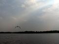
| 10/01/2005 09:15:18 PM | My Grandma and Grandpa used to bring me here..by tolovemoonComment: Greetings from the Critique Club
by strangeghost
COMPOSITION
Composition is excellent. You've placed the horizon near the bottom "third" line giving you a pleasing balance between water and sky. Horizon line is level. The bird is also placed well, adding interest and harmony to the shot.
TECHNIQUE
It is in the technical details that this shot literally falls flat. The colors seem very flat and grays dominate. Other than the pale blues in the sky, there seems to be almost no color at all in the shot. Since you provided no camera setting details, I can only speculate that maybe you were a little over or under exposed and tried to compensate in post-processing. Surely with blue skies, you could have pulled some color out of the water or some greens in the distant foliage? From the appearance of the sunbeam in the sky, it looks like the sun may have been in front of you, to the upper right? That can make achieving the correct exposure tricky, and can fool the camera's internal meter into underexposing the darker parts of the image. At any rate, I can't help but wonder what you might have been able to achieve here with a bit of levels and saturation work in a photo-editor package. With an excellent composition, this image bursts with unrealized potential.
OVERALL IMPACT
Pretty dull and low impact, as your final score of just under 4.3 reflects. Given the emotional significance the shot had for you, I imagine you were a bit disappointed, but surely you see what the voters were responding to? (looking over your voter comments) - Your commenters pretty much touched on everything that I mentioned. "Destinations" was not a huge challenge, but your photo likely didn't cause voters to stop and look more than a few seconds. Let your colors pop. Learn how to use post-processing to your advantage and make a photo - like the bird in this one - soar.
| | Photographer found comment helpful. |
| 09/29/2005 08:57:46 PM | Wednesday's Moonby LadeeMComment: Greetings from the Critique Club
by strangeghost
COMPOSITION
You missed the intersection of the bottom right third by a bit, but I'm not one to take a ruler out on such things. I go by feel, and by what looks right to MY eye, and I suspect you did as well. The moon as a lovely gibbous gem floating in absolute black space is tough to resist, isn't it? Nice composition. Nice feel for how to crop the image and add interest just by subject placement alone.
TECHNIQUE
Astrophotography is damn hard (I know from experience, check my portfolio). The moon seems like such an easy object to photograph, but it's very difficult to photograph well, even with expensive cameras, telescopes, and means to join the two. Your shot has the appearance of a handheld, with enough sharpening and contrast enhancement to make the major lunar features visible. It lacks the critical sharpness and focus that characterizes a classic, drop-dead gorgeous moon shot, but with your composition, that's not really essential anyway. You probably could've tried a slightly faster shutter as some of the lighter areas are a little blown out.
OVERALL IMPACT
I've found that DPCers generally like a nice moon shot, but yours apparently didn't rise to the standard, garnering only a 4.8 final score. As I glance at your comments now, I see some of the voters did decide to take you to task on the placement of the moon, and that probably affected their vote too. I like your shot and hope you continue to experiment with moon shots. Try at moonrise or set, when the moon is low on the horizon and you can compose interesting shots with trees, buildings, people, and other foreground objects.
| | Photographer found comment helpful. |
| 09/28/2005 08:29:25 PM | Voting, Update Buttons, Submitting, Photos....NO MORE!!!!!!!by JudiComment: Greetings from the Critique Club
by strangeghost
COMPOSITION
Wow. Quite a strong photo with a great concept to grab DPCers' attention! I love the "in your face" centeredness because the photo is all about her being in your face. I might have considered a slightly closer crop, but I'm sure you considered that too, and went with your actual crop for good reason. The costume, the face paint and facial expression, the pose, open mouth rage, and angry sky background all make for a very compelling and strong composition. Good job.
TECHNIQUE
Very well lit with strong, sharp contrasty colors. Excellent job on the dodging and burning of the sky (is it a sky?). Technically a very strong shot.
OVERALL IMPACT
This is quite a high impact shot, IMO. So why didn't it do better (though 5.6 is a respectable score)? Like most people shots, it might have scored better if you had gotten tighter on the face, but this would clearly have made it very difficult to retain the other elements. I like it though, and hope you're happy with your work.
| | Photographer found comment helpful. |
| 09/24/2005 05:58:48 PM | A Legal Perspectiveby kari1Comment: Greetings from the Critique Club
by strangeghost
COMPOSITION
My initial feeling is that, while a decent enough shot, it lacks a clear point of focus to draw my interest. The "school of law" seems to be well placed, but the way it curves out of easy visual range makes it feel like it just fizzles out. Likewise, the interesting windows are arranged in lines that lead the eye to the edge of the photo, but again, lack a balanced or harmonious feel.
TECHNIQUE
The main impression here is of a somewhat monochromatic image, with relatively low contrast. The grays really rule the day. Bumping the contrast up a bit may have paid off. I think the reflections in the lower windows are particularly unfortunate, since they add a bit of additional detail that fails to add any interest. Focus is sharp, but without any key element that draws the eye, it's technical adequacy without emotional impact.
OVERALL IMPACT
Pretty flat, I think. It's an attractive enough building, but I think you didn't find the pleasing angles or lines that would have really made it a 'wow' photo. Keep browsing the architectural photos on this site and others. Watch for how people make dramatic use of light, shadow, angles and perspective to add punch. | | Photographer found comment helpful. |
| 09/24/2005 02:42:19 PM | Bridge into Darknessby nemesise1977Comment: Greetings from the Critique Club
by strangeghost
COMPOSITION
This is certainly a unique perspective. Even after examining it for a full minute, I'm still not entirely sure what I'm looking at. Your photographer's note helps, but I can't tell from what perspective you've shot this bridge. The tree at the top suggests either a 90 or 180 degree rotation, but I'll be darned if I can tell. Enough already! What of the composition? Well, I like the perspective created by the very large elements at the bottom (trusses?) that recede into the distance. The large pipe at right, ditto. There's also a nice contrast throughout the photo that enhances the feel, as you said, of depth. I'm just not sure of your choice of subject. Being unrecognizable is not bad if there's a ton of naked visual appeal, and this photo doesn't hit me that way right out of the gate.
TECHNIQUE
Great sharpness, depth of field and exposure. For the length of your exposure, the light that people commented on is not all that blown, and actually adds a nice bit of interest. Given that the pipe at right is a bit dirty, I wonder what boosting the highlights would have done? Possibly made the lights intolerably blown, so you probably made the right decision.
OVERALL IMPACT
I wonder if others, like me, were confused by the image and then didn't spend enough time really looking at it? Your final score of 5.1 suggests a lot of kneejerk "5 and move on" votes, which is unfortunate. Your image doesn't have that major initial WOW factor, but is a very technically adequate photo.
| | Photographer found comment helpful. |
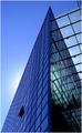
| 09/24/2005 12:59:08 PM | Spiky buildingby blue_dragonComment: Greetings from the Critique Club
by strangeghost
COMPOSITION
Certainly meets the challenge by showing an unusual building from an interesting perspective. The composition is filled with lines, more lines, still more lines; all forming interesting angles and a treat for the eye to wander around. The single open window near the bottom left adds further interest. It may be been interesting to move this mini focal point to a third and re-compose from there, possibly eliminating the distraction you noted at the upper right. I may also have considered just using the left surface of the building, which has far fewer reflective inconsistencies.
TECHNIQUE
I can't find any fault with the technique at all. Everything is sharp throughout, colors are striking, though mostly a blend of blue tones. Nice job capturing an interesting gradient in the sky too. The area around the hidden sun is subtle. Just perfect, IMO.
OVERALL IMPACT
This is a very nice picture with a lot of instant visual appeal. I'm a little surprised that it finished at 5.8. While a respectable score, I imagine you were a little disappointed that it was not higher. I can't see what part of the football stadium this is. Very interesting choice in subject and excellent job on all fronts.
| | Photographer found comment helpful. |
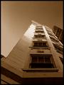
| 09/23/2005 08:40:12 PM | WINDOWS - 95, 98, ME, 2000, NT and XPby ardnetihComment: Greetings from the Critique Club
by strangeghost
COMPOSITION
An interesting perspective to be sure. You've created an interesting set of lines that lead out of the bottom of the image and converge toward the center/top. There might be a bit too much space at the top, give the pic a bit of a bottom-heavy feel. I like architectural shots a great deal but this one feels a bit blase' to me.
TECHNIQUE
Looks like it might have been a night shot with a long shutter, but I'm not at all sure about that. The muddy tones are unique but also ultimately unsatisfying, IMO. Coupled with the slight softness and noise/grain (especially in the sky), it has a fairly sloppy look to it. Then there's the very blown-out section of the building near the center.
OVERALL IMPACT
This shot doesn't grab me with visual impact. It has a haphazard look and feel that I think turned off many voters, as suggested by your final score of 4.7. Without any photographer's comment from you, it's difficult to critique further. For future reference, anything you can tell about your intent, your methods, or your own feelings about a picture aid immeasurably in the process of a critique. Feel free to let the voters/viewers know what you were angling for in a photo.
| | Photographer found comment helpful. |
| 09/22/2005 05:48:08 PM | Like Her Momby spydrComment: Greetings from the Critique Club
by strangeghost
COMPOSITION
Wow. Though I'm by no means a portrait photographer myself, this photo strikes me as an outstanding composition. I believe you have achieved a perfect crop on her face - not too close, not too far. Lovely detail visible, beautiful facial expression, soft lovely tones, understated background that blends perfectly with the color scheme, etc. I honestly can't think of a single recommendation for change or improvement.
TECHNIQUE
Again, I'm at a loss to be critical. I love your lighting and the exquisite play of shadow and light. Focus looks flawless. Beautiful texture visible in the skin and fabric. An unbelievably well-done job. The predominant opinion (besides loving your photo) was to brighten it up a bit. Taking another look myself, I guess I could agree that lightening _might_ improve, but I was hesitant to recommend that myself because I liked your lighting so much. Maybe an opinion, but I like your judgement on this.
OVERALL IMPACT
As with all well-done portraits, there is considerable impact. This is a beautiful girl captured beautifully. Her face radiates personality and charm. Her smile suggests barely restrained elation or joy. I look at her and am filled with wonder: who is she, what's she thinking, what's her story? Your title (the only clue you give to your own motivation) enhances the wonder. Ah, her mother's daughter. "Like" her mother. Your picture manages to communicate much about family, love, bonds, etc. It's a rare picture that can communicate a connection like that. | | Photographer found comment helpful. |
| 09/21/2005 09:00:58 PM | Onlooking...by jmleliiComment: Greetings from the Critique Club
by strangeghost
COMPOSITION
I think this is a masterful composition. Off-center, perfect sense of how to place your subject in the image, wonderful use of negative space, etc. The whole photo does what all great shots should do, it occupies my mind as well as my senses. The lighting from the left as she looks off to the right is beautiful. I like the low light level and the wonderful interplay of shadow and illumination that is created on her body and the deeply textured wood wall.
TECHNIQUE
I can't find any nits to pick here. You've achieved a wonderfully expressive photo with great detail and texture throughout. I love your lighting and the broad range of tonality. This is a photo that defies technical critique so I'm going to let it speak for itself. Reader, look at the picture!
OVERALL IMPACT
As I hope you've sensed, I like this picture a lot. I think its sheer emotional impact is very high. It's a photo that seems to raise questions and make me wonder who she is, why she looks so somber, what's happening here. In a word, she suggests a story and sets the imagination to work. I'm frankly stymied by your score. Did people think there wasn't enough color (as your photographer's comment suggests)? Did they not think a full body shot qualifies as a portrait?
I figured there would be a lot of complaints about the grain, but IMO, that was a very necessary part of this image. Low light creates mood and the grain really adds to the mood. Correct decision on your part. This was a superb photo Jeremy and I really hope you are still happy with it. Voters come with their own idea of what's good and what's not, but a great photo will stand on its own long after the challenge is forgotten. I thoroughly enjoyed studying this image in detail. | | Photographer found comment helpful. |
|
Showing 471 - 480 of ~1262 |
Home -
Challenges -
Community -
League -
Photos -
Cameras -
Lenses -
Learn -
Help -
Terms of Use -
Privacy -
Top ^
DPChallenge, and website content and design, Copyright © 2001-2025 Challenging Technologies, LLC.
All digital photo copyrights belong to the photographers and may not be used without permission.
Current Server Time: 08/13/2025 04:04:54 PM EDT.
|