|
|
|
Showing 461 - 470 of ~1262 |
| Image |
Comment |
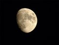
| 10/14/2005 10:05:39 AM | moon.jpgby hyperfocalComment: Much better than your challenge entry (which didn't do that badly, BTW). Good glass makes a lot of difference. If you really want good results with the moon though, you need a telescope and an adapter to mount your camera to it. Now you're talking some bucks!! |  Photographer found comment helpful. Photographer found comment helpful. |
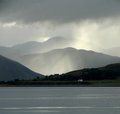
| 10/10/2005 02:33:15 PM | IMG_4805_scotch-mist.jpgby barbaraanneComment: Nice composition! I wonder if you could have brought up the color saturation a little to bring out some of the greens of the lakeshore? The heavily moistured air is going to knock out a lot of color, but the result is pretty gray. Very sharp in spite of the fog! | | Photographer found comment helpful. |
| 10/09/2005 09:54:55 AM | Shadowby hannekeComment: This is a very cool effect. Could be interesting for lots of other objects too. Nice going! | | Photographer found comment helpful. |
| 10/07/2005 09:07:20 AM | Natural Symmetryby JeanComment: A remarkable photo in every way. Lighting is great, choice of background is genius. A superb entry to this challenge. | | Photographer found comment helpful. |
| 10/07/2005 09:06:22 AM | Whirlwind Passion (Floral)by NeilComment: This is quite simply breathtaking. Wow. If you don't get punished by voters who don't care for the abstractness, this ought to ribbon. This is a technique I want to master, thanks to your work. If it's you, NS, superb job buddy. | | Photographer found comment helpful. |
| 10/06/2005 08:59:16 PM | Baseballby hstegComment: Wow, simply beautiful. Great lighting and shadows, wonderful detail on the stitching and leather. But WTF? Coffee shop?? Who cares. 7. | | Photographer found comment helpful. |
| 10/06/2005 08:34:21 PM | Happy Birthday (Where's The Party?) by idnicComment: Greetings from the Critique Club
by strangeghost
COMPOSITION
Ah, first time I've gotten a ribbon-winner to critique! Here goes: Composition is perfect. A cute dog is a very good choice for a subject. A cute dog wearing an adorable costume is tough to beat. The off-center composition and liberal use of negative space work well. With the dog's very attentive look, it's obvious that you've riveted her attention with something just off camera. The composition creates a sense of anticipation as we're drawn into the expression her face. I'm usually the commenter calling for a tighter shot on faces to bring out the emotion and feel, but I think you've captured it perfectly here, and her body language adds to the attraction. The angle of the shot, using the floor as the whole of the background is great, avoiding any distracting clutter or extraneous detail.
TECHNIQUE
Very nice job managing the bright white backdrop. It doesn't overpower the dog or costume colors, and manages to look so effortless that it's hard to imagine any other color back there. Lighting is very nice, and the understated shadow is perfect. I'd like to see a bit more light on her face but as I've said above, the facial expression is preserved and adds so much to the impact. Good post processing and camera control. You didn't give any details which makes me think auto mode, but whatever, it worked for you and you got a real winner here, in more ways than one.
OVERALL IMPACT
Your score speaks for itself, and a ribbon to boot. I hope you're happy with this image. This is a pet shot that manages to convey tons of personality. Anyone would have been proud to have shot it. It begs to be printed, framed, and hung.
| | Photographer found comment helpful. |
| 10/06/2005 06:51:01 PM | Coffee Barristaby Sherri1209Comment: A very busy shot that manages to capture the ambiance of a typical coffee shop. I'd suggest a tighter crop to eliminate some of the extra detail that doesn't accentuate the main subject, the girl. Using my hands to crop out everything to the left of her right hand and below the left pinky still gives me a great shot of her (and a little tighter on her face) but eliminates the paper cubs, the label on the milk container, etc. There's also a little bit of a red caste to her skin that seems unusual. What I like most about this shot is her face. Profile views are wonderful, and that lock of hair hanging down in her eye is a perfect expression of a hardworking caffeine jockey. | | Photographer found comment helpful. |
| 10/06/2005 06:44:25 PM | Teen Terra Firmaby Sherri1209Comment: I love the concept behind this shot, but I believe you missed the opportunity to really nail it. I think you were going for a dark feel here but perhaps a bit too dark? You've created a lot of negative space at the left edge and bottom that doesn't necessarily add to the image. Additionally, it feels a little soft to me, maybe a bit too soft in focus. Other detail is lost as well - I can't tell what he's laying on and I can't make out the object just to the left of his chest (music player?). I think you could have tightened up your shot by moving in on his head and upper chest, maybe with the music player laying directly below his chin, to push the concept that he's off in a world of his own, lost in the music. As shot, there's a little too much competing detail that doesn't contribute to this feel (assuming that was your aim). | | Photographer found comment helpful. |
| 10/05/2005 08:38:38 PM | Invitation, Come Join Me At The Beach!by PoobaComment: Greetings from the Critique Club
by strangeghost
COMPOSITION
There's a lot to like in this photo. The blinding orb of the sun sprays its rays downward toward the viewer. Sky, water and reflections are a wonderful feast for the eye. Tones are rich and deep. The bike is a touch of genius - it adds that element of interest and surprise. I'm a little disappointed that the bike is not more prominently placed though. It's SO interesting, I want to see more of it. I want to see it dominate the foreground shot a bit more. I visualize it closer, perhaps right in the large puddle front right, so the bike and it's reflection command the full third square at that bottom right side? As it is, the bike spans the sand, sea, and sky, and seems a little lost in the mix. All my preferences of course. I can see why this shot caught your attention and bravo for having your camera ready!
TECHNIQUE
Good job capturing a scene that spans the entire range from blinding sun to darkest shadows and silhouettes. Too bad you didn't include the technical details of your shot though. Perhaps that means you used full auto mode? My experience with my own Coolpix is that you rarely go wrong using auto, or perhaps the sunset "scene" mode for a shot like this. Works well and paid off in this case. You also give no hint of any post-processing you did, so can't comment on that. Final result is a fine looking pic though.
OVERALL IMPACT
Pretty nice shot and has nice visual impact. Everybody loves a good sunset (or sunrise, in this case) shot and yours is pleasing to the eye. It might have done better in the voting (though a near 6.0 score is quite respectable) if you had stretched more color range out of the sky and maybe toyed with the prominence of the bike a bit. | | Photographer found comment helpful. |
|
Showing 461 - 470 of ~1262 |
Home -
Challenges -
Community -
League -
Photos -
Cameras -
Lenses -
Learn -
Help -
Terms of Use -
Privacy -
Top ^
DPChallenge, and website content and design, Copyright © 2001-2025 Challenging Technologies, LLC.
All digital photo copyrights belong to the photographers and may not be used without permission.
Current Server Time: 08/12/2025 10:46:58 PM EDT.
|