|
|
|
Showing 371 - 380 of ~1262 |
| Image |
Comment |
| 03/21/2006 08:32:55 PM | Forest Spirit masquerading as Chickareeby hahn23Comment: Greetings from the Critique Club
by strangeghost
The first three parts of this critique are written based purely on examination of your photo. "Final thoughts" is written after reviewing your score, photographer's comments, and voter comments.
TECHNIQUE
Focus and sharpness are great. The tonal range seems a bit flat to me though. The picture has an overall gray feeling to it. That's possibly just what it should be, after all, the only real color is the greenery in the background. However, with snow visible in the leafy foreground, that seems like it's where the white point ought to be. Whatever that white is to the right of the squirrel probably would've blown out then, right?
COMPOSITION
Well obviously it's an adorable animal! I have no idea what that reflection is in the eye. It almost has a face-look to it but for the life of me, I can't make it out. Your title seems to imply that it has some connection with your intent but I'm not sure I get the connection. As for fitting the challenge, it's probably a stretch but the voters have the final say on that. Compositionally, I like the mix of sharp leaves around him and gently blurred background. It looks very natural and in situ.
EMOTIONAL IMPACT
It's a fine shot and one that's generally not easy to acquire, as these animals are pretty twitchy and tend not to sit around long when people are poking around. It's probably not bursting with "wow" to the extent necessary for highly successful DPC shots, but it's definitely nice. The odd reflection in the eye is enough to make me pause and really look closely at what's going on, but doesn't add enough impact to put this pic in the upper crust.
FINAL THOUGHTS
Ah, now I see where the reflection came in, but I really question your decision not to post process. Even in basic editing, you could have adjusted your white and dark points and really made this image scream as far as tonal range. It didn't need any sharpening but could have really used a tweak for the colors and brightness. Your commenters, for the most part, liked the shot, but your final score of 5.5 shows that you scored mostly 5's and 6's with the voters. IMO, not bad for this shot for this challenge. |  Photographer found comment helpful. Photographer found comment helpful. |
| 03/20/2006 02:01:32 PM | Amazing!by eschelarComment: Responding to your plea for "negative" comments.
For me, I just don't buy that there's something in the book that is so amazing. Other ideas? A boy looking at his first girly magazine; a film photographer looking at the price of a dSLR; a woman opening a jewelry box, etc., you get the idea. There has to be something that communicates with the viewer that matches the expression of amazement on the guy's face. For a challenge "literary," I have trouble coming up with a good idea, but that's my take. | | Photographer found comment helpful. |
| 03/19/2006 05:49:00 PM | and now doth time waste meby arlanbartComment: Greetings from the Critique Club
by strangeghost
The first three parts of this critique are written based purely on examination of your photo. "Final thoughts" is written after reviewing your score, photographer's comments, and voter comments.
TECHNIQUE
Focus is great and depth is handled well, adding a nice three-dimensionality to the image. Works very well, IMO. The tones seem to be very mid-range without a lot of true highlights which gives the image a fairly gray feel, but I like it because it fits with the feel of old books and pages. I can almost feel the dustiness and smell the age. Nicely done technically.
COMPOSITION
It's an interesting composition, and I think it works. Books resonate with me and you've chosen a perspective for your composition that is unusual and not often seen. It highlights an aspect of books that is very dear to me, and captures very well the texture of the pages even down to the dust and fiber. Your pic makes me want to run my hand over these books; cradle them in my palms and feel the weight of the ages. I love your title too. Very poetic and thoughtful. I'm usually not a fan of borders, but yours is nicely understated. Usually the best I can say about a border is that it doesn't suck, and yours doesn't suck. Good job. ;-)
EMOTIONAL IMPACT
As stated, this image connects with me. I like it. Would the average voter respond in kind? Without some type of splash or pop, probably not. This is like a very narrow kind of study. Unless the average voter is a bibliophile or has some reason to connect with a close-up of well-aged books, it might not have sufficient impact to be a standout in the field.
FINAL THOUGHTS
Two thoughts: first, the lack of any photograher's comment from you is frustrating. Having spent time studying and trying to critically evaluate your image, it's disheartening to find that you didn't even supply me with any of your own thoughts; what were you aiming for? What feel were you trying to achieve? What is your connection with this image?? Please, when you request a critique, at least do us the honor of leaving your own feelings/frustration/etc. Second, your final score of 5.2 is a little disappointing; I would have thought this would have scored a little higher. You only gathered a few comments, making me think that most voters passed lightly over this one. One commenter (e301) did spend some time though, and touched on some of the same themes that struck me. | | Photographer found comment helpful. |
| 03/15/2006 10:54:41 AM | Reunited by Keith ManiacComment: A true product of genius and determination. It's a pleasure to see such creativity on exhibition at this site. Warm congrats Keith! | | Photographer found comment helpful. |
| 03/14/2006 10:05:12 PM | | | Photographer found comment helpful. |
| 03/12/2006 10:55:06 AM | Bath Timeby jaylenComment: Greetings from the Critique Club
by strangeghost
The first three parts of this critique are written based purely on examination of your photo. "Final thoughts" is written after reviewing your score, photographer's comments, and voter comments.
TECHNIQUE
Focus isn't perfect, but it is certainly pretty good and probably adequate. Shooting babies and getting fully sharp shots rarely go together anyway. My biggest criticism of this photo is the predominance of gray tones. Soap bubbles are probably white, so it seems as though you would have had plenty of white and black (eyes, hair) portions of this photo to use as calibration points for a true BW tonal range. I like your decision to go for BW with this shot, but leaving everything in shades of gray leaves the image feeling flat. Though size is probably more of a composition issue, I encourage you to use the full 640 pixel dimensions that DPC allows you. Your photo is going to be noticeably smaller than the other entries, and voters usually chafe at that. Lighting seems to be based on the camera flash, and that's almost never the best. The bubbles have lots of possible texture that will disappear in a head-on flash.
COMPOSITION
Babies are smaller than us, and the natural impulse is always to photograph them from above. This is problematic since none of us, babies included, look best from that "birds' eye" perspective. In your shot, you've captured his forehead pretty well, but his whole face, especially the mouth, are so foreshortened that it's tough to really relate to the face. And in babies, lets "face" it, the face is where all the action is. Bring your camera down to his eye level. Lean over the side, get in the tub with him. Set your tripod up in the water (kidding, don't know if I'd do this). Above all, get him to look at the camera. Get him to laugh, to stare in wonder, to hold a bubble in his hand and experience the wonder of life. DPC baby shots fall into two broad categories; quick snaps and wonderful expressions of the world of the child. Unfortunately, this one belongs to the former group.
EMOTIONAL IMPACT
As with all baby shots, the parents and other loved ones usually have the strongest emotional connection, and often fail to see that their shot is not a great one. This shot was a great idea, and had great potential for the challenge topic, but didn't live up to that potential.
FINAL THOUGHTS
Your commenters saw some nice things, but also briefly pointed out some of the shortcomings. Your final score of 5.0 is pretty good, given the technical and compositional problems. Look over some of the higher scoring child and infant shots on this site, and get a flavor for what I'm referring to above. If I were you, I'd reshoot this with some of those ideas in mind. It would be a killer shot and one you'd be happy to share with the relatives. | | Photographer found comment helpful. |
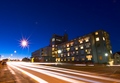
| 03/11/2006 08:25:48 AM | The Hospitalby DjabordjaborComment: Greetings from the Critique Club
by strangeghost
The first three parts of this critique are written based purely on examination of your photo. "Final thoughts" is written after reviewing your score, photographer's comments, and voter comments.
TECHNIQUE
There is so much to see in his photo it's hard to know where to start. Focus looks great, considering it's obviously a very long exposure. Everything is very sharp and contrasty and very pleasing to the eye. I love the very sharp starburst on the nearest streetlight. The deep blues of the sky and the very pleasing, gentle gradient to the horizon is just too well done. The minor lens flares are a bit of a distraction but when the theme is painting with light, those flares add a ghostly light echo to the mix as well. During your exposure, it appears as though someone walked through the composition, or maybe a bicyclist, creating some extraneous ghostly trailing at the bottom center and left. This is the only disappointing element I see. Very well done technically!
COMPOSITION
This composition shows some very significant thought and planning, IMO. The building is perspective distorted, which, along with the car headlight trails, creates a melange of lines flowing from right to left, converging on a vanishing point just at the left edge of the photo. The starburst streetlight is placed at a satisfyingly decentered position that strikes eye as a well planned element. Some might quibble and wish that you had followed a strict rule-of-thirds mandate and re-think this placement, but rules are nothing if not to be broken when the circumstances demand. I love the way this light is seemingly floating in a pool of brilliant blue sky. The perspective distortion then gives us a second vanishing point out of the top of the frame, created by the leaning of the streetlights to the right, and the lines of the building leaning inward. It's really quite amazing, how many lines there are to follow in this image.
EMOTIONAL IMPACT
Well, I certainly like it, though I wouldn't describe its impact as strictly emotional. It has a vague, otherworldly feel to it, like something out of a film noir or a science fiction movie. Something about the scene does ignite my imagination and make me speculate about other possibilities. It's a true visual treat that should reward anyone who takes the time to appreciate all the subtleties. In my view, this is a very creative shot with the right mix of the unusual and the ordinary.
FINAL THOUGHTS
I'm very surprised that you were accused of not meeting the challenge. It never even occurred to me as I was writing this that your photo didn't meet the challenge. It's a wonderfully unusual take on the challenge, and definitely deserved a higher score than the 5.4 it earned. Ah well, keep shooting. I look forward to seeing more of your stuff! | | Photographer found comment helpful. |
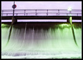
| 03/09/2006 08:33:45 PM | Damn itby marvinComment: Greetings from the Critique Club
by strangeghost
The first three parts of this critique are written based purely on examination of your photo. "Final thoughts" is written after reviewing your score, photographer's comments, and voter comments.
TECHNIQUE
I confess that I've struggled with this picture for quite awhile tonight. Frankly, I can't decide exactly what it is that bothers me about it. The motion blur in the moving water is nice, but the glaring, blown out green light is pretty harsh, as is the blown out sign (?) directly above it. The bridge looks a little too dark compared with the rest of the scene. The bright sky behind combines to create a whole pic where the lighting just somehow seems off.
COMPOSITION
The composition seems to be fairly plain and uninspiring. This is odd because flowing water generally has a pleasing feel to it, but this somehow feels a little abrasive or prickly. There's some nice symmetry with the posts, the signs, etc., but I don't feel any particular message coming from the comp. In relation to the challenge, I don't see an obvious connection to the odd couple. Dam and bridge? Water and walkway? Seems like you're stretching and not connecting.
EMOTIONAL IMPACT
None that really strikes me. There's nothing unusual or evocative that captures the imagination. No dynamic elements or tension implied. No real subject that grabs the eye and holds it, or lines that gently lead me to devour the elements. I think I don't really "get it."
FINAL THOUGHTS
I appreciate your humorous response to your commenters. It seems that most, by far, were perplexed by the relationship to the challenge, but many liked the photo, or at least were not as bothered by the technical elements as I was. In your photographer's comment, you say that you used USM to increase the saturation. I'm familiar with the oversharpening technique where you crank the amount down and the radius way up to boost contrast, is that what you mean (USM 35/100/2, for example?)? If so, you may have not had enough contrast and hue to begin with. Your final score of 4.34 reflects the voters' overall blase' attitude toward your image. You just didn't tickle their - or my - fancy with this interesting shot. | | Photographer found comment helpful. |
| 03/08/2006 08:53:10 PM | Don't Push It!by JudiComment: Greetings from the Critique Club
by strangeghost
The first three parts of this critique are written based purely on examination of your photo. "Final thoughts" is written after reviewing your score, photographer's comments, and voter comments.
TECHNIQUE
Technically excellent, I think. There's good detail across the full tonal range, except that bright white rectangle against the back wall, but I think that's supposed to be bright white. Good detail and textures in the wood, clothes, etc. It's all very sharp, exposure is great. Excellent technical control.
COMPOSITION
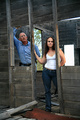
I'm not sure I understand the idea or purpose of your shot. The title, "don't push it" doesn't really rink a bell with me? An old building, hence "pushing" the walls could make them fall down?? Is the best I can think of. An "odd couple?" Hmmm. From a strictly compositional standpoint, the vertical joists are leaning to the left due to the perspective effect. That's disconcerting to the eye, but it also may add a little to the feel of this old structure on the verge of falling down. I particularly like the splash of sky and tree that's visible through the window. That bit of added color really sets off the starkness of the old, weathered interior. I think a closer crop on their faces might have made for a clearer statement in composition. There's plenty of wood at the top and foreground floor at the bottom that probably could have been sacrificed in the interest of tightening on the faces. There's plenty of building still available for context behind and directly in front of them. Just a suggestion. Whenever humans are present, faces are pretty crucial, unless pose and body language is speaking loudly (which doesn't appear to be the case here).
EMOTIONAL IMPACT
Hmmm, it's really just a shot of a man and woman posing rather pensively in an old building. It does make me wonder what they're doing, and any photo that raises questions in the mind of the viewer is making a connection, right? The problem is, for me it is much more of an intellectual question than it is an emotional one. Overall, I doubt that it has the initial visual appeal to hold voters' attention for more than a few seconds. Just a thought, maybe if he was trying to knock the wall down and she was on the other side trying to hold it up? (tension, emotion, and "odd" couple - at odds??).
FINAL THOUGHTS
Wow, only three comments, and no real obvious connection to the voters, eh? Your score of 5.17 surely reflects this blase' attitude, but I think you earned some points because you really nailed it technically. I wish you would have shared some of your thoughts and intentions in the photographer's comment. What were you aiming for? What "feel" were you hoping to evoke in voters' minds?? I find these comments invaluable after I spend time trying to grapple with a critique photo. | | Photographer found comment helpful. |
| 03/08/2006 06:23:03 PM | the classic GOOD vs. EVILby gocComment: Greetings from the Critique Club
by strangeghost
The first three parts of this critique are written based purely on examination of your photo. "Final thoughts" is written after reviewing your score, photographer's comments, and voter comments.
TECHNIQUE
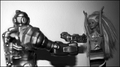
Several issues to talk about here. First is the obvious focus issue on the left. The robot doesn't seem to have an compositional reason to be out of focus. If it was intentional, it doesn't seem to me to work. Second is the very bright background behind the robot, seeming almost blown out, with the light level decreasing sharply behind the barbie. Barbie is quite well lit, and the exposure seems to have been perfect for her but not the rest of the photo. Then there's the awful shadow of his arm holding the gun. Looks like possible on-board flash. This would have worked much better, imo, with two or more light sources, giving a more evenly lighted, diffuse feel. I don't feel that the black/white conversion adds much to the composition either. It's not a bad BW conversion, it just doesn't feel as though it has any real purpose in the photo.
COMPOSITION
Apropos of the subject of the challenge, it certainly is an odd couple. I appreciate the humorous aspect of the shot, but the technical issues really detract from the whole, as mentioned above. The composition is fairly centered. I think it might have been improved by having an interesting or more emotional take on the comp. For instance, Barbie with her hands up and back to the camera, with the point-of-view looking over her shoulder into the face of the robot. Or conversely, looking over the shoulder of the robot, into the joyously vacant stare of the Barbie. Either way, making the face the focus of the composition, and letting the other elements organize themselves around that focus. As shot, it looks a little too bland, as though it's an incidental setup on a toy shelf.
EMOTIONAL IMPACT
It's a somewhat unusual picture, but toys rarely make for impactful shots unless they're truly stunning or breathtaking in some way. If this had been sharply focused throughout, with bright vibrant colors, it might have been a more attractive shot, but still probably not a true eye popper. For me, it doesn't really evoke much in the way of a reaction at all, it's rather bland. A more creative approach to composition as mentioned before, might have helped also.
FINAL THOUGHTS
Your commenters were a mixed bag, but really offered some insight into how to improve the photo. I also can't help but appreciate the fact that you marked them all as helpful, even the ones that bordered on rudeness!. Your final score of 4.0 was probably a little disappointing to you, but I'm sure you can see the reason for it. Voters need to be hit over the head with impact and emotion. If that's not available, they need to have a steady dose of technical perfection. Failing those two things, low scores are almost certain. I also very much appreciate the fact that you wrote an excellent photographer's comment, letting me know exactly your frame of mind in shooting this. It makes perfect sense. Keep shooting. I looked at your profile and portfolio. You've got some great stuff, and a pretty good eye. I look forward to seeing more of your stuff in the future. | | Photographer found comment helpful. |
|
Showing 371 - 380 of ~1262 |
Home -
Challenges -
Community -
League -
Photos -
Cameras -
Lenses -
Learn -
Help -
Terms of Use -
Privacy -
Top ^
DPChallenge, and website content and design, Copyright © 2001-2025 Challenging Technologies, LLC.
All digital photo copyrights belong to the photographers and may not be used without permission.
Current Server Time: 08/09/2025 11:09:20 AM EDT.
|